Overview
The usage over time chart type in Heap allows you to construct powerful visualizations of your data over time. In the usage over time view, you can analyze any event, segment, or property and review multiple types of analysis on the same usage over time chart.
The following chart templates use the usage over time chart. Click any of the links and populate the fields provided to quickly get up and running with your first usage over time chart.
- Which countries are my visitors from?
- What are my daily/weekly/monthly user counts?
- Have the most viewed product categories changed since last week?
- Which marketing channels are driving my conversions?
- Which pages are landed on the most?
Setting Up a Usage Over Time Chart
To create a usage over time chart from scratch, navigate to Analyze > Usage over time. From here, select an event of interest from the drop-down and click the View results button. For example, we’ll use the built-in pageview event.
View results hotkey
You can also press Command + Enter (Mac) or Control + Enter (Windows) to view your results.
To set up a Heap Connect query equivalent to this chart, see Event Counts.
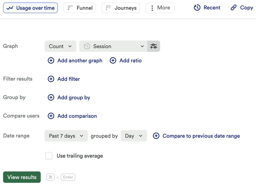
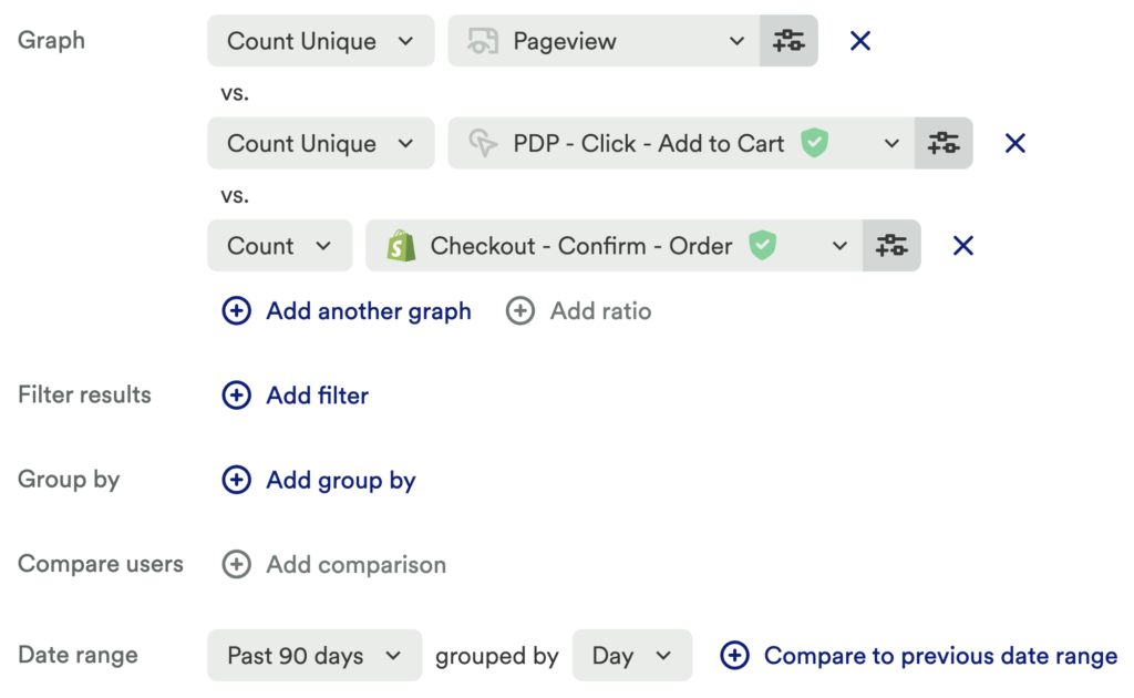
Here are the elements that make up a usage over time chart:
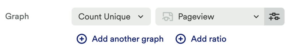
Graph: Your graph is made up of your chosen analysis type and event, as well as any filters, groupings, or segment comparisons. In the screenshot above, the graph is Count > Session.
Filters: This allows you to limit the results of your chart to a specific subset based on user-level parameters, such as to exclude bot traffic or free users. For more info, see Filters.
Group By: This allows you to group together results based on a certain parameter, such as grouping pageviews by referrer or clicks by the title of the item clicked. For more info, see Group By.
Compare Users: This allows you to compare groups of users based on select criteria, like whether they have done or not done a certain action or belong to a certain segment. For more info, see Compare Groups of Users.
Date Range: This is where you choose the date range over which you analyze your data. By default, Heap will set the date range of the usage over time chart to the previous 7 days. The usage over time view supports the following ranges:
- Past 7 Days
- Past 30 Days
- Past 90 Days
- Past Year
- Date To Now
- Choose a Date Range (a custom date range)
Granularity (grouped by): The second half of the date range field; this value determines the interval by which we view the analysis – either by Hour, Day, Week, or Month. By default, this value is set to Day. Intervals refer to calendar days, weeks, and months, rather than a rolling 1, 7, or 30-day window.
In the example above, the Data Range is Past 30 Days, and the granularity (grouped by) is Day.
Changing the granularity affects the way we calculate average time between and conversion rate between (two types of graphs) in the usage over time chart. In both views, the granularity (24 hours, 7 days, 30 days) represents the window of time the user has to complete both events to be included in the calculation.
Using the Entire Range option allows you to calculate the number of total users in a time-bounded segment, and the number of unique users who performed an action. You can also use this to calculate the total revenue across an entire date range.
For Custom Date Ranges, you need to pick the start date, followed by the end date. The shading on the calendar illustrates the range you’re selecting. For example:
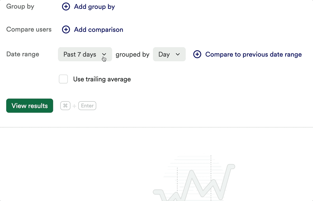
Trailing Average: This checkbox changes your usage over time chart from individual day counts to the average of the past 7 days, 4 weeks, or 3 months depending on the chosen granularity. Note that checking this box will cause your results to appear as calculated averages that look like decimals. If you want to see whole numbers only, uncheck this box.
The following options appear after you’ve clicked the View results button.
- Chart Type: A line chart is the default chart type, though Heap also supports the following formats: bar chart, donut chart, metric card, stacked bar chart, and table chart.
- Hide Today / Hide Current Time Period: The hide today or hide current week/month toggle hides the last time step from the chart. For example, if today is Nov. 19, and you have a chart for a line chart from Nov. 13 – Nov. 19, switching hide today on will remove Nov. 19 from the chart. Note that this toggle doesn’t appear if the granularity of the chart is set to hourly, or if you are measuring a time range in the past.
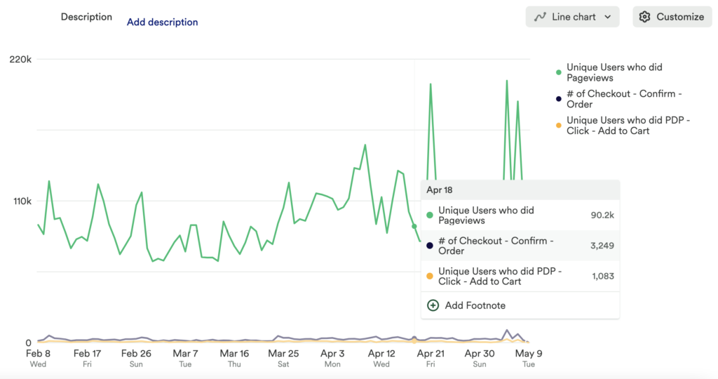
Once you’ve clicked View results, your results will look something like this. They typically default to a line chart unless you are using certain ranges, like Entire Range.
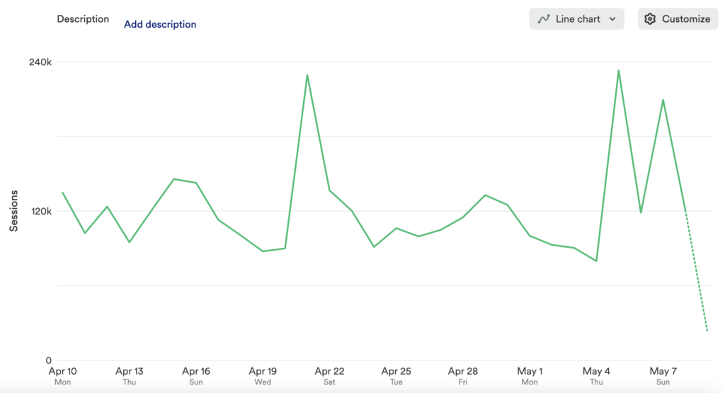
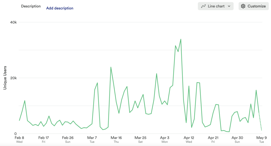
As you can see, the pageview count varied over the month analyzed from about 10,000 to 60,000 per day. Hovering near one of the data points, you can see the specific value based upon the granularity defined.
Usage Over Time Chart Types
There are 11 types of usage over time charts, which you can find by clicking on the usage over time chart type drop-down.

Count, Count Unique
Count returns the number of times an event occurs each hour, day, week, or month. Count unique returns the number of unique or individual users who have performed an event. For example, if Sally clicks the ‘sign in’ button 10 times, then Count unique will return 1 because Sally is one user. (This replaces the unique checkbox from the old usage over time chart.)
Number of Sessions
Shows the number of unique sessions in a given date range that contain an event of your choosing. You can combine this with ratios to get the percentage of sessions where a given user action was taken.
Number of Users
Shows the total number of users who meet specific criteria over time. There are three types of Number of Users charts: property-based, behavioral/active usage-based, and segment-based.
A property-based chart shows how many users have a specific property or property value over time. A user is included in this usage over time chart if they currently have the property or property value; they start being counted in the chart on the date they became a user in Heap.
A behavioral/active usage-based chart shows the aggregate number of users who meet a specific behavioral or active usage condition (ex. did a session or started/stopped doing sessions) within a specific timeframe over time. A unique feature of this chart is that it contains a lookback window.
A segment-based chart shows the number of users who meet the criteria for a specific segment over time. Segments can contain both property filters and behavioral/active usage filters with a lookback window. The size of these different types of segments is calculated in the same way as a property-based chart or behavioral/active usage-based chart, respectively.
Lookback Window
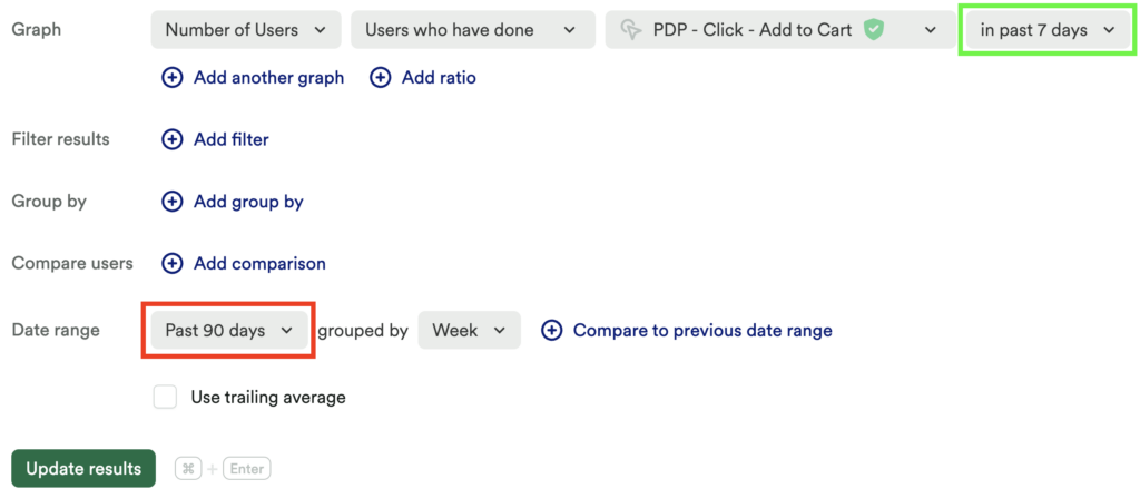
The lookback window, highlighted above in green, controls the timeframe over which to aggregate how many users performed the desired behavior. The date range, highlighted above in red, controls the dates over which you want to see the number of users calculations.
It’s important to note that the lookback window is calculated from the start of each time bucket seen on the usage over time chart. For example, if the chart uses the granularity of day, the lookback window will look back from midnight each day to calculate the number of users who meet the behavioral criteria of the chart within the desired timeframe. For a granularity of hour, it will look back from the top of each hour; for a granularity of week, it will look back from the beginning of each week.
In the example above, for each day in the last 90 days, you will be shown the aggregate number of users who did sessions in the 7 days prior to each date.
Number of Users vs. Count Unique
Because the lookback window begins aggregating from the start of each time bucket on the chart and is not inclusive of the time bucket, a count unique chart can be a better way to understand daily or weekly usage in a specific time period. For example, if you are hoping to get a count of unique users who have done sessions each day in a given week, this type of analysis will be better suited for a count unique charts.
Number of Accounts
Shows the number of unique accounts in a given date range who completed an event of your choosing.
Conversion Rate Between
Tracks the percentage of users who did event one and then did event two. As with Average Time Between, the amount of time a user has to complete events one and two is dependent on the granularity, or how the date range is grouped. If the granularity is a day, a user has 24 hours to complete both events; a week, 7 days; a month, 30 days.
For an example of how this works, see Calculate conversion rate between two events.
Average Time Between
Calculates the average time it takes to complete event two after having performed event one. Granularity, how the date range is grouped, plays a large role in how the average is calculated. This controls the window of time the user has to complete the set of events to be included in the chart. If the granularity is a day the user has 24 hours to complete the second event. If the granularity is a week, the user has 7 days. If the granularity is a month, the user has 30 days. If a user completes both events, the chart calculates the time between the first event and the first time the second event is completed, then returns the average across all users who have completed event one and event two within the window specified.
You can also use this chart to see time between two events, as detailed in Measure the average time between two events.
Retention Rate
Retention rate allows you to measure the completion of two events within a specific duration of time. For example, you may want to see what percent of users who completed the click – add to cart event came back to complete click – add to checkout.
For a more granular depiction of retention, see the Retention Analysis chart.
Sum, Average, Max, Min
When used with numerical event properties (e.g. total order amount), these functions chart the total, average (mean), or max/min per day/week/month, based on the chosen granularity.
Filters
Let’s return to our pageview chart example. Just like charts in other analysis views, we can add filter statements to our data. We’ll run a chart to chart the unique count of users who visited from Facebook.
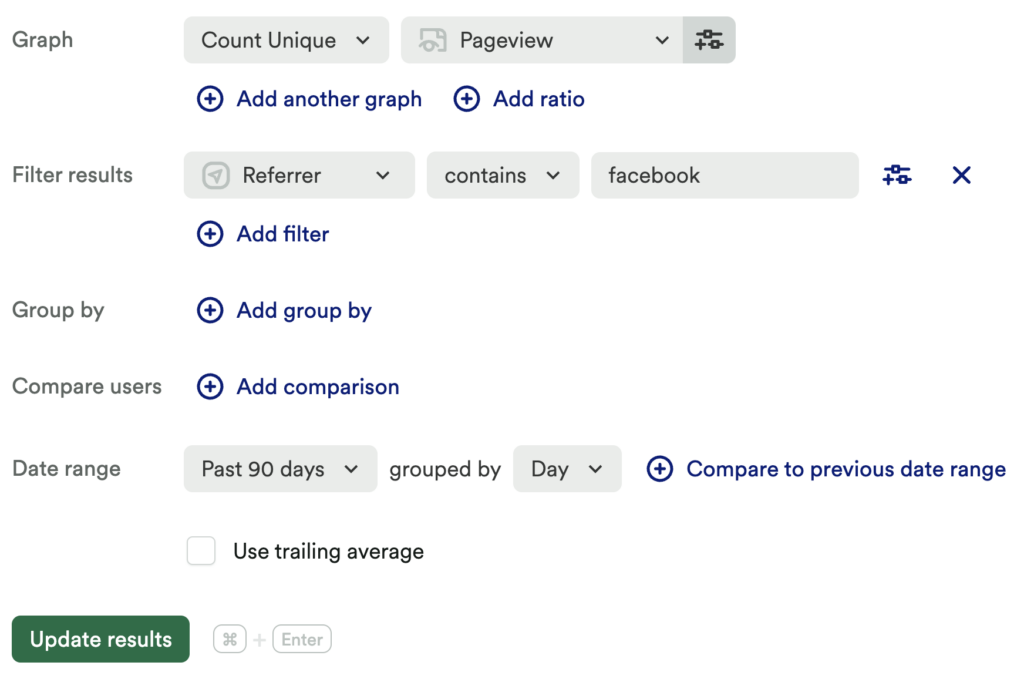
You’ll see the numbers in the results drop from before you added the filter, since you’re now only seeing data that matches this criteria.
For more information on how filters work across all analysis modules, see Filters.
Group By
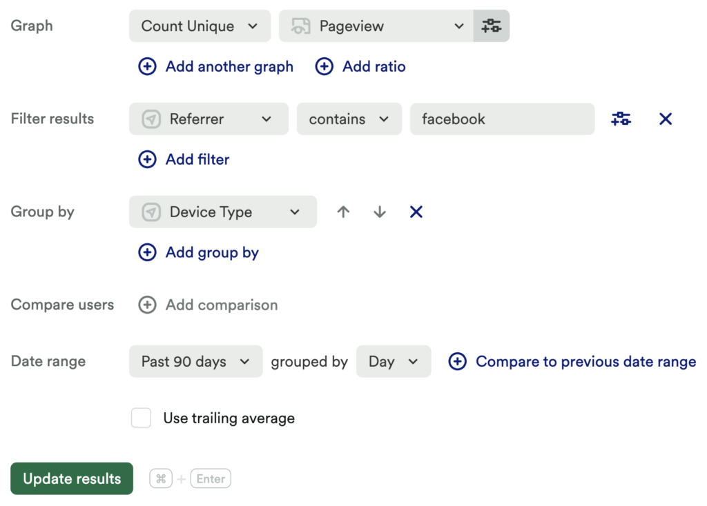
Heap’s usage over time chart chart becomes even more powerful when using the group by clause to compare activity across different groups. Building upon the previous example, we could use a group to see the distribution of pageviews from Facebook based on device type. To do so, all you need to do is add a group by Device Type clause.
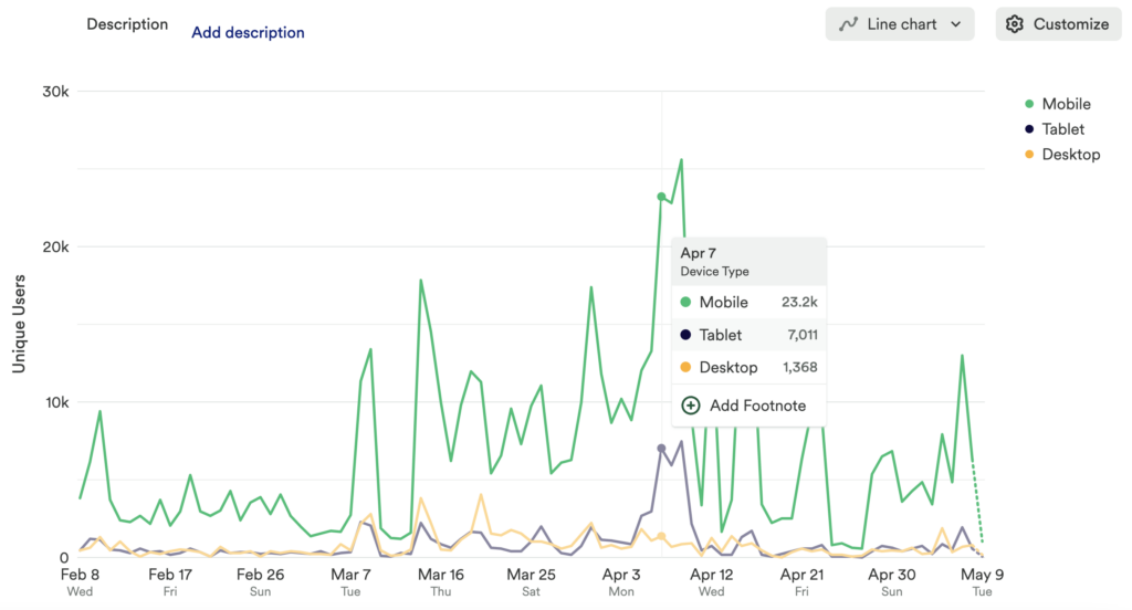
In the chart results, you’ll see different colored lines based on the groupings, with a legend on the side.
Heap’s group by clause can group charts by a variety of parameters, such as whether someone has or has not done an event, the count of how many times someone has completed an action, whether they are in a segment, the first date of an event, or any other user or event property. You can also perform a double group by to add more complexity to your analysis.
Count Unique Charts and Group Bys
Count unique charts will count how many unique users performed an event. When a group by is added to a count unique chart, users will be counted once for each group that they are a part of. This means the count unique chart will likely have a higher total count after a group by is added.
Multi-Event Charts
Heap’s usage over time chart also supports viewing multiple events at once and comparing statistics between them. To set up a multi-metric chart, click the Add another button.
For our example, we’d like to compare the number of times an event was performed to understand which one is the most popular.
The results allow us to compare the events to each other.
Ratios
The Ratios button allows you to chart the ratio of one metric to another. It works by dividing the result of the first chart by the results of the second chart.
To try out ratios, use the following chart templates:
- What is my ratio of daily active users to monthly active users?
- What percent of my monthly active users are using a feature?
You can use the Display as Percentage toggle above your ratio results to see this number represented as a percentage of users.
When charting a ratio, it is currently not possible to:
- Chart multiple ratios at once
- Chart the ratio of a conversion rate, or of average time between
- Use compare segments feature
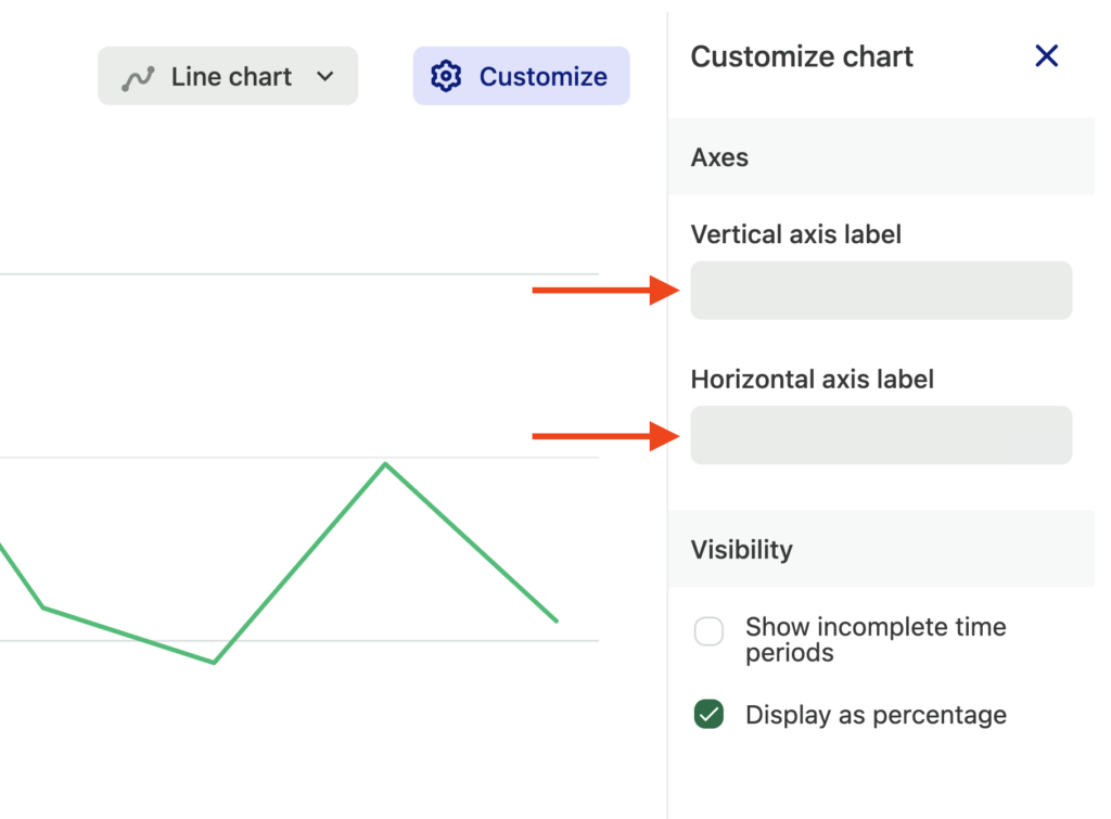
Customize axes labels
Click Customize next to your chart results to open a modal where you can type in new axes labels. You should see them render immediately as you type.
For more information about usage over time charts, see our Usage over time chart overview guide.
Need help? Please post in Community or contact us via the Get support page in Heap.
Frequently Asked Questions
For FAQs about this chart type, see our Chart FAQs.