This feature is only available to customers on paid plans. To upgrade, contact your Customer Success Manager or sales@heap.io.
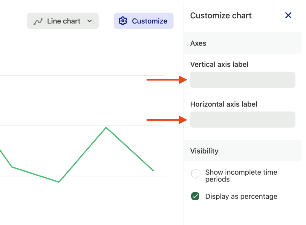
Click Customize next to your chart results to open a modal where you can type in new axes labels. You should see them render immediately as you type.
For more information about usage over time charts, see our Usage over time chart overview guide.