Overview
Retention charts allow you to visualize engagement over time by tracking the number of users that complete one event after another. Retention analysis, also known as cohort analysis, has the potential to answer a multitude of questions related to engagement over time, such as:
- After users sign up for our app, do they continue to visit day by day?
- Are my new users more active than my old users?
The following Suggested Reports use the retention chart. Click any of the links and populate the fields provided to quickly get up and running with your first retention chart.
- Does a given user action drive higher retention?
- How often should I expect users to complete a given action?
- What is my daily user retention?
Note that the retention chart only counts the first time a user completes the start event in the specified window. To chart any time a user completes a start event, use the Retention Rate option in a usage over time chart.
To set up Heap Connect queries for retention, see Retention.
For a deep dive into retention, including strategies for improving retention across the customer journey along with examples from Heap, check out our eBook The Complete Guide to Retention.
Setting Up a Retention Report
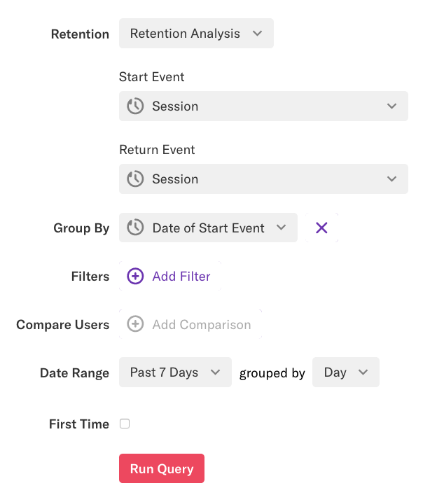
To make a retention chart, navigate to Analyze and select the retention chart type at the top. Next, choose between Retention Analysis and Usage Interval. To learn how to set up usage interval, see Usage Interval Analysis.
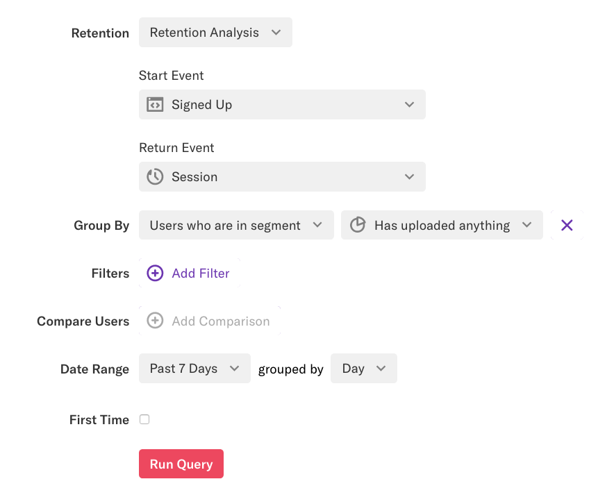
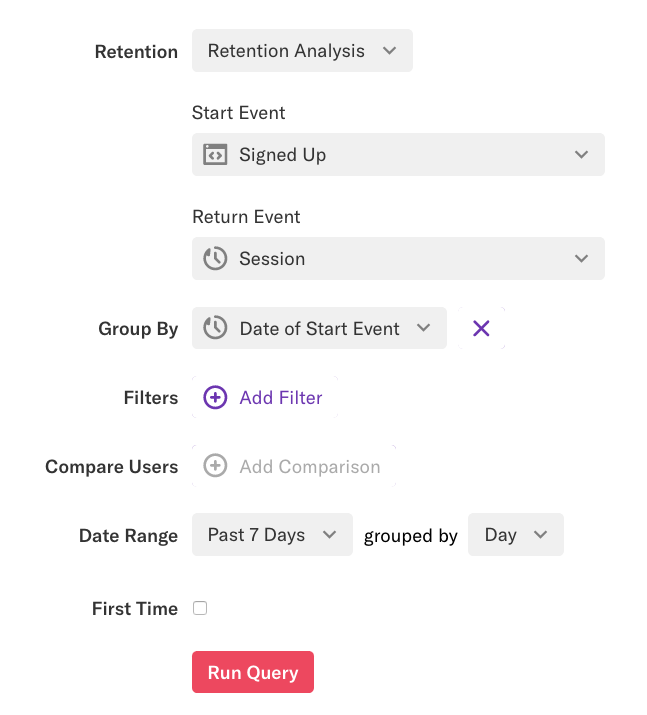
When Retention Analysis is selected, you’ll be presented with options to select the following:
Start Event: The start event is the event that you’d like to use as the foundation of the retention report; it is often some sort of one-time activation event. Session, Create Account, Upload a Profile picture, and Install App are all good examples of start events, though any defined event can serve as a start event.
Return Event: The return event is generally a repeated action that you want to see over time. Examples of repeated actions might be Login, Visit, or Read Article, though any event can be a return event.
Group By: By default, the group by clause is set to the date of the start event, which means the retention chart will group based on the first time they completed the start event within the date range. The group by clause supports any user-level property available to Heap, as well as behavioral properties. You can also remove the group by clause to see your users’ aggregate retention without cohorts.
Date Range: By default, Heap will set the date range of the retention report to the past 90 days. The retention chart supports the following date ranges:
- Today
- Yesterday
- Past 7 Days
- Past 30 Days
- Past 90 Days
- Past Year
- Date to Now
- Choose a Date Range (a custom date range)
Keep in mind that the date range bounds all the numbers presented in the retention chart.
Granularity: This value determines the interval by which we view how often a person completes the return event, either by Hour, Day, Week, or Month. By default, this value is set to Week. A week or month refers to 7 days or 30 days, rather than a calendar week or a calendar month.
For this example, we will make a Session to Session retention chart, grouped by the Date of First Event.
Curious what the icons in the top-right of your retention report are for? Hover over each one for the icon title or visit the Analysis Tools section of our Icon Glossary to learn more.
Understanding the Retention Report
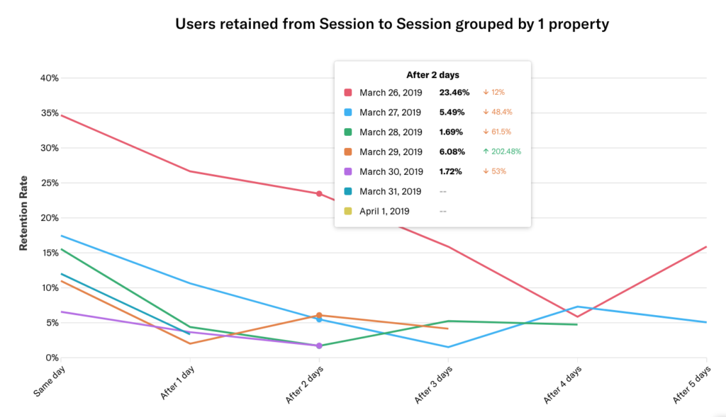
By default, retention chart results are represented as a line chart, which allows you to see trends at a glance. Hover over any line in the chart to see a percentage of users who completed the return event for each day following the date of the start event, as well as the percentage increase or decrease from the day before.
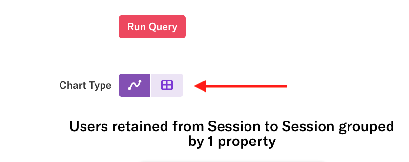
To switch to the table view, click the table icon in the Chart Type field just above the retention results.
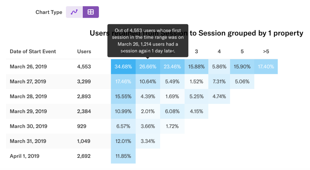
The table view allows you to see a breakdown of activity for each cohort during each rolling window. Each row represents a cohort of users. Each column represents a rolling window from the start event, defined by the granularity.
In our example, we see the Session to Session retention chart for the past 7 days by Day. Column 0 is within 24 hours of the user’s first event. Column 1 is 24-48 hours after the user’s first event. Users are only counted in one cohort per chart, so a user who had their first session in the range on March 26 who came back a day later on March 27 will not be double-counted in that cohort.
Hover over any cell to see a description of the data.
By default, users are counted each time they do the return event. Clicking the First Time checkbox and re-running the chart changes the data to count only each user’s first return event.
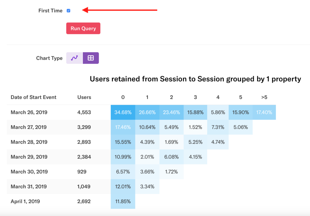
For an explanation of why the numbers in the first row are so high, see the FAQ Why is the first row in my retention chart always so high? at the bottom of this article.
Date Range, Granularity and Retention
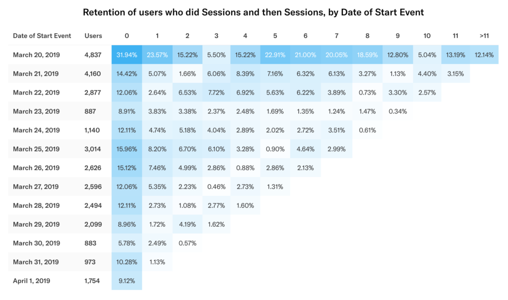
Retention is relative to the date range and the granularity chosen. Staying with the above example, if you change the date range to include the previous week, a user whose start event in the range appeared in the March 26 cohort may now appear in an earlier cohort. Below, the number of users in the March 26 cohort has dropped from 4,557 to 2,626.
Let’s change the date range to the past month and granularity to week. Each row now shows a calendar week in which the users did their first start event in the range selected. Each column is now a rolling 7-day window in which the user can do subsequent return events.
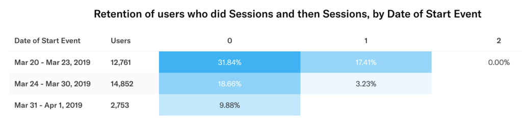
Because the date of the return event is relative to the first event, per user, in the chart above, a user who did their first event in the week of Mar 24 – Mar 30 has a possible window of Mar 31 – April 6 to do their second event and be counted in column 0. This is an important distinction to remember when analyzing 7-day (weekly) or 30-day (monthly) retention.
Defining Cohorts
Retention analysis is most powerful when you group by cohorts beyond the default Date of Start Event. A cohort is a group of people who share a common characteristic over a period of time. For instance, in the previous example, users who first signed up on the same day make up one cohort of users. Almost any type of user-level property you can imagine can be a cohort. Some examples of cohorts are location, event history, and you can even create cohorts based upon custom properties sent to Heap via our Custom Identify API.
Heap only counts unique users in cohorts, not the total number of events or sessions. One person is only counted once in a given cohort and is in only one cohort (row) per retention chart. However, an individual user isn’t limited to one cell within a row — if a person repeats a return event many times over time, these actions are reflected in multiple columns.
The example below answers the question “how does a particular user activity affect retention?” In this case, we want to know if users who upload a picture to our app are better retained over time than those who don’t. Grouping by this property creates two cohorts.
If we want to analyze our data without cohorts, we can do that, too! Click the x next to the group by clause to see the average retention curve across all users within the range selected.
Getting Value From Retention Analysis
The ability to derive insights from retention analysis goes beyond knowing how to generate and read a chart — it depends on knowing what questions to ask. We recognize determining what metrics to analyze is difficult, so we’ve created a short list of tips below.
Need help? Please post in Community or contact us via the Get support page in Heap.
Tip 1: Retention analysis is particularly useful for making sure that changes to your application actually drive engagement. If you’ve made product improvements over time, you can use retention analysis to see if these changes have made an impact. You’ll likely want to make sure that your newest users are more engaged, as this signals that product iterations are driving retention.
Tip 2: Retention analysis enables analyzing engagement even when masked by growth metrics. 52 Weeks of UX has a great write-up on this topic.
Tip 3: It is always best to create the start event as a one-time event to render clear results when grouping by the Date of Start Event. If you create the start event as a repeated event, such as Session, the first row of your retention table will likely be inflated. This is because the number of users in a cohort is defined by the first time they completed an action within the time range defined (which most likely will not be all-time). Thus, activity in the first row of your table will be artificially high from the activity of your power users.
Tip 4: Although we use retention and engagement synonymously in our documentation, it is always good to keep in mind the difference between the two.
Frequently Asked Questions
For FAQs about this chart type, see our Chart FAQs.