To make the most of this guide, you’ll need a baseline understanding of key concepts like events, charts, and properties. If you are still learning about Heap (meaning those terms don’t mean anything to you), we recommend taking our Hello Heap course or reviewing our Setting Up Heap guide prior to jumping into this guide.
Introduction
Every digital experience consists of a number of critical journeys, each with a starting point and a business-critical endpoint. For example, a checkout flow, a navigation flow, a setup or signup flow, and many more.
In this guide, we’ll walk you through a process you can practice to iteratively improve these journeys and drive real product and business impact!
Step 1: Baseline key journeys
If you can’t measure it, you can’t improve it. To start making impactful improvements to your digital journey, you first need to understand how the various parts of that journey are performing.
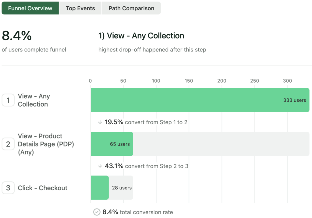
Start by breaking the journey into key workflows that lead your customers to value (and if possible, directly to actions that drive revenue). Make a funnel chart for each of these workflows and note the overall conversion rate — this tells you how well each part of your journey is performing.
Take note of which journeys are performing well vs. poorly. Do you have teams staffed on improving the journeys that are not performing well? Is improving these journeys a priority for your upcoming quarter? If not, now might be a good time to start the conversation about shifting priorities and resources to better support the workflows with the most opportunity for improvement.
You should revisit these baselines and your priorities at least once per quarter. Once you’ve identified the biggest areas for improvement and have a team ready to iterate on them, move to Step 2, which focuses on one specific workflow.
Output: One funnel chart per key workflow in your digital journey
Step 2: Find the friction
At this point, you’ve chosen one or more specific workflows that aren’t performing as well as you’d like. In this step, we’ll use Heap to find the best opportunities to drive the most impact with changes.
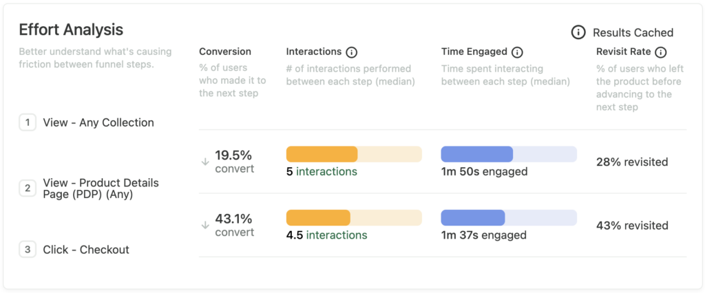
Start by quantifying the friction in the workflow. Open the funnel chart you created in step 1, and scroll down to see the Effort Analysis summary for each step. You’ll see three signals that give you an idea of where and how users are struggling.
Interactions shows you the parts of the workflow where users have to take the most actions; time engaged shows you which parts of the workflow require the most time; and revisit rate shows you how often users have to leave and come back later to make it to the next step (indicating that they weren’t prepared to make it to the next step on the first try).
You can add more steps to the funnel to zoom in on a more narrow part of the funnel (you want to ideally find the smallest incremental changes that can drive a noticeable impact rather than doing bulky re-design projects that slow your rate of learning). Heap’s Step Suggestions can help here — they appear to the right of the funnel when there may be a hidden step taken by most users who complete the funnel but represents a milestone with significant drop-off before and after.
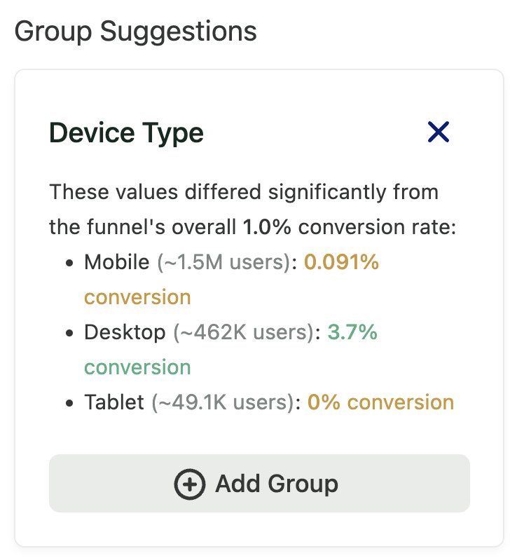
You can also segment your funnel by different audiences (e.g. desktop vs mobile users, users in a specific country, users with a given role/persona, or more) to see if there are particularly pronounced differences in performance (overall conversion rate) for different segments of users. Heap’s Group Suggestions can help here as well — they appear to the right of the funnel when there is a potentially interesting grouping that shows significant variation between groups.
Once you have identified a set of specific funnel steps where there seems to be the most friction, you can move on to step 3.
Output: A funnel chart with a “zoomed in” set of steps and/or a narrowed customer segment with particularly poor performance and/or high friction
Step 3: Choose candidate changes
Now that you have identified a specific area to focus on, it’s time to identify some changes you can make that have the highest potential to drive impact.
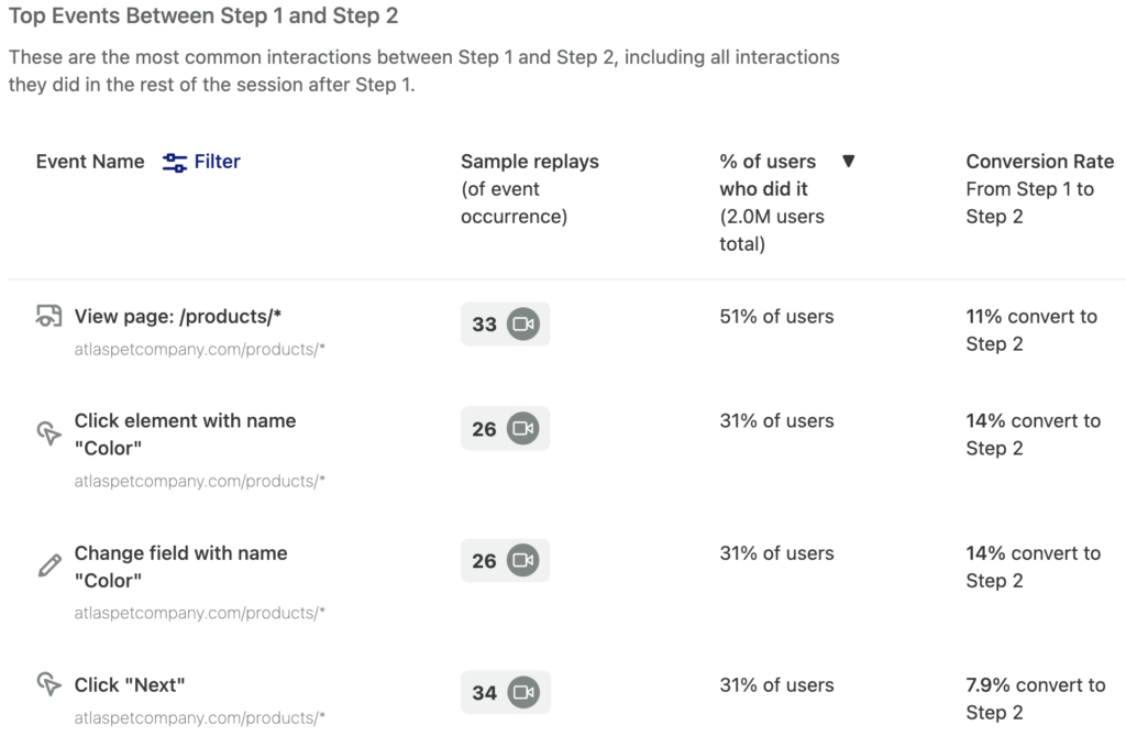
Start with the “zoomed in” funnel chart you created in step 2. In the funnel chart, click the Top Events tab and choose the steps that either have the lowest conversion rate or particularly high effort signals (e.g. lots of interactions between the steps). This view includes autocaptured events on web and mobile, as well as key third-party events and server-side events.
As you inspect this list, you can look for alternate steps that most users are doing, and also see what impact these alternate steps have on conversion to the next step (are these alternate steps helping? hurting?).
You can then use the Path Comparison view (between the same two steps, with a given alternate step selected) to visualize the impact of either doing or not doing that alternate step. This is useful for telling a story to stakeholders about where users are actually going, and why you should prioritize making a change that makes an alternate route either more prominent (if it is helping conversion) or less prominent (if it is hurting conversion). You may also reveal valid alternate use cases that you can better account for in your design.
To interpret the Path Comparison view, take note of the % of users who take an alternate route that may be helping or hurting, as well as the difference in conversion rate for users who took that alternate route vs. the “happy path” of your funnel. These two signals can give you an idea of the potential impact of making that alternate route more or less prominent in your digital journey.
Now it’s time to make a list of potential changes. For each of the high-impact alternate steps you just identified, think about potential changes you might make (ex. changing the position of a step in a form, making a call to action more prominent, or changing the ordering or naming of your navigation links). To reason about the potential impact of these changes, create a Path Comparison chart for each potential change.
Output: A list of potential changes to make to your digital journey, along with a set Path Comparison charts (one per change)
Step 4: Prioritize investments
Set up a meeting with your engineering team to prioritize the list of potential changes you created in step 3. Start by listing all the potential changes on the y-axis of the chart below (you can use the signals from the Path Comparison charts to do this ranking). Then, discuss as a team the level of difficulty of the change. Note that exact values don’t matter as much here — the important thing is that the relative rankings of effort and potential impact for each change are roughly accurate.
This is a simplified version of other frameworks like RICE – here’s a nice blog post from our partners at Intercom explaining this framework – which you can use as a more advanced alternative. In fact, the number of users taking an alternate path and the relative increase/decrease in conversion map directly to the Reach and Impact parts of the RICE framework.
You should plan on ranking the low-effort, high-impact changes first (it’s important to test your hypotheses as quickly as possible!). You can then move on to higher-effort or lower-impact items as desired.
Output: A ranked list of changes to make to your digital journey
Step 5: Implement, measure, repeat!
Now that you have identified a ranked set of changes, it’s time to implement them! Remember, improving digital journeys is an iterative process, so make sure you note your hypotheses and remember to follow up after you ship your changes (we have some helpful templates for this!)
You can either track changes over time (this is faster, but it may be harder to see) or you can ship your changes incrementally as A/B tests (this may take longer depending on how many users you have, but will give you statistically significant data proving or disproving your hypothesis).
Make sure to note the before-and-after state of the KPIs you’re trying to move, and don’t forget that failure is part of the process — just keep going! In the long run, by focusing on impactful changes, you will see tangible results. You can do this easily in Funnel charts by adding a comparison period (e.g. week over week, quarter over quarter) or by creating a chart that shows conversion over time for each of your key workflows.
Output: Updated funnel charts from step 1 showing improvement (or neutral/negative results) from each change