To make the most of this guide, you’ll need a baseline understanding of key concepts like events, charts, and properties. If you are still learning about Heap (meaning those terms don’t mean anything to you), we recommend taking our Hello Heap course or reviewing our Setting Up Heap guide prior to jumping into this guide.
This guide is meant to be used in tandem with one of Heap’s in-app Dashboard templates (linked in step 0). We recommend having the template and this guide open and working through them side-by-side.
If you’re new to analysis in Heap, we recommend reviewing Create Your First Chart, which covers helpful charts 101 info.
Introduction
Understanding who visits your site, where they come from, and what content is getting engaged with, is table stakes for most teams. This dashboard will help to give you a broad overview of your site traffic.
Step 0: Open the in-app dashboard template
First things first: Open up the in-app dashboard template (linked directly below this line) so that you can complete these steps side-by-side.
In-app dashboard template: Audience overview
Step 1: Define the inputs needed for this dashboard template
To use this dashboard template, you’ll need to select some baseline inputs. In some cases, you’ll have the option to use a default Heap event or property.
If you need to create a new event or property as part of this process, see our guides on creating new events and properties.
Not sure what to put here? See a list of useful events for eCommerce, SaaS, and Financial Services businesses in the Industry Recommendations section of our Getting Started guide.
| Name | Description |
|---|---|
| Browser type | A property that groups together browsers (you can use the Heap default or choose another property) |
Step 2: Save your new dashboard
This dashboard will be automatically generated as you select your inputs. To save it for future reference, click the Save dashboard button at the top.
Chart Breakdown
Chart 1: User Count
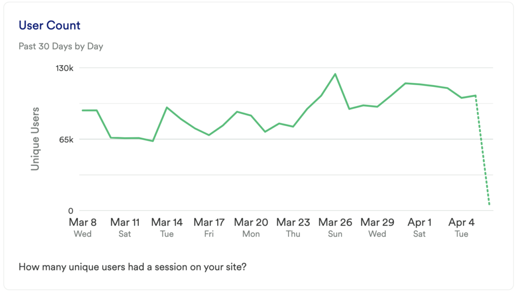
What does it tell you?
This chart shows you how many unique users had a visit (session) on your site in the last 30 days.
How to interpret?
When you first create this chart, it’s really about getting a baseline, though you’ll want to monitor this over time to ensure that your traffic is growing.
Chart 2: Session Count
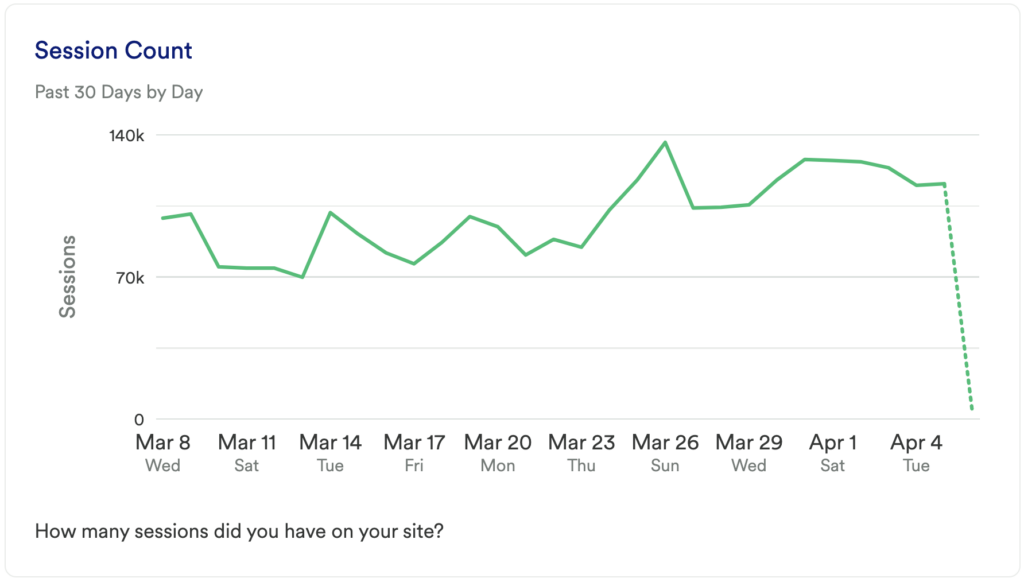
What does it tell you?
This chart will show you how many total visits (sessions) you’ve had to your site on a daily basis in the last 30 days.
How to interpret?
If this number is going up, then great, it means you are getting more traffic. If you see a spike try to figure out what caused it. Being able to replicate this success in the future can have a meaningful impact on your business.
Tip: Try grouping by Referrer or Landing Page to see if you can uncover the cause of the change.
Chart 3: Number of Sessions Per User
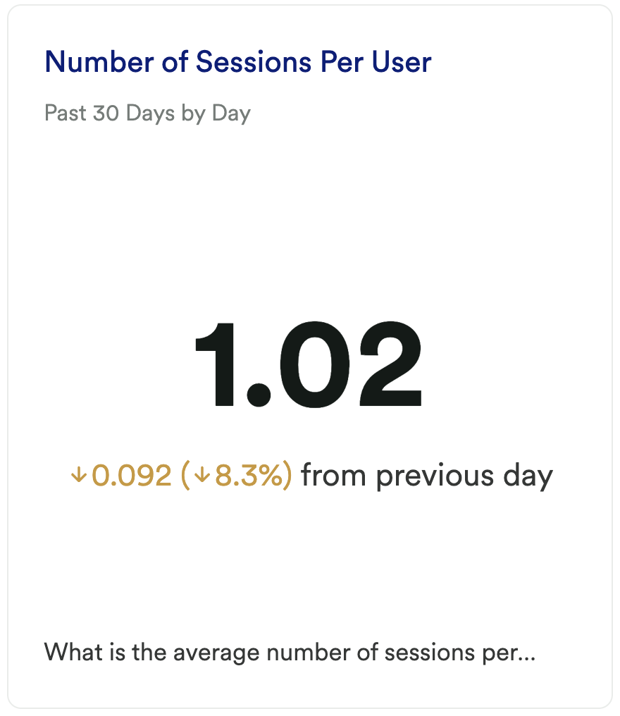
What does it tell you?
This chart will show you the average number of sessions per user.
How to interpret?
Our data shows that the average number of sessions per user is 1.4. Use this chart to understand if users are actually coming back to your site once they’ve landed there once.
Chart 4: New vs Returning Users
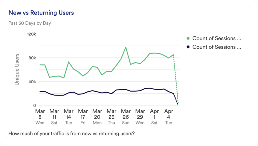
What does it tell you?
How many of your unique visitors were new users?
Note: In this chart, a New User is defined as a user that has only had 1 session.
How to interpret?
This chart takes the User Count chart and groups the results into users who have had a single session and users who have had more than one session. This allows you to get a sense for how much of your traffic is from new visitors vs returning visitors.
If you just installed Heap, the majority of your traffic will be displayed at New Users until we have enough data to track behavior over time.
Chart 5: Returning Users
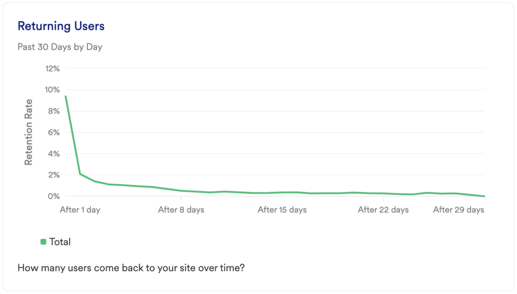
What does it tell you?
This chart will tell you your user retention rate. In other words, how many of your visitors come back over time?
How to interpret?
Retention is a critical measurement of success. This chart will help you to understand if users are coming back over time.
Chart 6: Pages Per Session
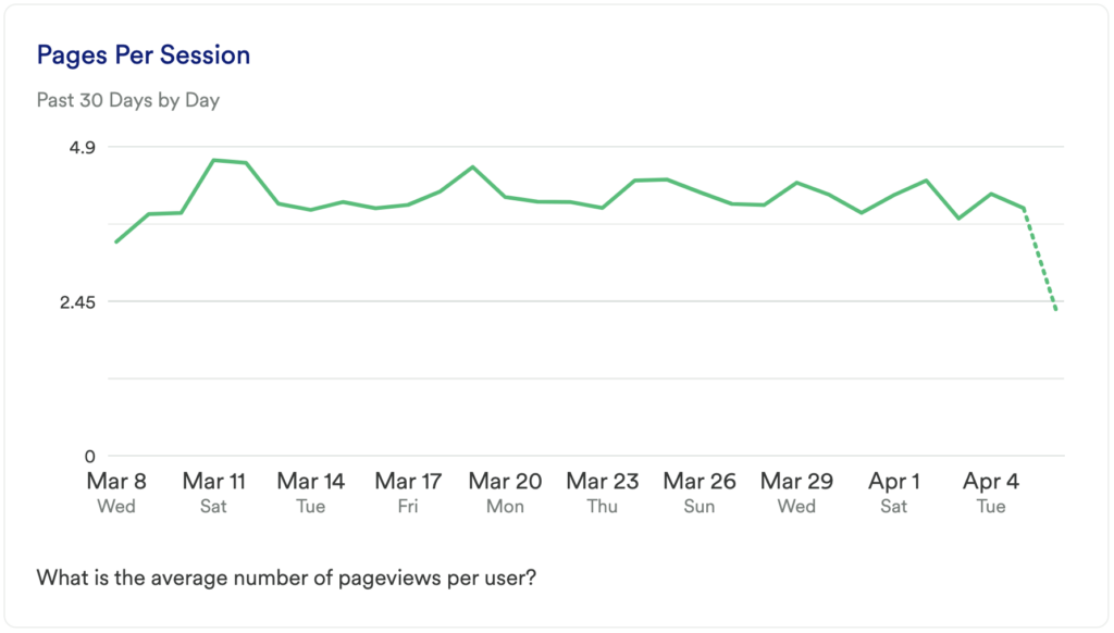
What does it tell you?
This chart shows you the average number of pageviews per user.
How to interpret?
Pages per session can help you understand how engaged visitors are with your site. If this number is close to 1 it means that the majority of your traffic is bouncing.
Chart 7: Count of Pageviews
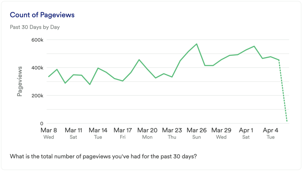
What does it tell you?
This chart will show you the number of pageviews you’ve had on your site.
How to interpret?
Again, this chart is about getting a baseline. As you acquire more traffic and add more content, you’ll want to move this metric up over time.
Chart 8: Top Viewed Pages
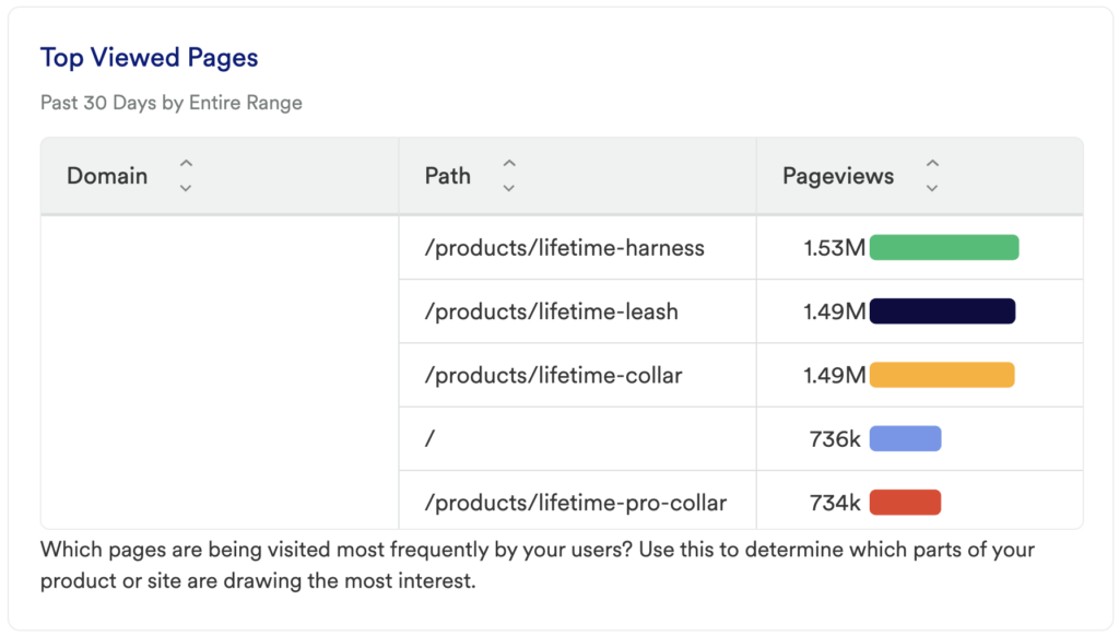
What does it tell you?
This will show you the specific pages on your site that are getting the most traffic.
If the Title results aren’t descriptive enough, you can switch the Group By to use the Path property which will give you the URL of the page instead
How to interpret?
Understanding what content is getting used is key to understanding what your visitors find interesting and or helpful.
Chart 9: Users by Country
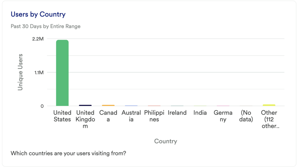
What does it tell you?
This chart is going to tell you which countries your users are visiting from.
How to interpret?
Any surprises here can uncover some untapped markets that you may want to try advertising to.
Chart 10: Users by Device Type
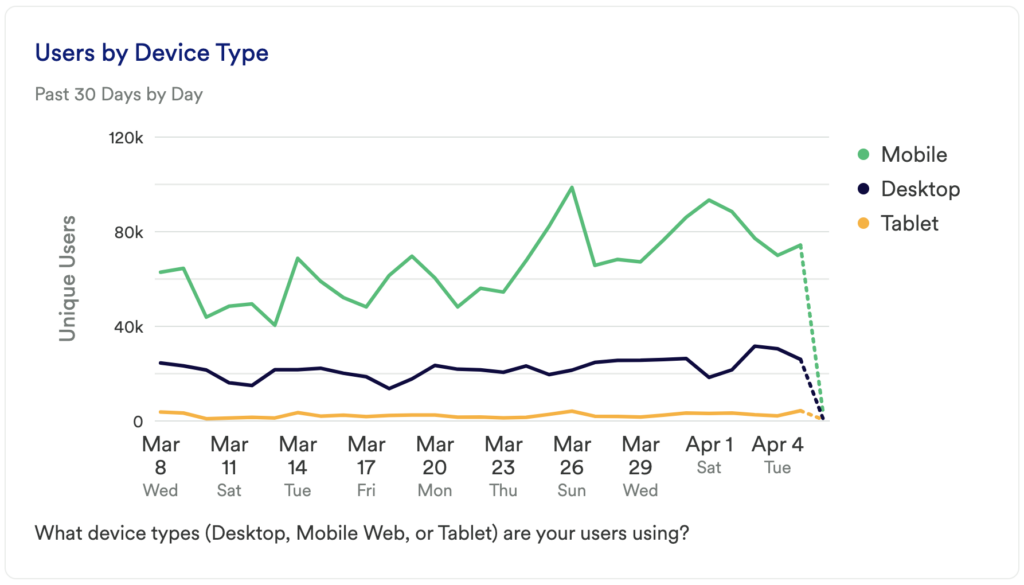
What does it tell you?
This chart will show you which devices your users are using to access your site (Desktop, Mobile Web, or Tablet).
How to interpret?
If you see that a high percentage of your users are visiting from any of these device types, you’ll want to make sure that you spend some time optimizing the user experience for each of them.
Chart 11: Users by Browser
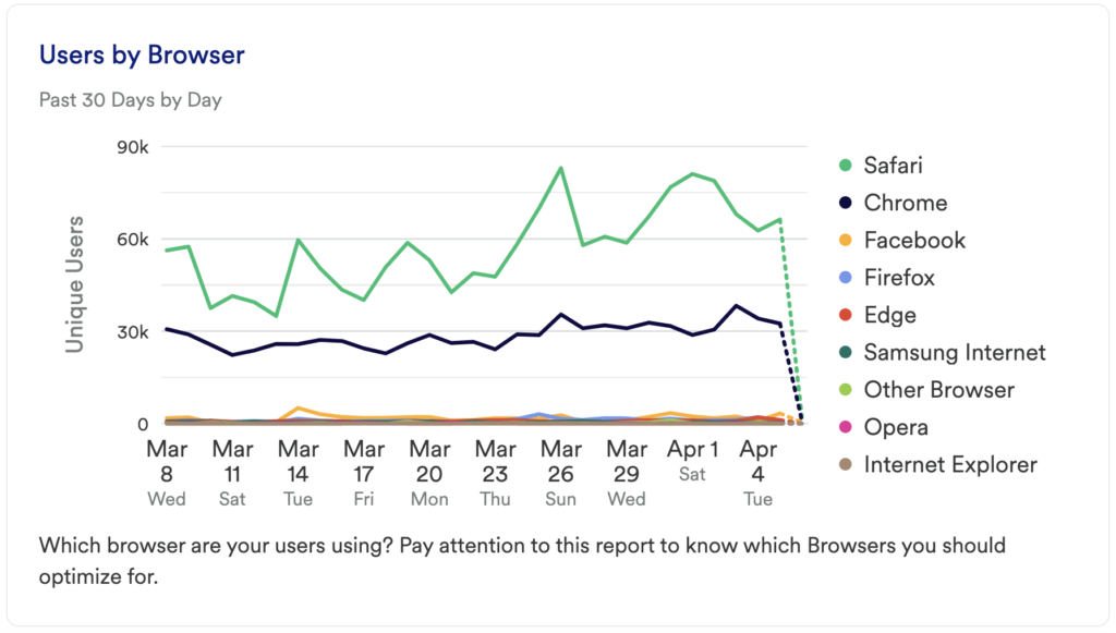
What does it tell you?
This chart is going to tell you which of your landing pages are getting the most traffic.
How to interpret?
Similar to the previous chart, this chart is about understanding where you need to optimize for performance reasons. Do you see a high number of users visiting your site who are using IE 11…then you’ll want to make sure that your site performs well in that Browser.
Step 3: Take action
This dashboard contains the metrics you’ll want to look at to decide where you want to focus. While most of this data is high-level, it can give you a good overview of your traffic.
Did you notice that your blog pages aren’t getting viewed? Maybe it’s time to retire that portion of your site, change your content strategy, or try some campaigns that advertise it.
Is the majority of your traffic coming from new users? Try to understand why they aren’t coming back.
Did your pageviews spike one day? Try to uncover what caused the change as replicating that could be key to your success.
In conclusion
If you’re just starting out with analytics, you’ll want to understand your audience demographics. This dashboard template will help you to do just that.