To make the most of this guide, you’ll need a baseline understanding of key concepts like events, charts, and properties. If you are still learning about Heap (meaning those terms don’t mean anything to you), we recommend taking our Hello Heap course or reviewing our Setting Up Heap guide prior to jumping into this guide.
This guide is meant to be used in tandem with one of Heap’s in-app Dashboard templates (linked in step 0). We recommend having the template and this guide open and working through them side-by-side.
If you’re new to analysis in Heap, we recommend reviewing Create Your First Chart, which covers helpful charts 101 info.
Introduction
Understanding how well your online store is converting is crucial to improving your eCommerce site’s conversion rate. The average conversion rate on eCommerce sites is only between 1-3%, so being able to improve is crucial to long-term success. However, the only way to improve is to understand where you have the most opportunity.
Step 0: Open the in-app dashboard template
First things first: Open up the in-app dashboard template (linked directly below this line) so that you can complete these steps side-by-side.
In-app dashboard template: eCommerce metrics
Step 1: Define the inputs needed for this dashboard template
To use this dashboard template, you’ll need to select some baseline inputs. In some cases, you’ll have the option to use a default Heap event or property.
If you need to create a new event or property as part of this process, see our guides on creating new events and properties.
Not sure what to put here? See a list of useful events for eCommerce, SaaS, and Financial Services businesses in the Industry Recommendations section of our Getting Started guide.
Note: If you are using our Shopify integration, you should have these events available by default as a part of the integration.
| Name | Description |
| View PDP | An event that captures the product description page for a given product |
| Add to cart | An event that captures a click on an “Add to Cart” button |
| Start checkout | An event that captures the start of the checkout funnel (e.g. filling in the first field of contact information or clicking a “Checkout” button) |
| Confirm order | An event that captures confirmation of a completed order, with an included property for the total price of the order |
| Total price | A property on the “Order” event that captures the total price of the order |
| Customer order count | A user property that counts the total number of orders a user has made |
Step 2: Save your new dashboard
This dashboard will be automatically generated as you select your inputs. To save it for future reference, click the Save dashboard button at the top.
Chart Breakdown
Chart 1: Order Funnel
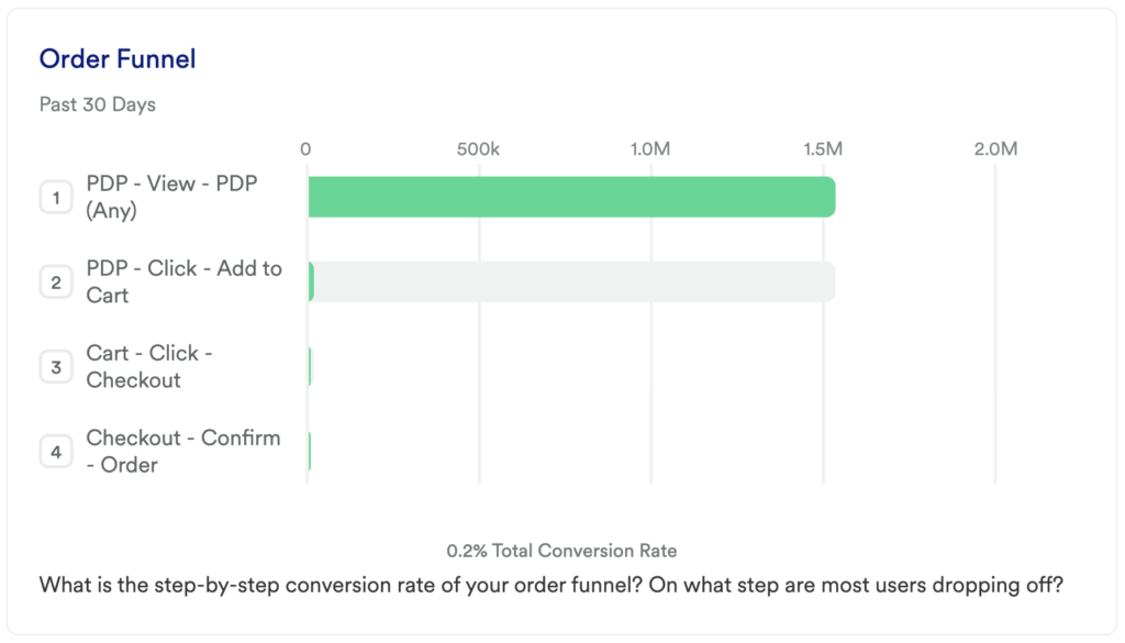
What does it tell you?
This chart looks at your purchase funnel. Once a user actually views a product, how likely are they to convert?
How to interpret?
This funnel is all about helping you to determine which step of your funnel needs the most attention.
Chances are high that there will be a significant drop-off between viewing a product and actually adding it to the cart. But when you look at your remaining 3 steps, is there room to improve the flow once someone has signaled that they like the product (by adding it to their cart)?
If you see a step you want to dig into, feel free to add more granular steps. For example, maybe users are dropping off between clicking checkout and confirming their order because there is an error happening on your submit payment info field, or maybe you just ask them for too much contact information and they get frustrated and give up. Maybe the users who pay via PayPal are converting at a higher rate than those who pay by card!
Whatever the case, this funnel is your foundational starting point to understanding where your biggest opportunity for improvement lies.
Pro tip: Add a Group By to see how the conversion rate differs between different cohorts.
Chart 2: Average Order Value
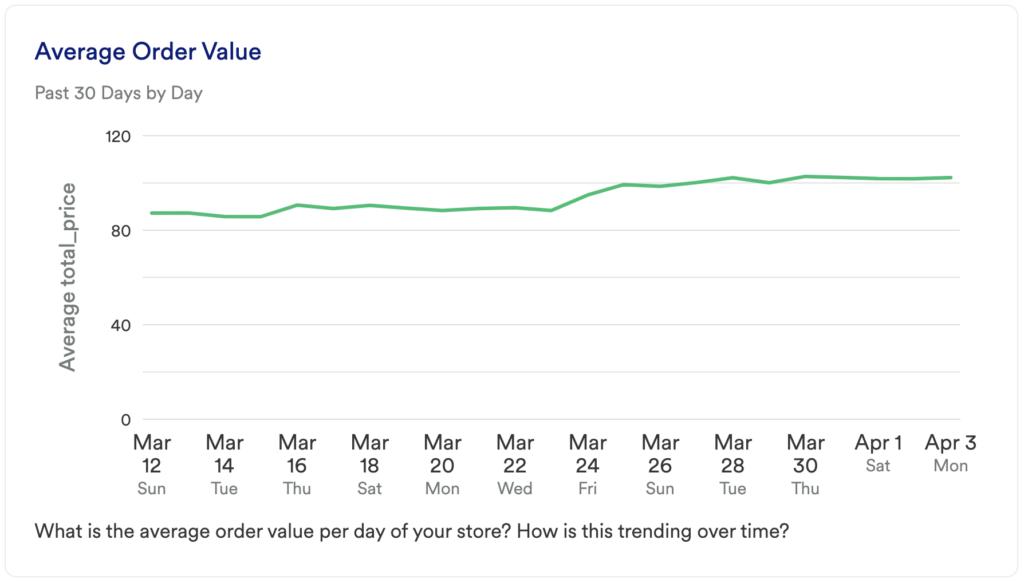
What does it tell you?
This chart will show you your average order value per day over the last 30 days.
How to interpret?
As you make changes to your site, add new products to your inventory, or launch new marketing campaigns, you’ll want to keep an eye on this chart.
If this metric increasing, then great, you’re doing something right!
If you see a decrease, you may want to dig in further to uncover the reason for this dip (perhaps it’s just a result of your seasonal clearance event). Whatever the reason, it’s important to pay attention to.
Chart 3: Order Conversion Rate Over Time
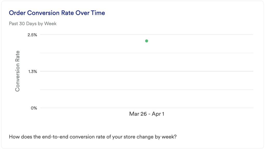
What does it tell you?
This chart is similar to the first funnel we looked at. However, there are two key differences.
1. This chart is looking at your overall conversion rate from viewing any page on your site to making a purchase (the funnel only looks at conversion rate from when someone actually adds an item to their cart).
2. This is showing you your conversion rate over time instead of looking at your conversion rate within a limited window. This will help you understand performance over time.
If you want this chart to match your funnel chart more closely, you can swap the Pageview event out for your view PDP event
How to interpret?
Similar to the previous chart, this chart is really about measuring the impact of your changes over time. Any time you make a big change, be sure to mark it with a Footnote so that you can understand the impact.
Chart 4: Step-by-Step Order Conversion Rate
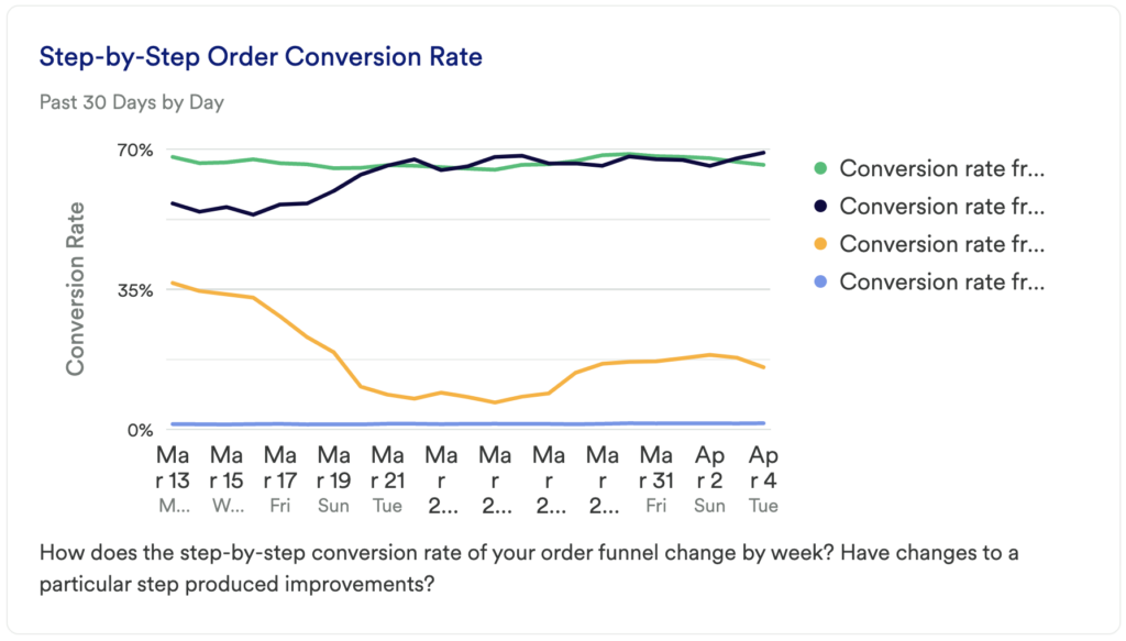
What does it tell you?
The Order Funnel showed you the number of unique users dropping off between activation steps, but this chart will tell you how each portion of your funnel is improving over time.
How to interpret?
We recommended earlier that you should find the area of your funnel with the most opportunity and work on that micro-conversion. This chart will help you to interpret the impact your changes are making at a granular level over time.
If your goal is to simply improve the conversion between adding an item to the cart and beginning the checkout process, then this can help you monitor that.
Chart 5: Revenue
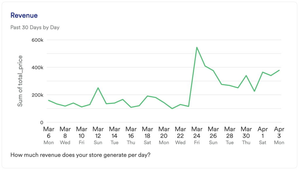
What does it tell you?
This chart is pretty straightforward – how much gross revenue is your site making per day?
How to interpret?
You likely won’t see any large changes here over a 30-day period, though if you see any large spikes or dips, you may want to dig in further. Was there a sale that performed really well? Did a new marketing channel or an influencer’s mention on social cause a spike? Did you recently start “suggesting” other products for users to purchase? Is the increase due to a higher average order value (AOV) or was it due to an increase to the total number of purchases?
Understanding what drives success can help you to refine your future acquisition strategy.
Chart 6: Average Revenue Per User
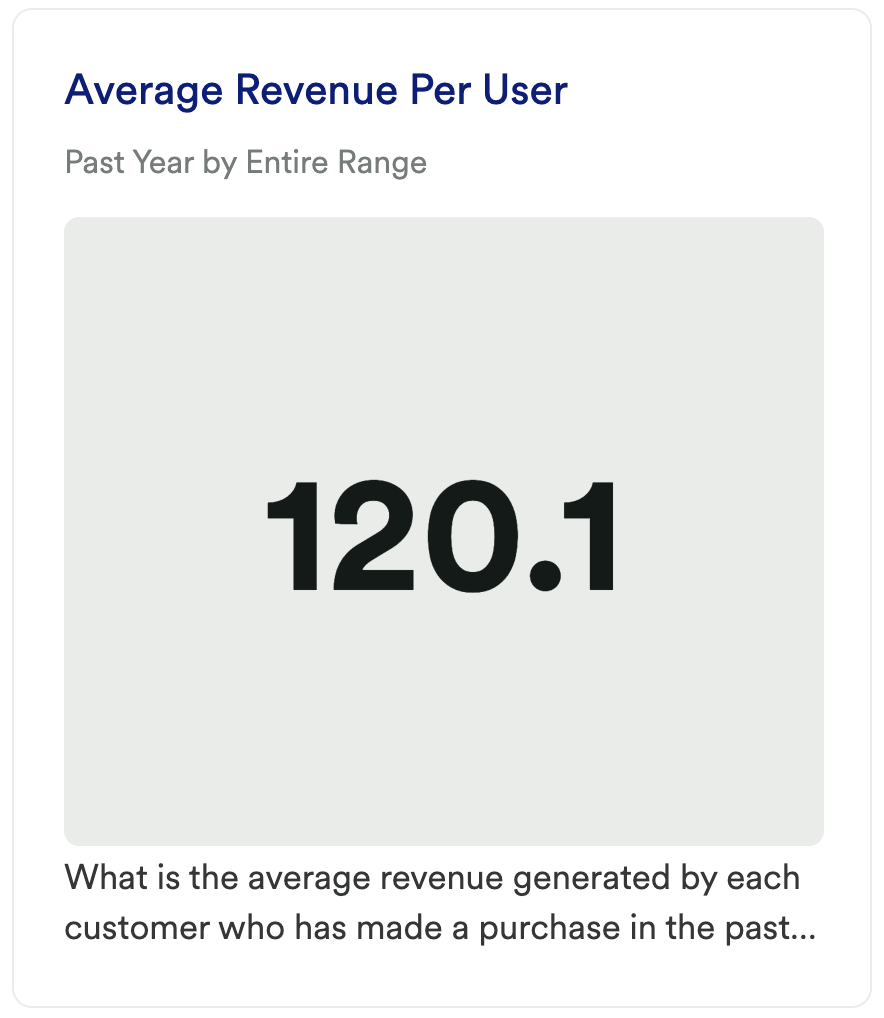
What does it tell you?
This chart will show you the average revenue generated per customer over the past year.
How to interpret?
This is a key metric for many eCommerce companies. Over time, you’ll want to see an increase here, though this metric is great for just knowing what your baseline is.
Chart 7: Repeat Purchase Rate
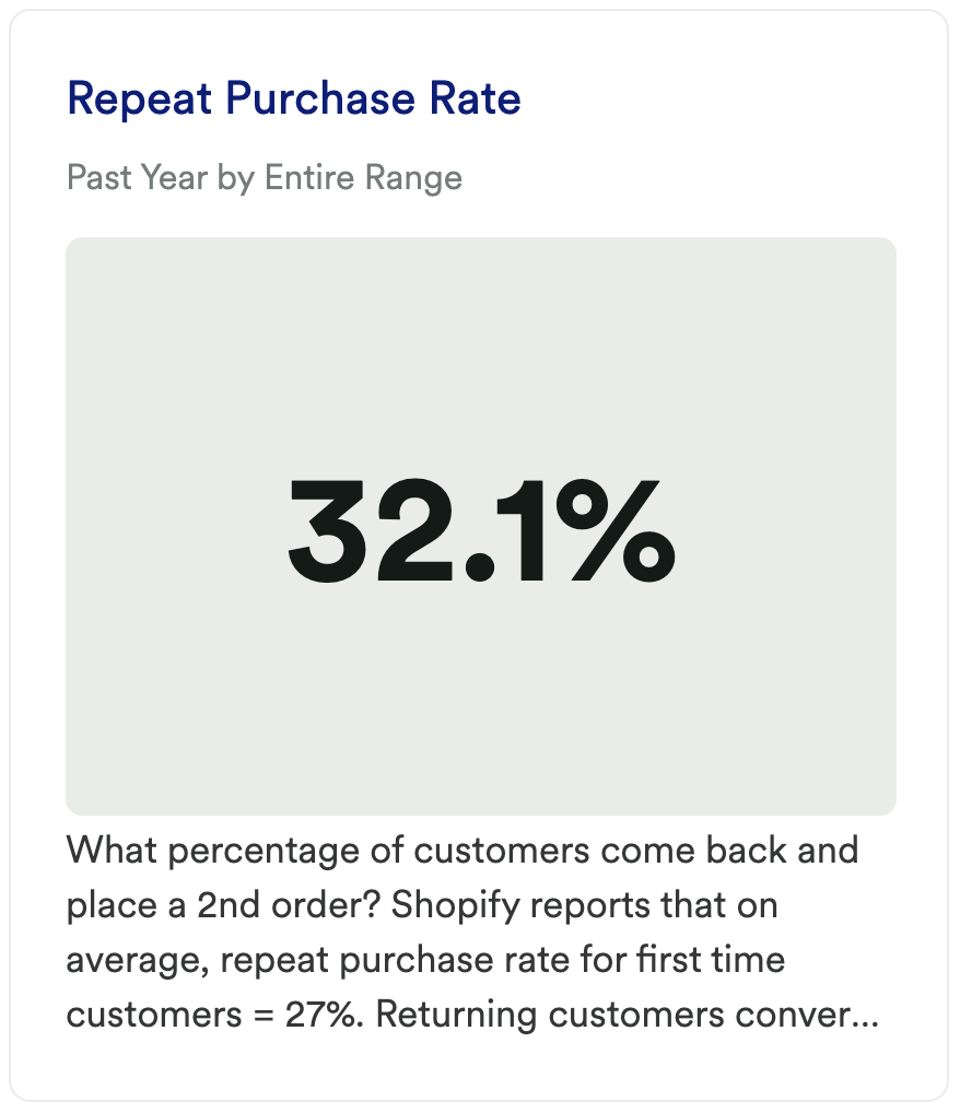
What does it tell you?
This chart will show you the percentage of users that come back and make a second purchase.
How to interpret?
Shopify reports that on average, repeat purchase rate for first-time customers = 27%. Returning customers convert at a much higher rate than first-time customers. Investing in improving repeat purchase rate (RPR) could be more impactful than focusing on improving your conversion rate for first-time customers.
Chart 8: Average Order Frequency
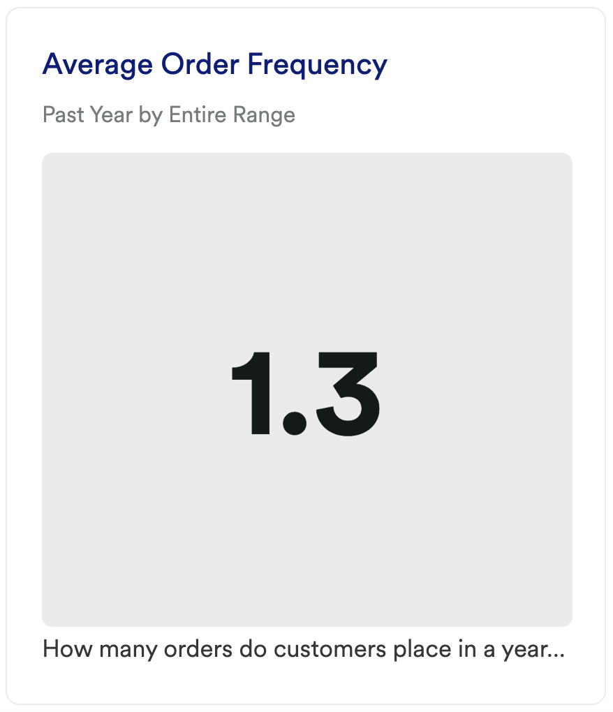
What does it tell you?
This chart will show you the average number of purchases per customer over the past year.
How to interpret?
This result should be closely paired with the previous chart to understand how often your users are coming back to make purchases. But rather than looking at the % who do, this shows you your average order total. Coming back a second time is fantastic, though ideally, your customers are coming back again and again and again.
Chart 9: New vs Returning Customers
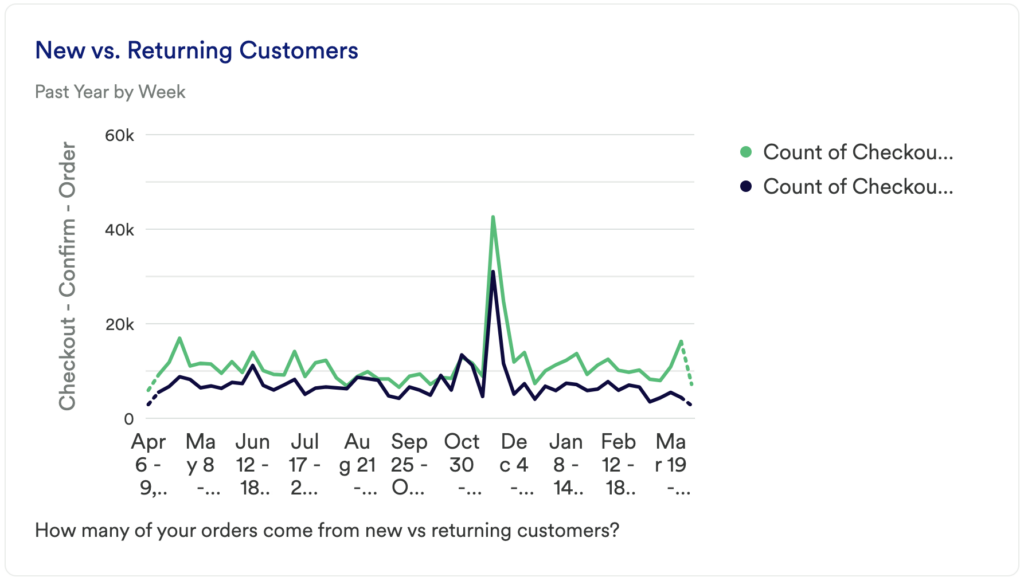
What does it tell you?
This chart is a count of the number of purchases that came from first-time vs returning customers.
How to interpret?
You’ll want to see an increase in both lines here over time to ensure your business is growing. You’ll want exposure to attract new customers while also getting more users to come back and purchase again.
Step 3: Take action
This dashboard is less about uncovering unique insights with specific solutions and it’s more about getting a baseline understanding of common metrics that we find our eCommerce customers care about. Use this dashboard to get a sense of your current performance and to inform the areas you want to focus on in the next quarter or year to make a meaningful impact on your business.
In conclusion
Too often, we see our eCommerce customers only focusing on acquisition channels as the key way to improve their conversion rate. Optimizing the site experience itself can have a huge impact on your bottom line.