Checking the most to least common user actions in your app can give you a sense of what areas of your user journey may be strongest, and which could use some focus for improvement. Heap’s multi-event chart tool supports viewing multiple events at once and comparing statistics between them.
To set up a multi-event chart, complete the following steps:
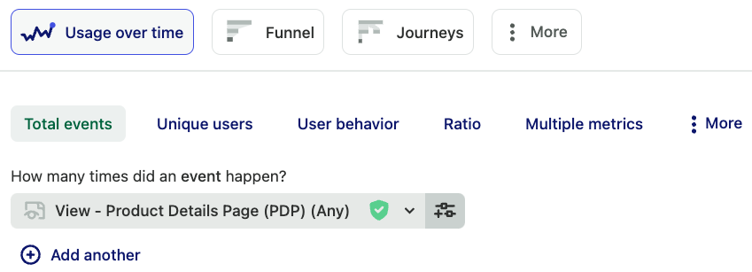
1. Navigate to Analyze > Usage over time
2. Select the first event you’d like to compare. For example, if you run an online shop, one of the events you may want to see is how many times users view a product details page.

3. Click the + Add another button to add counts for the rest of the events you’d like to compare. You can add up to 12 usage over time charts in one chart.

You can also use the Unique users option for these usage over time charts to make sure each count represents a unique user interaction.
4. Last but not least, click View results to see which of these events is done the most. You may wish to use filters or group bys to see these results for a particular group of users, or adjust the date range for a larger time window.
For more information on all the different features in our usage over time chart, see our Usage over time overview guide.