To see what time of day your customers are most active, you can use the usage over time chart in Heap with a spreadsheet tool. Here are a couple of options for calculating and mapping this information:
Generate Bar Chart of User Activity By Hour
1. Navigate to Analyze > Usage over time
2. Select Total events
3. Select Sessions (or whichever event you are interested in analyzing)
4. Set the date range to past 90 days to get a breadth of data)
5. Set the granularity to hour
Your chart setup should look like this:
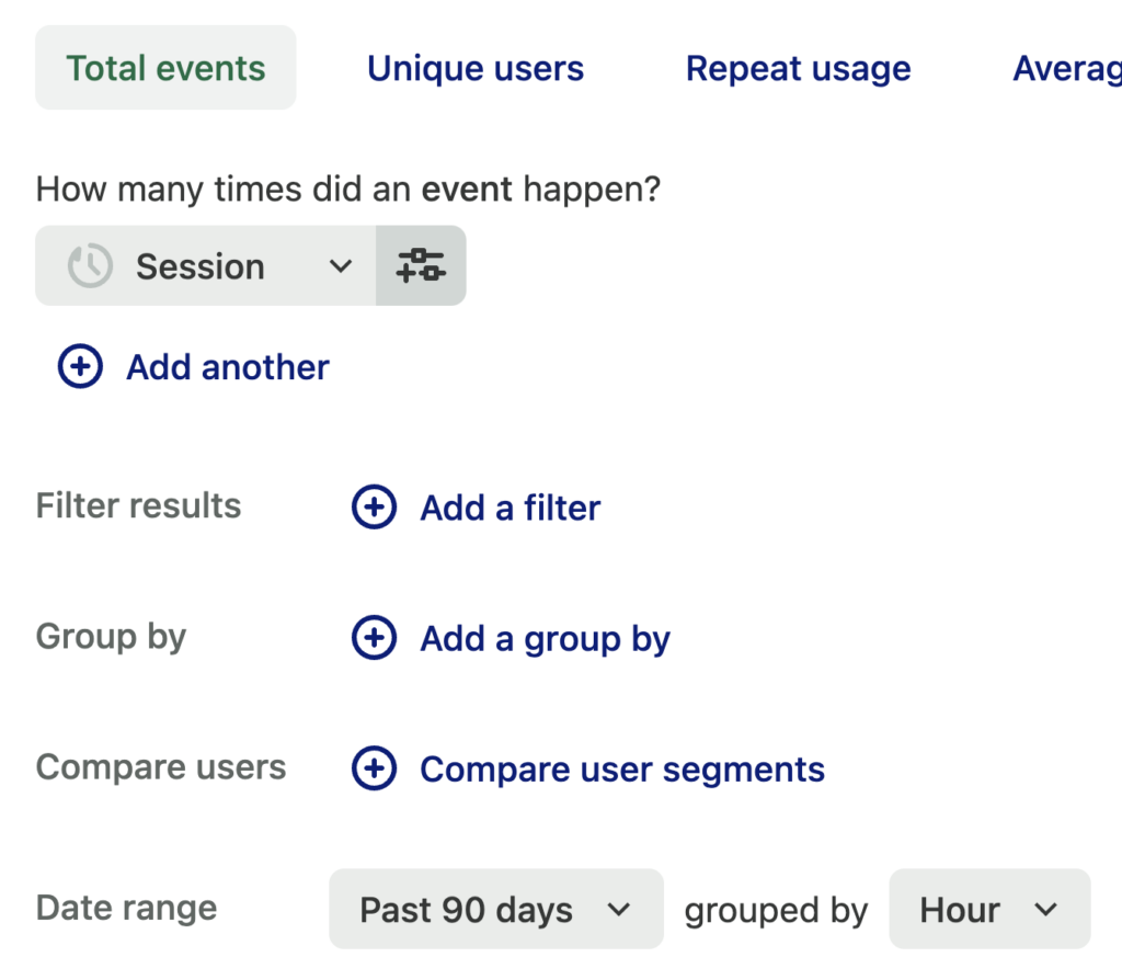
6. Click View results to generate a line chart
7. Click Actions > Export to CSV at the top to download a CSV file of these results
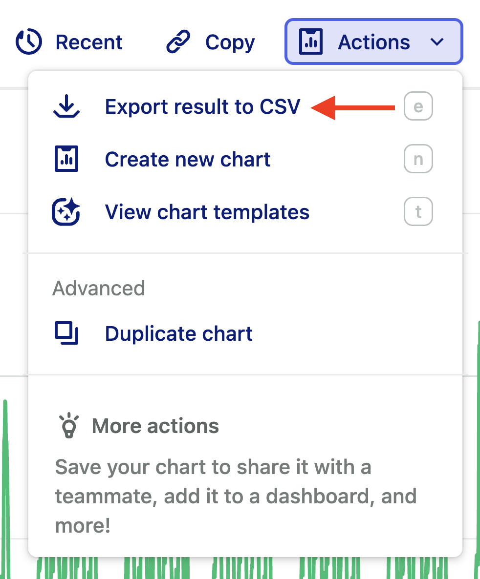
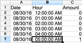
8. Open this file up in your spreadsheet software of choice. Use Text to Columns (or equivalent feature) to split the timestamp at the hour. This should update the spreadsheet to look like this:
9. Set up a pivot table with the hour in the row fields and the sum of the amount in the data fields. The example below uses Open Office, though Excel works the same way.
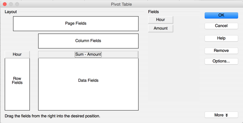
10. Chart the distribution of the summed amounts. In this example, “1” is midnight to 1am, “24” is 11pm to midnight.
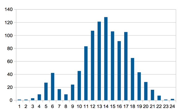
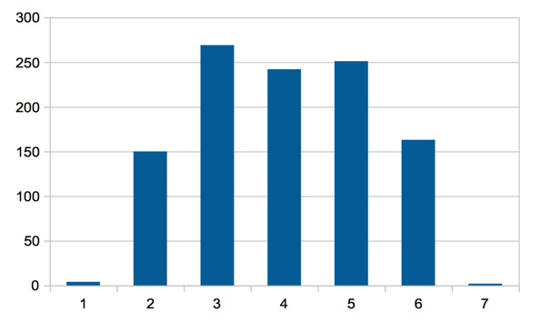
Note that if you update the granularity of the initial export to day, you will get a chart like this, where 1am is Sunday.
Map User Activity By Hour With Custom Colors Applied
To generate a spreadsheet with custom colors applied for a visual overview of session activity broken down by hour, complete these steps:
1. Navigate to Analyze > Usage over time
2. Select Total events
3. Select Sessions (or whichever event you are interested in analyzing)
4. Set the date range to past 90 days to get a breadth of data)
5. Set the granularity to hour
Your chart setup should look like this:

6. Click View results to generate a line chart
7. Click Actions > Export to CSV at the top to download a CSV file of these results

8. Open the data in the spreadsheet app of your choice. In the screenshots below, we use LibreOffice, though these steps should be applicable with minor modifications for any other spreadsheet app, such as Excel. Use Text to Columns (or equivalent feature) to split into a date-hour part to look like this:
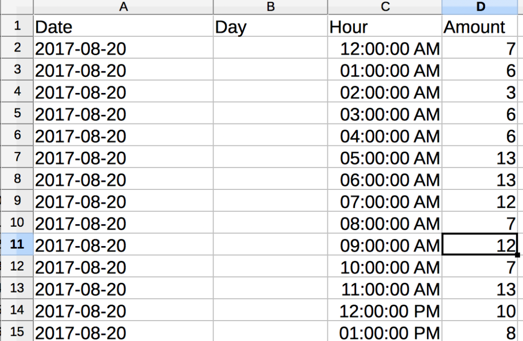
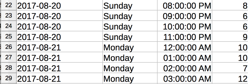
9. Put the following formula in the column that we, in our example, named “Day”. This retrieves the day name from the date.

10. Copy this information down all rows. You can also format the hours to be neater and more concise (24h clock) if you like.
11. Next, highlight the Day, Hour, and Amount columns, navigate to Data > Pivot Table, then create a new pivot with that highlighted data. You’ll see a result like this.
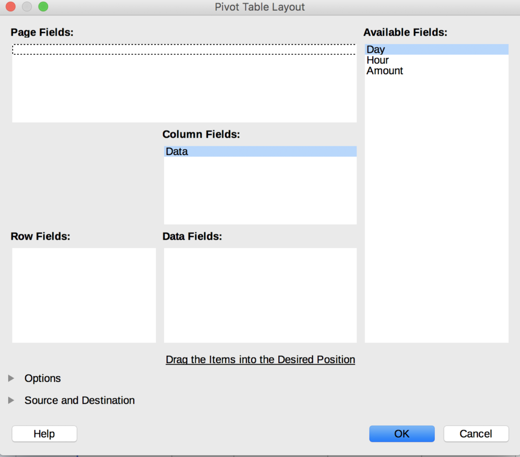
12. Drag the fields so it looks like the image below.
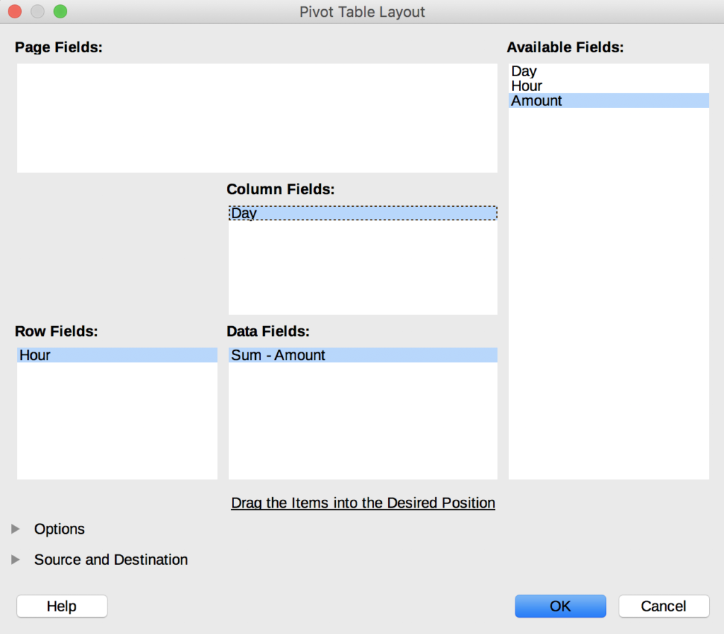
13. Click OK. Now you’ll see this:
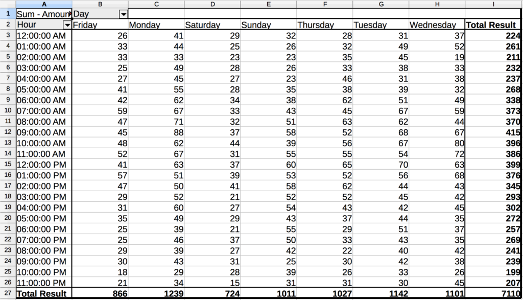
If it comes out of order, sort the header row.
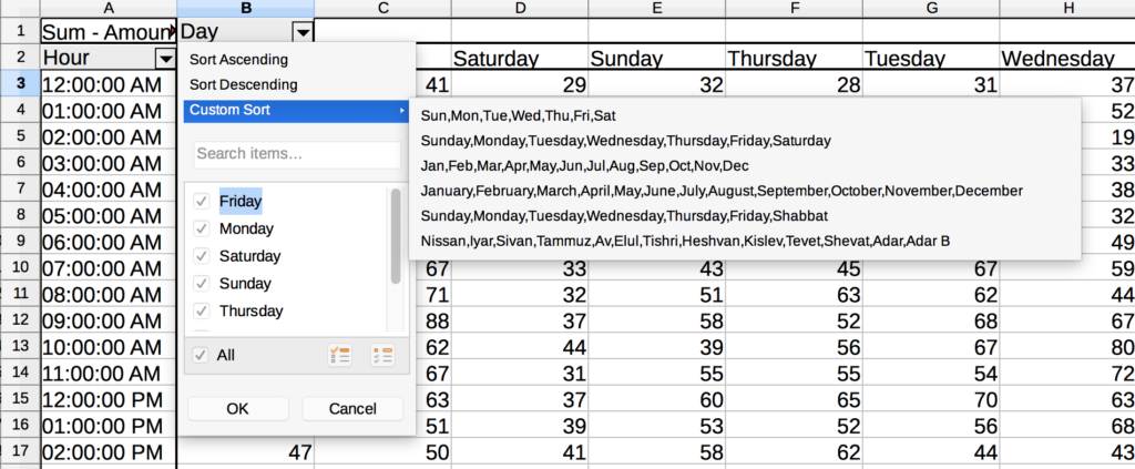
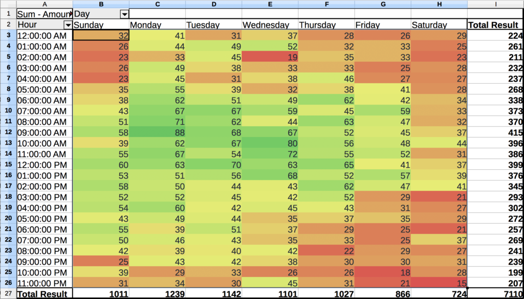
14. Now let’s add the finishing touches and format the cells for easy reading. LibreOffice has a color scale formatting with some ugly colors, though you can tweak those to your heart’s content.
Find the color scale option in your spreadsheet software, as depicted below.
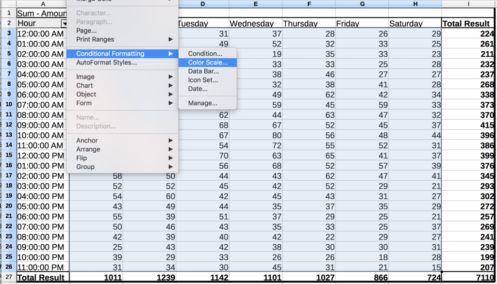
You will likely see a set of options like this:
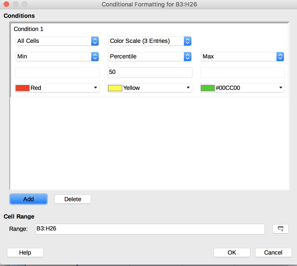
15. Click OK to use the default formatting. Colors will be applied to each cell for a visual sense of the volume of events that took place during that hour.
Optional: Group Results Across Different Devices
To group your new day/time matrix to cut across different devices, add a group by device type to your report, then export it to CSV.
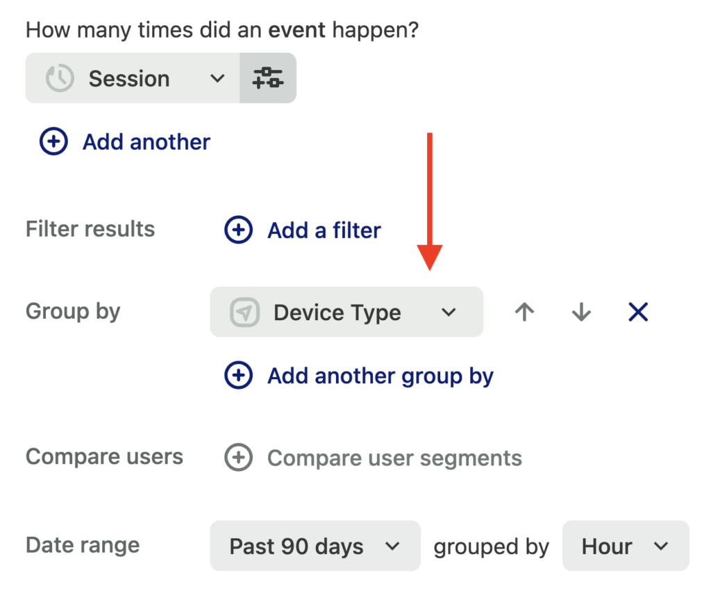
Heap may export the CSV differently depending on the report. The ‘group by’ CSV is formatted as follows. We’ll need to transpose the columns into rows, which is super easy with LibreOffice.

Highlight the data, and cut it (cmd/ctrl-x). Highlight the top-left cell and go to Edit > Paste Special, and choose the Transpose option.
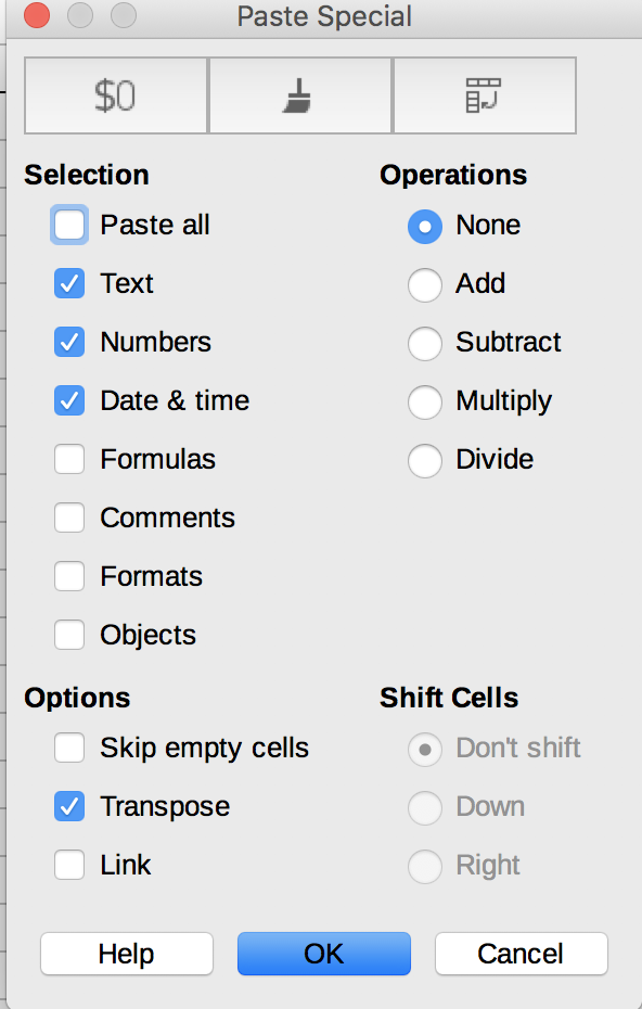
Click OK. You should see this result:

Manipulate the date values as before to derive two columns: Day and Hour.
Highlight the Day, Hour, and Grouped data columns. Navigate to Data > Pivot Table > Create.
Drag the fields around so that it looks like this. Be sure to leave “Data” in the column fields, otherwise it will group on the row and be difficult to read.
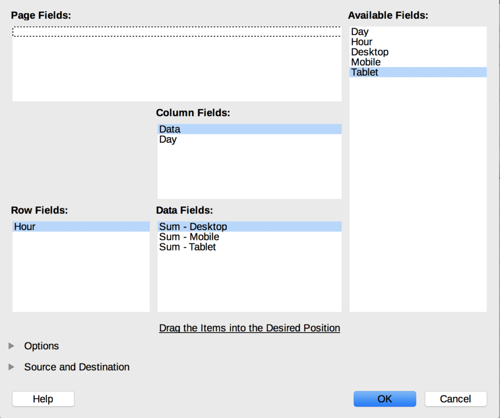
Make it at-a-glance ready by adding a color scale per the steps above. You’ll get something that looks like this. Each grouping has its own set of day columns, with the hours down the left.
