The results of a ratio or conversion rate between chart will differ in a table chart vs. other chart types (line, bar, donut) because those chart types order results by sample size, whereas table orders results by rate.
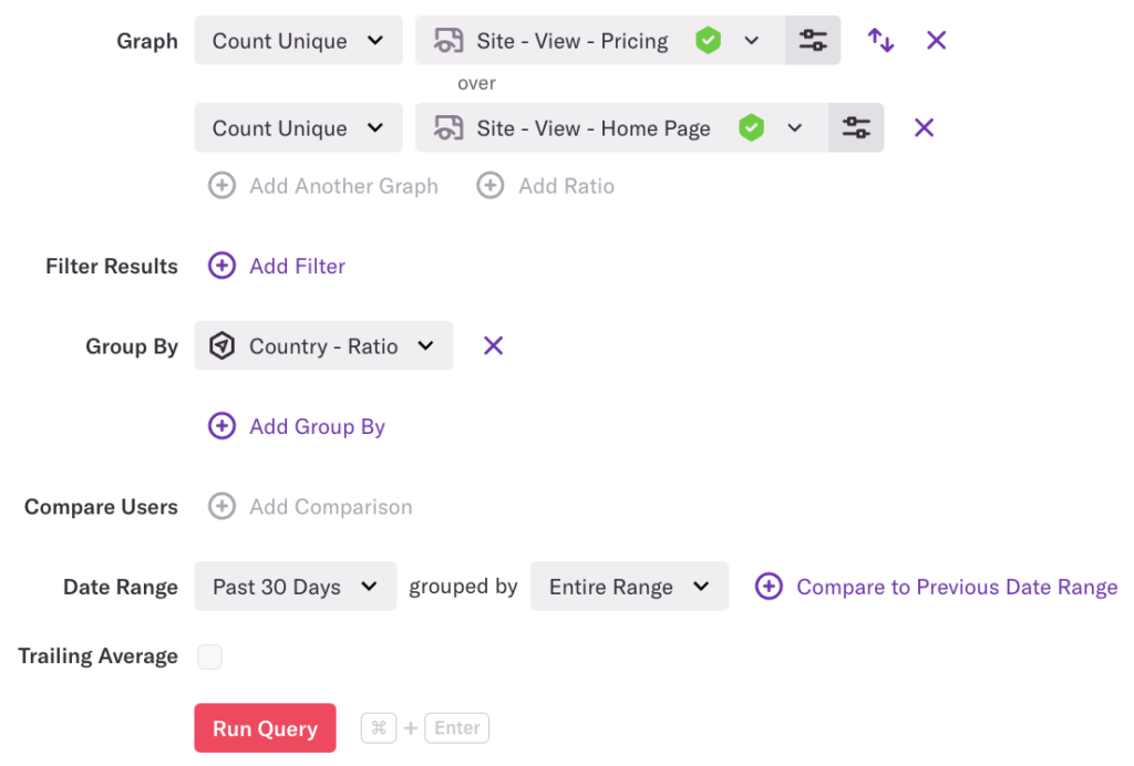
For example, let’s say you have a ratio grouped by country.

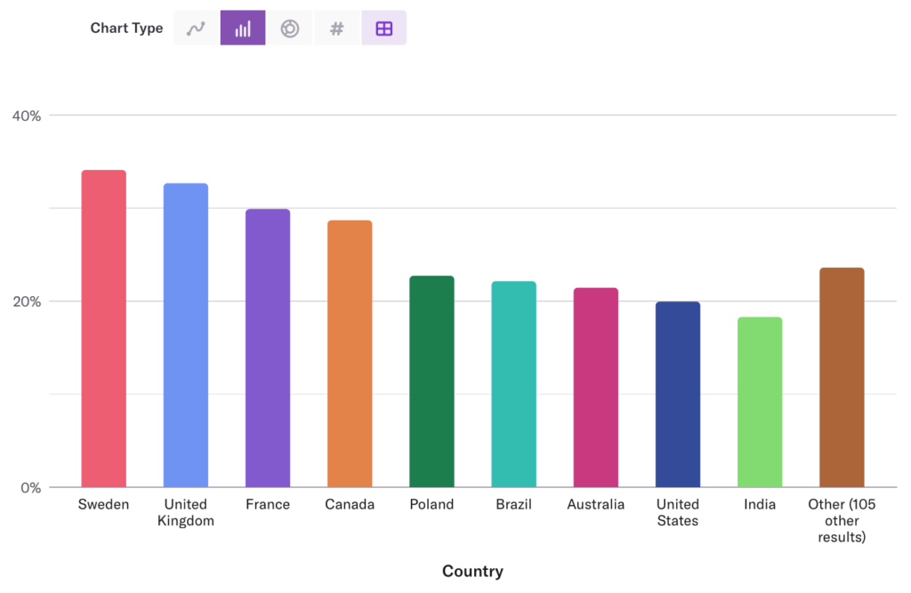
The bar chart lists Sweden, United Kingdom, and France as the countries with the highest conversion rates.

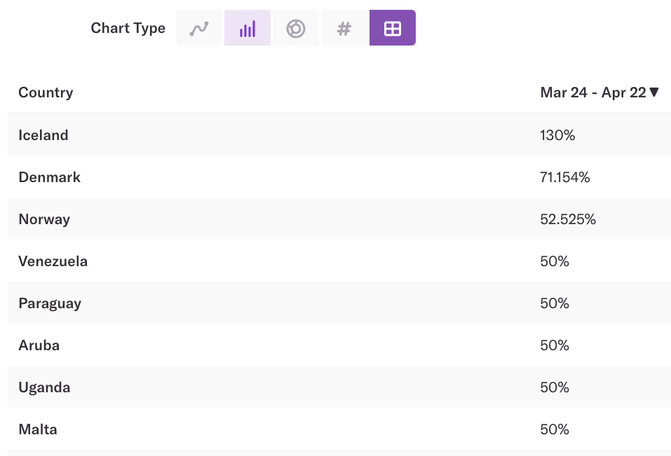
However, when you switch to the table chart type, it lists Iceland, Denmark, and Norway as the countries with the highest ratio.

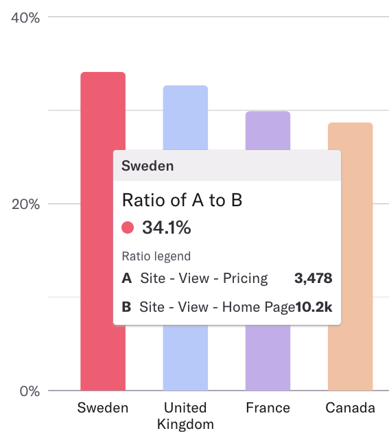
Hovering over the countries in line, bar, or donut charts will show you the sample size for each one. Sample sizes are not currently shown in tables.
Looking at the example above, in the bar chart, Sweden had a ratio of 34.1% with 3,478 users completing the first event and 10.2k users completing the second event. This is a large sample size in comparison to the list of countries that had users complete these two events.

In the table chart view, Iceland had only 611 unique users who completed the first event, and 470 unique users who completed the second event. This is a smaller sample size, so it was bucketed into Other in the bar chart view.
