Overview
Some products have very different active usage other than daily, weekly, or monthly. Heap’s active usage analysis module helps you identify the specific interval of regular usage for a given product. It works by calculating and displaying the median time that a user takes to repeat an event, with select outliers removed to avoid skewing the data. You can use this information to define a unique user segment for measuring active usage.
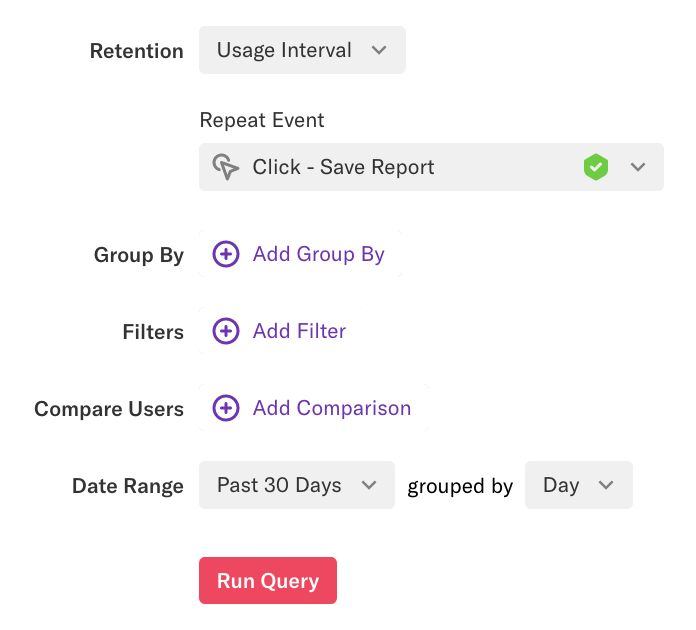
To set up a report with the usage interval, navigate to Analyze > Retention > Retention Analysis, then select usage interval from the retention drop-down.

Next, select the following:
Repeat Event: This is the value-driving event you want your users to repeat, which you use as a benchmark for defining active usage. For example, in a SaaS product, this event would correspond to use of a core feature.
Group By: You can group by any user-level property available to Heap, as well as behavioral properties. For example, you may wish to group by Initial Device Type to see, for example, if users are repeatedly performing an action at very different rates on mobile vs desktop.
Filters: These allow you to limit the results of your query to a specific subset of users based on user-level parameters, such as whether they are in a certain segment, or if certain active usage properties apply. See Filters for details on how each filter works.
Compare Users: Use this option to compare two sets of users using behavioral properties. See Behavioral Properties for details on how they work.
Date Range: This determines how far back in time you are checking for repeat events. You can adjust the ‘grouped by’ value to check for repeats from the past few hours, days, weeks, or months.
As an example, in Heap, we might want to measure how often our customers are using our suggested reports feature, so we would define this as our repeat event.

Understanding the Usage Analysis Report
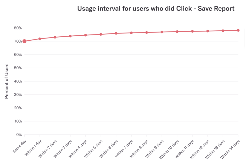
In the results, the y-axis shows the percentage of all users who use the feature, which flattens out when it reaches the percentage all of your users that have used the feature at least once. In the example below, the curve flattens out at around 73%, which is the total percentage of users who have saved a report at least once within the past two weeks.

You want to see this curve take on an elbow shape. In the absence of a clear elbow in the curve, try adjusting your analysis to identify the closest point to when ~80% of users came back. This is your usage interval.
You can also use the suggested report How often should I expect users to complete a given action? to analyze this information.