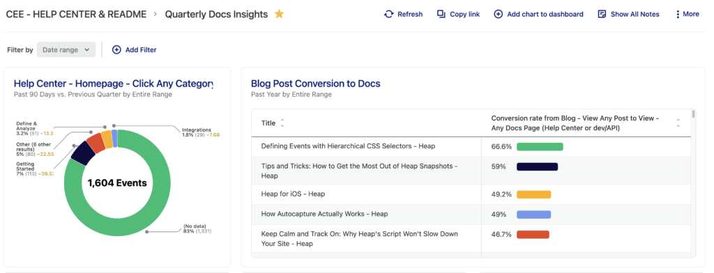
Charts are saved analysis results. You can pin several charts to a single dashboard to have a birds-eye view of the metrics that are most important to you. For example, as a documentation writer, I have a dashboard to track pageviews and searches within this very Help Center.
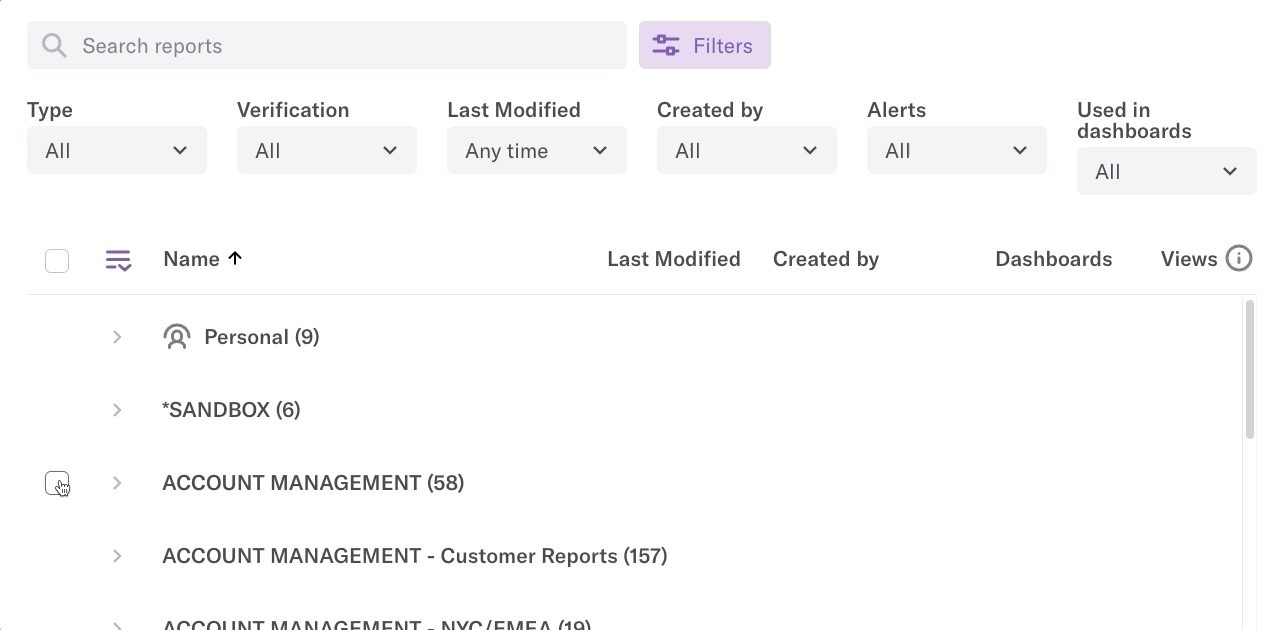
The charts page gives you an overview of all of the charts available in your Heap account. You can search by chart name or by category to filter down to specific charts.
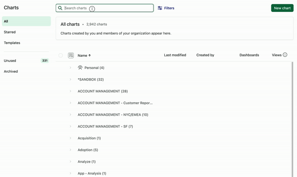
You can click on the filters icon to filter charts by type, verification status, when the chart was created or last modified, and more.
You can also re-sort the charts list by clicking on the headers below the filters, which are as follows:
- Last Modified: The most recent date where new changes were saved to the chart.
- Created by: The email address of the team member who created the chart.
- Dashboards: The number of dashboards this chart is currently pinned to.
- Views: The total amount of views of the chart over the past 90 days. This includes counts of views of any dashboards the chart may be pinned to.
Creating Charts
You can create a new chart in Heap by clicking the New chart button on the charts page, which will open the analysis launcher.
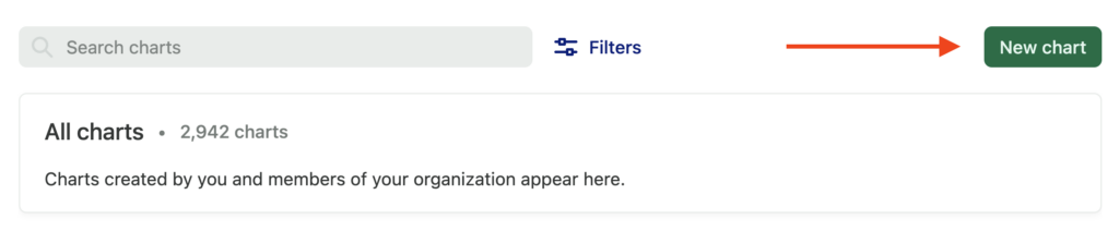
You can also get started by navigating to Analyze and clicking through the options to select the type of analysis you want to run. Once you have your analysis set up and you’re ready to save it, click the Unsaved changes button and select Save chart.
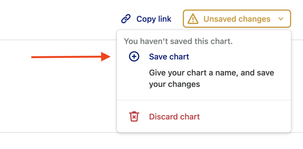
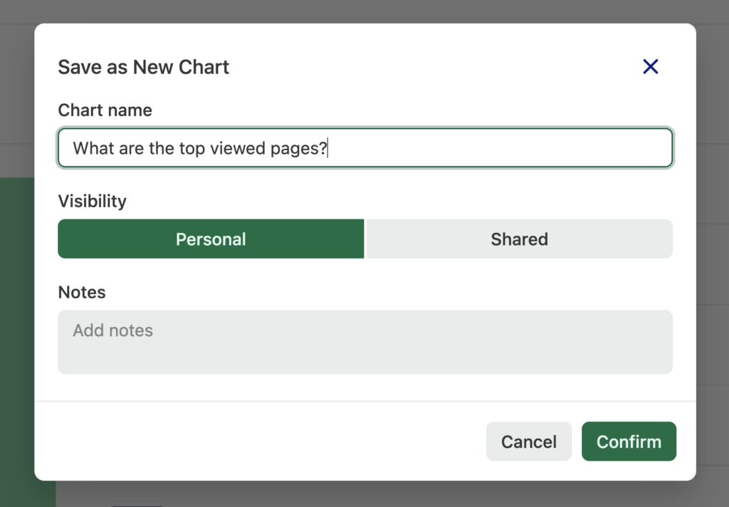
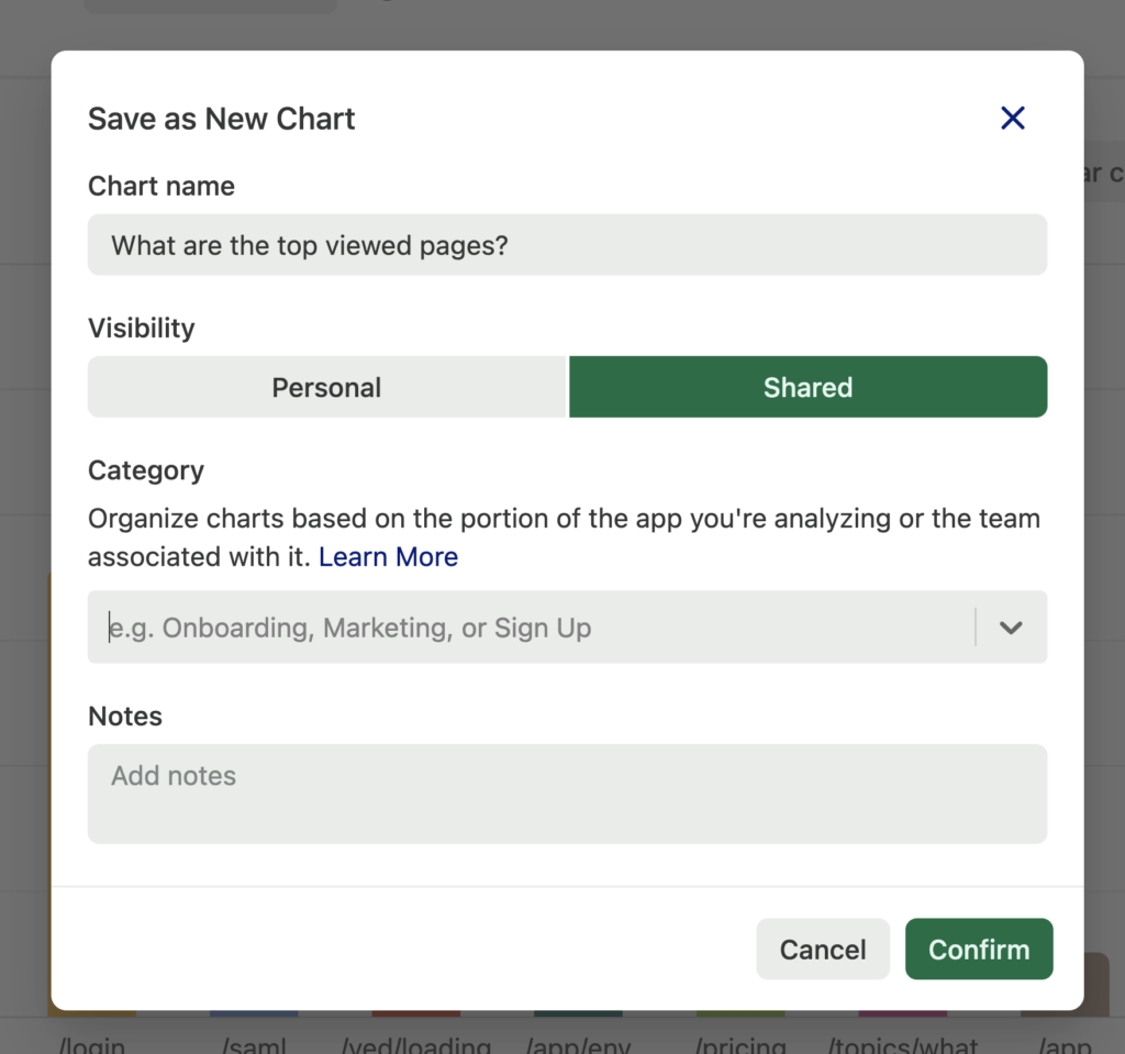
A pop-up will appear where you can name your new chart. You can also choose to make it a personal chart. Personal charts are only visible on your dashboard, though they can be published to a shared space later.
Only team members with the role of Analyst and higher can create shared charts.
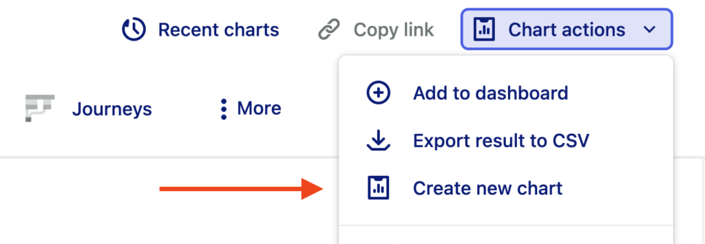
To create multiple new charts in succession, click Chart actions then select the Create new chart to have a blank slate for a new chart.
If you’re looking to create a new chart that’s a slight modification of an existing chart, there’s no need to manually set up that chart all over again. Make a copy by clicking Chart actions, then selecting Duplicate chart. Once the copy has been created, you can modify it and save it to your Personal or Shared space.
Starring Charts
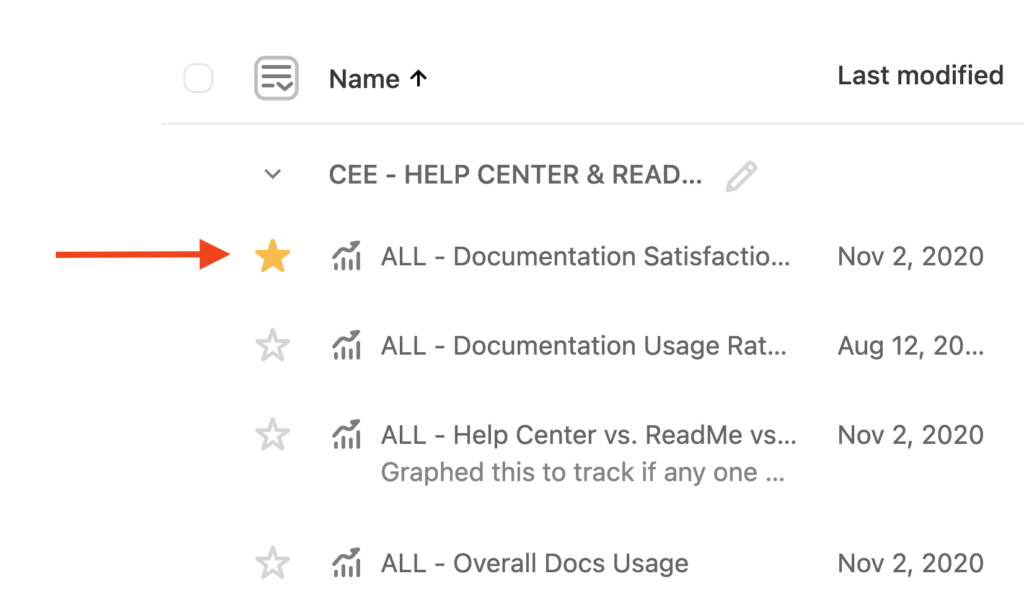
You can star charts you view often to make it easier to view them all in one place. Starred charts will always appear at the top of the category.
To star charts from the charts page, click the star icon that appears next to each chart name.
To star a chart you are viewing, click the star to the right of the chart’s name.
Once you have a few charts starred, you can view them by navigating to Charts and looking under the Starred charts category.
Exporting Charts
This feature is only available to customers on paid plans. To upgrade, contact your Customer Success Manager or sales@heap.io.
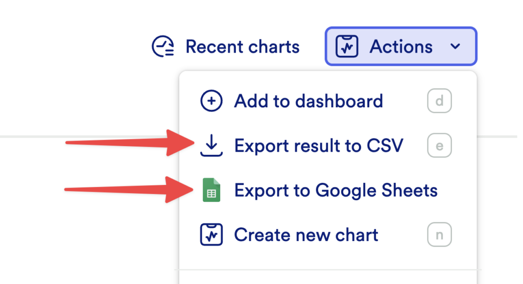
To export a chart, click the Actions menu and select Export result to CSV or Export to Google Sheets.
The max size of a CSV report in Heap varies based on where you download it from in your account. When you download a .csv file from the Users page, it will export the most recent 5,000 users who fit the criteria of the chart. When you download a .csv file from the Charts view, the export will show up to 100,000 rows of data per metric in your chart. There’s no overall file size limit.
Verifying Charts
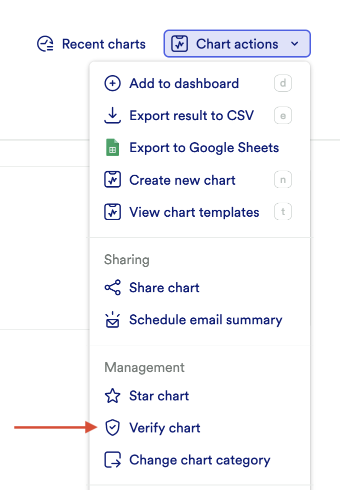
To verify a chart, click the Chart actions menu and select Verify chart.
Editing Verified Charts
Default permissions only allow admins and architects to manage verified charts. You will need to customize permissions to allow other roles to manage verified charts.
Adding Footnotes to Charts
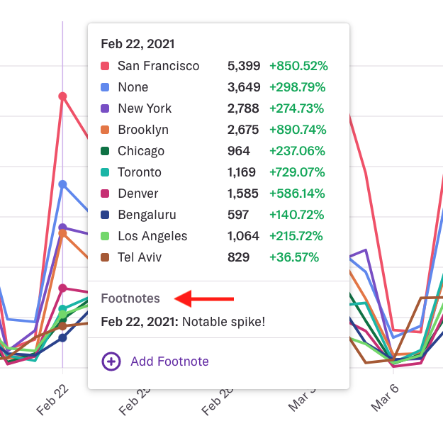
Once a chart has been saved, you can add footnotes to usage over time charts by clicking on any data point, clicking the Add Footnote button, and providing the text of your footnote.
Once the footnote is added, all viewers of this chart will see a line on the usage over time chart indicating a footnote is present. Hover the line to see the text of the footnote. If a chart with a footnote is in a dashboard, you can also see the chart’s footnotes from the dashboard view.
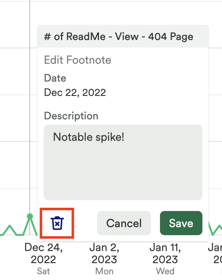
You can delete a footnote by clicking on the footnote and then clicking the trashcan icon when it appears. You can edit a footnote from this view as well.
Customizing Charts
This feature is only available to customers on paid plans. To upgrade, contact your Customer Success Manager or sales@heap.io.
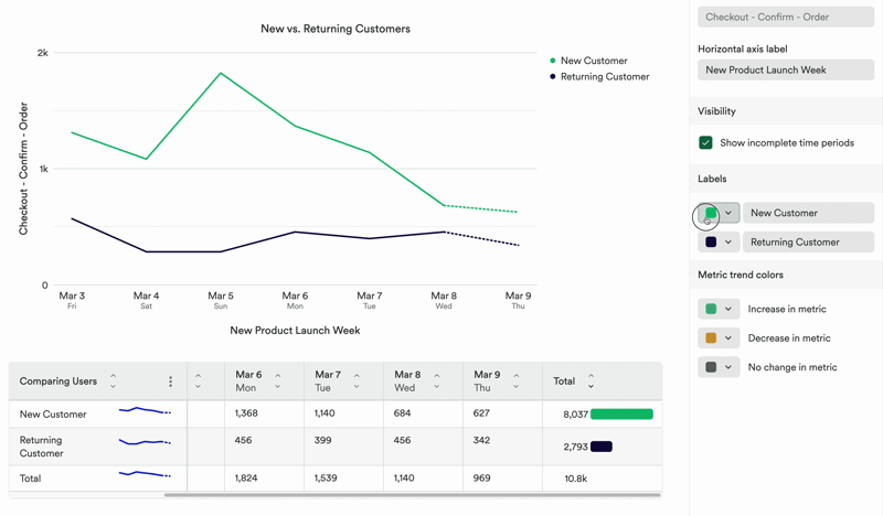
To customize colors, change the names of axes, and create custom labels, click the Customize button next to the chart. A pop-up will appear with all of these options.
Organizing Charts
Once you have enough charts, you’ll want to categorize them. New categories can only be created while creating a new chart in the Shared space.
To categorize a chart, click Save chart and type the name of the new category into the ‘Select category’ box.
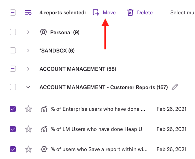
To categorize several charts at once, select the checkmark next to them where they are listed on the charts page, then click Move at the top.
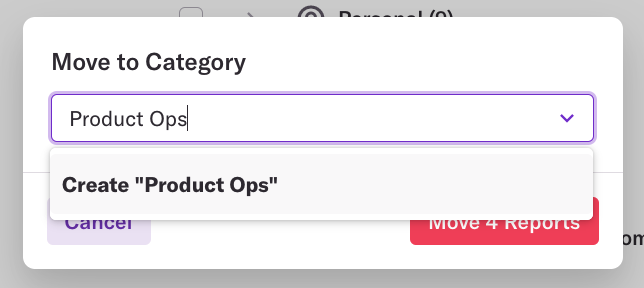
A pop-up will appear where you can select an existing category or create a new one by typing the new category name.
For best practices on naming charts and categories to benefit your team, see the charts section of our article on Categories.
Charts can be personal or shared, depending on their visibility setting. Personal and shared are not categories.
Renaming Chart Categories
To rename a chart category, just click the pencil icon next to the category from the Charts page. A pop-up will appear where you can update the category name.
Scheduling Emailed Charts
Heap allows you to schedule daily, weekly, and monthly emails to yourself and others based on existing charts you’ve saved. For full steps to set this up, see Schedule email charts for you & your team.
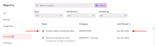
Archiving Unused Charts
Archiving unused charts lets you declutter your charts view. Unused charts are chartss that meet the following criteria:
- Are not used in any dashboards
- Have not been viewed in the last 90 days
- Have no scheduled email charts set
- Have no threshold alerts set
To archive a chart, click on the chart where it’s listed on the charts page.
Click the Archive button that will appear after you’ve made your selection. You’ll be prompted to confirm this action.
Deleting Charts
To delete a chart, it must first be archived. Once you have archived the chart you intend on deleting, navigate to Charts > Archived and click on the chart. Select the Chart Actions menu and click Delete Chart.
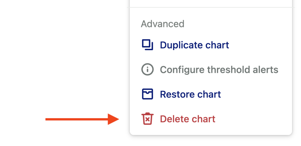
A pop-up will appear and ask you to confirm that you want to delete the chart.