This feature is only available to customers on Pro and Premier plans. To upgrade, contact your Customer Success Manager or sales@heap.io
Overview
Engagement analysis allows you to measure the success of product changes by making it easy to compare events in multiple ways. By default, it shows how many users do an event and the average number of times those users do it.

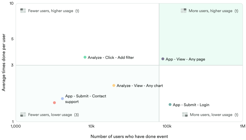
An engagement chart displays this information on a scatter plot, broken up in four sections or quadrants, which helps you easily compare events. Events are represented as data points. The points in the top right, for instance, are done the most often by the most users. You can use this type of chart to:
- Quickly measure feature success across the board with no need to set up multiple complex charts and dashboards
- Explore and compare your most and least-used features
- Understand how engagement varies across segments, such as mobile users versus web users
Setting up an engagement chart
To create an engagement chart, navigate to Analyze > Engagement.
When choosing which events you want to compare, we recommend starting with the most important events in your app. This allows you to see how their usage compares to each other and your overall site activity.
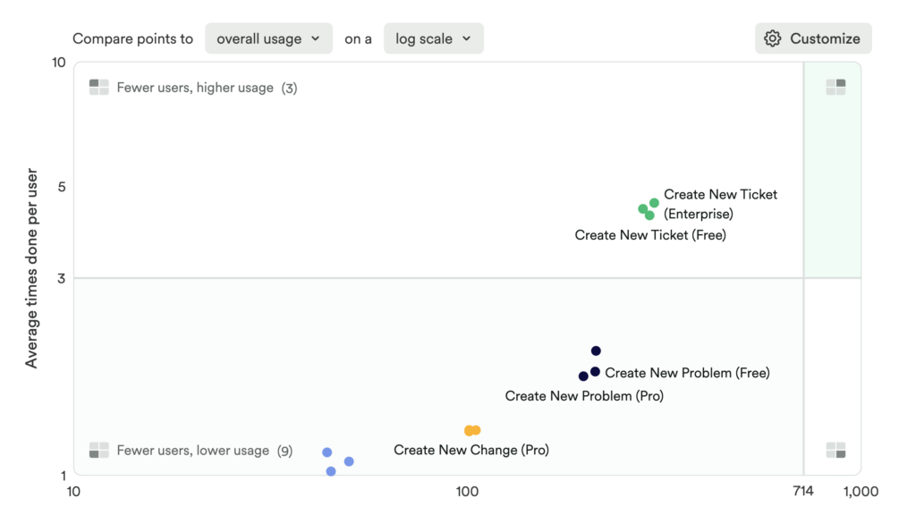
For example, let’s say you have a support portal on your website and you want to compare the four primary actions users can take in the portal.
You can also add filters to only see results for certain segments of users. For example, you may want to focus on power users by filtering for users who are active daily.
You can also use a Group by to organize results by certain criteria, such as grouping by device type, to see if there’s a difference in behavior by users on desktop, tablet, or mobile devices.
Another example is to group by subscription status to see where usage differs between free and paid subscribers.
Click View results and your engagement chart will load below.
Understanding your engagement analysis results
The results of the engagement chart above will look something like this:

Here’s how to interpret these chart results:
- Events in the top-right are done more often by many users. These are your most popular features.
- Events in the top-left are done more often by fewer users. These may be niche features that are only meant for certain types of users, or these features need to be made more discoverable.
- Events in the bottom-right are done less often by many users. These features are already highly discoverable, but aren’t being used as much as other features. This could mean they are only meant for certain use cases, or that they need to be worked on to be more usable.
- Events in the bottom-left are done less often by fewer users. These are your least popular features, in which both discoverability and usability could potentially be improved. It could also be that these events represent workflows that naturally occur less often in your product or on your site.
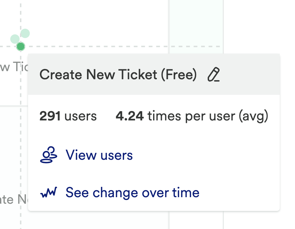
Hovering over a point shows you more information and the option to drill down into the data more.

Clicking View users will take you to the Users view of this particular group of users. See change over time opens a Usage over time chart that can help you look at this event over a different time period from your engagement chart.
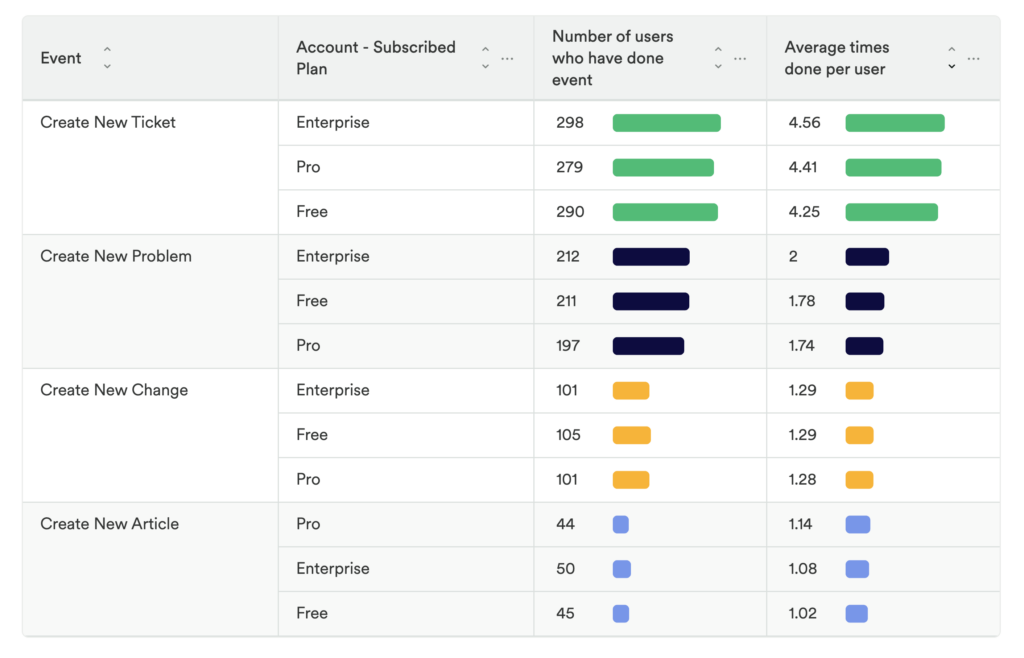
Directly below the chart, you’ll see a breakdown of each event, along with the metrics visualized in the chart.

Because we used a Group by for subscription status, we can see how the values are separated out depending on those users subscription tier (Enterprise, Pro, and Free).
Customize your engagement chart
Once you have engagement chart results, you’ll notice the option to change both how the results appear, and how the events in your chart are measured.
The first way you can customize your chart is with a pair of dropdowns that appear above the chart.
Once you have engagement chart results, you’ll notice the option to change both how the results appear, and how the events in your chart are measured.
The first way you can customize your chart is with a pair of dropdowns that appear above the chart.
The first drop-down determines how your events are compared (either to overall usage or only between your selected events), and the scale used for the chart (logarithmic or linear).
Overall usage vs. selected events
By default, we show you how the events in your engagement chart compare to the overall usage of your site or product. This is a great place to start because it creates an “apples to apples” comparison across the events you might choose.
As you dig in, you might see that your chosen events are too close together, or only appear in a single quadrant of the chart. In this scenario, try switching to selected events. Your events will be shown on the chart only in comparison to each other, which will generate a more visually balanced chart.
Log scale vs. linear scale
By default, we use a log (logarithmic) scale for this chart. Log scale works best for events that have extremely large differences in usage, and we’ve found it gives better results for most engagement charts.
However, sometimes a linear scale works better at showing differences between events, especially if the events are close together.
Changing the metric for the horizontal axis
Click the Customize button next to your chart to open the customization sidebar. Under Horizontal Axis you will see the dropdown for Metric.
By default, the horizontal axis shows Number of users, but this can be changed to Number of sessions or Percent of active users.
You can choose between Number of users and Number of sessions depending on how your organization measures usage activity. Percent of active users is helpful when you are trying to compare usage between the most engaged users of your product.
Change the definition of “active user”
By default, a user is considered active if they have done a session. You can customize this to be an event if a session isn’t the best indicator of active usage. Using a different event can be particularly helpful if you are tracking both public site traffic and app usage in the same Heap project.
To change this setting, first make sure that the Metric under the Horizontal Axis section is set to Percent of active users. Then, the question “Which even makes a user count as active?” will appear with a drop-down where you can make a selection.
Customize colors and labels
Click Customize next to the chart and a flyout will open with all the chart customization options. This includes changing the axes and quadrant labels, quadrant colors, and the metric trend colors. This menu also includes the horizontal axis metric options listed in the previous section.
Customize individual points
You can change the color and tooltip label for individual points.
Hover on the point you want to customize and click the pencil icon next to its name. Once you are happy with your changes, click Done. If you decide that you don’t like your changes, you can click Reset to bring it back to its original name and color.
How results are calculated
When you see a data point on an engagement chart, you’re looking at two different pieces of information, shown at once:
- For the vertical axis, an average is shown. This average is calculated as a ratio of a count of how many times an event happened, over a count unique of how many unique users did the event.
- For the horizontal axis, the data shown depends on what axis metric is selected:
- Number of users shows the same information as a Count unique usage over time chart.
- Number of sessions shows the same information as a Sessions usage over time chart.
- Percent of active users runs a ratio chart of Count unique on your selected event over a Count unique chart of your active usage event.
The default active usage event is session. This can be customized to be any event in Heap.
How does it work?
How many events can be shown in a chart?
You can compare up to 12 events at any one time. If you add a group by or segment comparison to your chart, we’ll show up to 100 data points at once.
In the data grid below the chart, we display up to 100 groups per selected event (the 100th event being Other if there are more groups than that).
You can export your chart to CSV to see a table with more groups for each event of interest (up to 100k rows).
How do the maximum values on the axes get set?
With a log scale
When using the default log scale, the horizontal axis is shown using powers of 10 (ex: 10, 100, 1000, 10k, 100k). The maximum value shown on the axis is the smallest power of 10 that includes all of the data. For example, if the max horizontal axis value to be displayed is 3.4k, then the max value on the horizontal axis will be 10k).
The vertical axis maximum value follows the same rule.
With a linear scale
This scale type uses scale logic from the visx library, except for Percent of active users for which the horizontal axis is constrained to either between 0% and 100%, or to the smallest multiple of 10% that fits all the data.
What are the rules for where the quadrant dividers are set?
For quadrants using overall usage
For quadrants using overall usage, the quadrant horizontal intercept is set based on the horizontal axis metric. Specifically:
- When the horizontal axis metric is Number of users, the X-intercept is set to 5% of the number of unique users that have at least one session in the date range and match the filters in the chart.
- When the horizontal axis metric is Number of sessions, the X-intercept is set to 5% of the number of unique sessions in the date range that match the filters in the chart.
- When the horizontal axis metric is Percent of active users, the X-intercept is set to 5%.
The quadrant vertical intercept is set to 3. In other words, higher usage would mean these events are used more than 3 times on average per user.
For quadrants using selected events
For quadrants using selected events, both quadrant intercepts are set at the median value of all data points in the chart.