Understanding how different groups of users interact with your product can help you understand how best to nurture those users. The compare segments option in Heap’s usage over time chart allows you to do exactly this. To set this up:
1. Navigate to Analyze > Usage over time
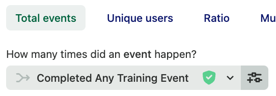
2. Select the event you’d like to conduct this comparison on. For example, if you’re a SaaS business with a training team, you may want to see how often users are attending training sessions.

3. Click the + Compare user segments button next to Compare Users. You can use this option to compare segments, group users by behavioral properties such as whether they have or have not taken a certain action, or any of the other properties listed.
In our example, we want to see if users who have completed a HeapU course over the past month have gone on to check out our chart templates. After adding the first comparison, click the + Add another comparison button to the right of the first comparison to add the second.

You don’t have to stop at two: click the + Add another comparison sign to add additional comparisons as needed.
4. Last but not least, click the View results button to see the results of your comparison.
For more information on all the different features in our usage over time chart, see Usage over time analysis overview.
In a case where you’re grouping by a property that has a large number of distinct values, it’s usually best to do a comparison of segments.
As an example, if your users are educators, and you want to compare data from different school districts, you can build an “email accounts” segment for email contains @california.edu vs. @oxford.edu, then use those in a compare by.