To make the most of this guide, you’ll need a baseline understanding of key concepts like events, charts, and properties. If you are still learning about Heap (meaning those terms don’t mean anything to you), we recommend taking our Hello Heap course or reviewing our Setting Up Heap guide prior to jumping into this guide.
Introduction
Retention is often at the top of everyone’s mind when it comes to running a successful business, which is why identifying those who are at risk of churning is so important. Knowing who your ‘at-risk’ customers are can have a domino effect when it comes to adoption, retention, and even renewal.
Step 1: Determine what health looks like for your team
What actions are you expecting your users to take? How often are you expecting your users to interact with the feature or features? This step is often overlooked, but setting this standard for the team will ensure everyone is taking the correct approach when identifying ‘At-Risk’ customers.
View Home Dashboard, Download to CSV, Add to Cart, or even interacting with a particular feature are all common events to consider. Setting the cadence in which users should be interacting with your events can vary greatly depending on your site or app. Collaboration tools might be used on a daily basis, whereas HR tools might be heavily used on a quarterly basis. Take a moment to think about the cadences you are expecting, but remember, this is something you can always play around with in your analysis!
Don’t forget to create appropriate segments!
If applicable, create segments of users who you expect to interact with your feature(s) at a higher volume.
For example, Admin users will interact with the setup components of a tool, whereas other team members may not interact with setup components at all. Alternatively, users who have not viewed their Home Dashboard will not have edited or downloaded anything from it.
Step 2: Analyze your features!
Now it’s time to analyze our features. We will cover how to identify general usage AND how to zero in on those unengaged, at-risk users.
Chart 1: Chart the total usage of your feature(s)
Analyzing overall feature usage allows you to zero in on your at-risk customers. To do this, you will want to analyze the number of times each of your features have been used. For this we will start by creating a multi-event chart in Heap.
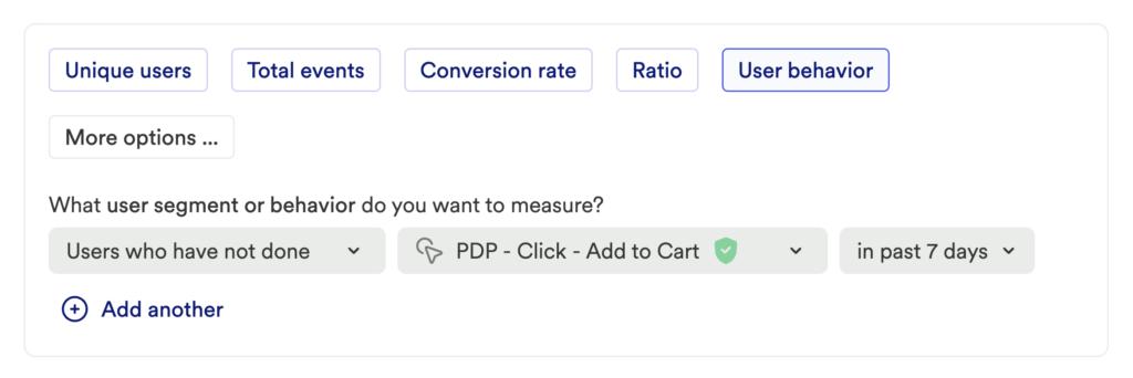
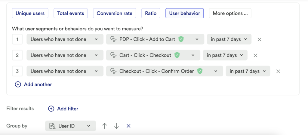
To start, set up a usage over time chart of User behavior > Users who have not done [your usage Event #1] in past 7 days or another time range.

Click Add another to add a second Users who have not done [your usage event #2] in past 7 days or another time range. Go through this flow again to add one more Users who have not done for [your usage event #3] also for the same time frame. Continue with this flow until all usage events have been added.
To get to know WHO the users are, add a group by, and select user identity (or your team’s equivalent property).

What does this tell you?
This helps you understand which of your users are not interacting with your features, or have low usage according to your team’s desired cadence.
Account Based Analysis
Account-based analysis is a powerful way to dig deeper into this information, particularly if you have Account Managers or CSMs responsible for their own book of business.
If you are pulling in account information, filter for a specific account(s) in addition to grouping by Identity. This will tell you which of the users within an account are, or are not using the tool.
Alternatively, for those bringing in Account-level information, you can identify at-risk accounts.
Chart 2: Compare usage over time
Using the same chart from above, let’s understand how usage of your features has changed over time.
On chart 1, click Compare to previous date range to see how usage has changed from your current time range to the previous one.

What does this tell you?
Understanding how interaction has changed over time is important for a full picture of usage, which can impact your outreach approach.
Step 3: Interpret your results and take action
Create an Outreach Plan. Now that you have identified the users who are at risk, there are several ways to engage with these individuals. Emails, in-app guides or tooltips, webinars, and training content are all low-lift ways that can drive engagement and adoption.
Consider creating a segment of users who have overall low engagement and send the segment a drip campaign. For B2B companies, take a look at company usage, too – while the chart that you just built will help you identify at-risk users, it will also allow you to identify a champion within a company. Reach out to them to see if the team wants additional assistance.
Conclusion
Heap makes it really easy for you to identify At-Risk customers AND take action with those specific users!