To make the most of this guide, you’ll need a baseline understanding of key concepts like events, charts, and properties. If you are still learning about Heap (meaning those terms don’t mean anything to you), we recommend taking our Hello Heap course or reviewing our Setting Up Heap guide prior to jumping into this guide.
If you’re new to analysis in Heap, we recommend reviewing Create Your First Chart, which covers helpful charts 101 info.
Overview
Oftentimes we think we need our users to have lots of information and navigation abilities on our site, but is it overwhelming for users? Are we sharing the information we want without it being overwhelming? Anything we can sunset? Find out how to button up your homepage!
Step 1: Define what conversion on your homepage looks like
What are you expecting your users to be interacting with most and least? What is your goal for users to achieve on your homepage? Is it creating an account? Clicking on blog posts? Taking an in-app quiz? Requesting a demo? Establish what your conversion goals are on your homepage, then define one or more events to capture this.
Step 2: Analyze your data!
Chart 1: Identify most and least interacted with items
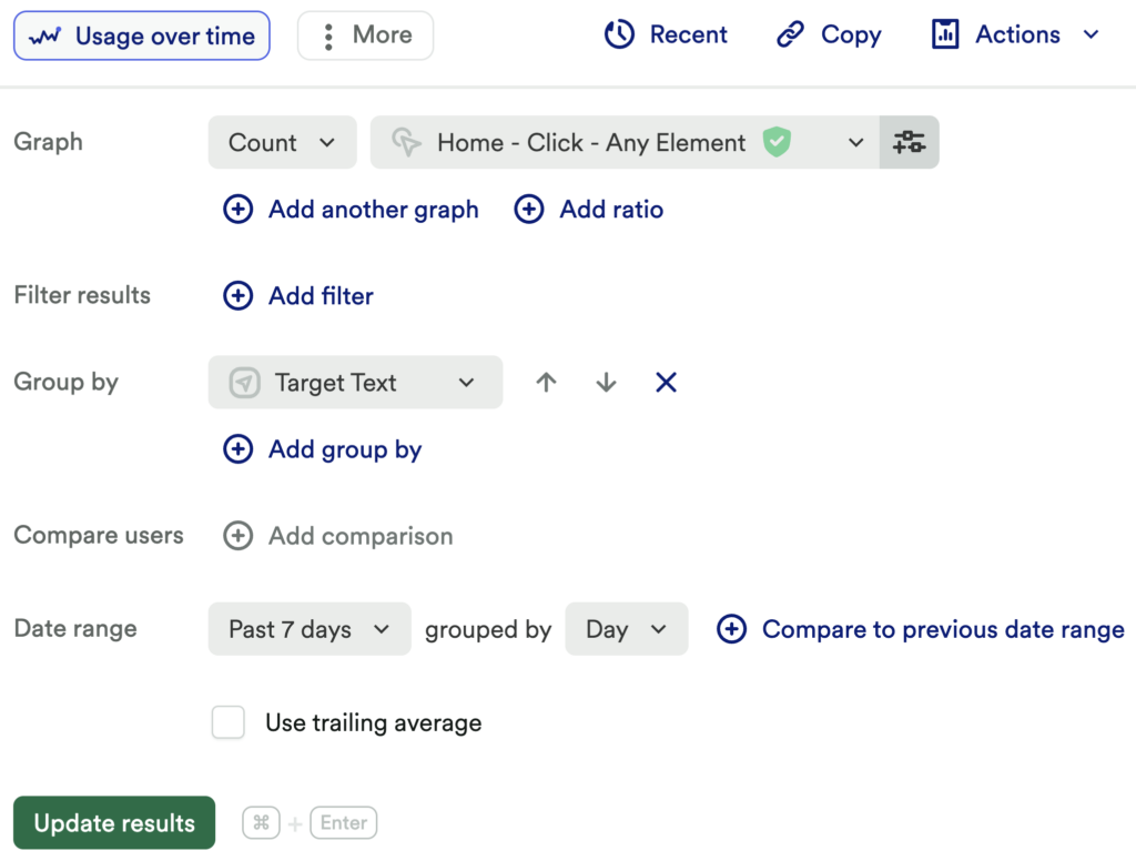
First, set up a usage over time chart of a count of click on any element. Be sure to group by Target Text.
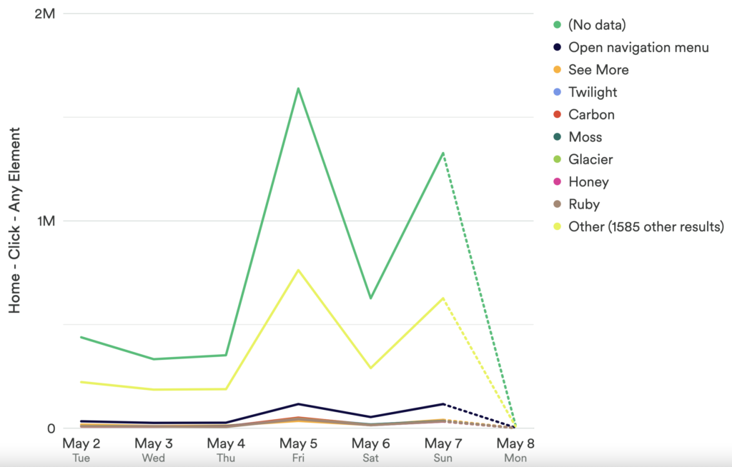
What does this tell you?
If you head into the “table” view, you can organize this list by the total and see clearly which elements have the highest, and lowest, number of interactions. This can be a great starting point to help you identify the most and least-used events.
Which Users Are Doing What?
In this chart, try comparing different user segments. Think about how different user types might interact with your site differently and see if those segments are behaving how you expect.
Segment examples include users with existing accounts, returning users, users who have also interacted with X, admin users, new users, etcetera.
Chart 2: Are users interacting with the elements you want them to interact with the most?
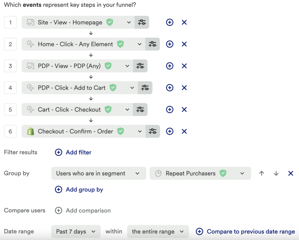
Next, set up a funnel chart with each step in your desired flow. Start with the element you want them to interact with from the Homepage, and end with the desired conversion event that indicates they successfully used the feature.
What does this tell you?
Are users going through the actions you expected them to? Where is there a drop-off?
We recommend using the same segments from chart 1 in this chart.
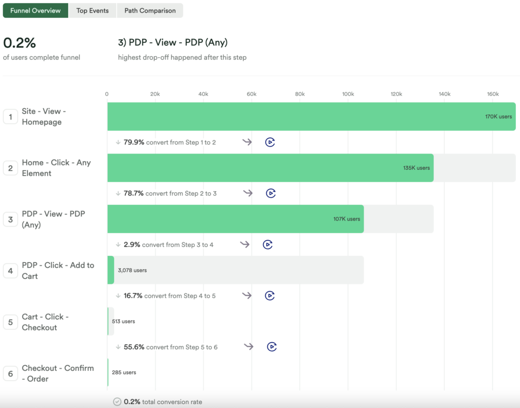
Chart 3: Discover what users are doing instead of your desired funnels
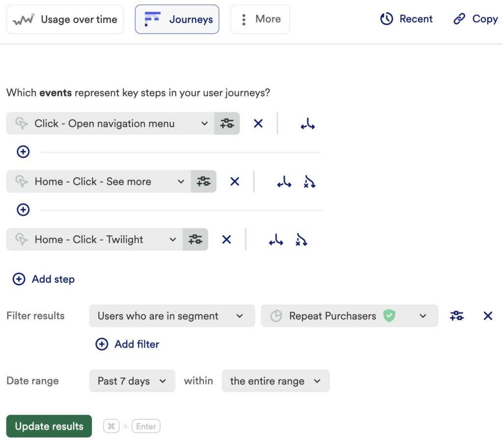
Next, set up a journey chart, and pick the top 3-5 elements from chart 1 that are being interacted with the most to analyze. Be sure to filter by your different user Segments!
What does this tell you?
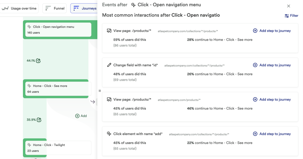
Journeys allow you to explore the most common interactions from your desired step; are your users bouncing from your site, or going somewhere that was not expected? You might discover that users are taking different directions than you would want them to take. Or maybe you find that users who are converting at a higher rate are also interacting with x.
Play around with Journeys and look at the most and least common paths. You might realize that you need to make changes to your site to better direct your users!
Step 3: Interpret your results and take action
The data uncovered through this series of steps can help identify your user’s specific pain point in your homepage CTAs and understand if there is just too much to interact with. Are there items that you want users to interact with not being clicked on frequently? For things that are being clicked on the most, is there an intended flow? (ex. 6 steps involved, are they doing those 6 steps? Or are they skipping past material?)
This will give you a lot of information on how users are interacting with your homepage and/or different pages on your site. Think about intended flow and conversion beforehand, but then be open to understanding that not all users are going to follow that or think the same way, so accommodate for that by running A/B tests and segmenting users to see if there are navigational patterns among certain user types.
By digging in more and analyzing influence and retention, you also might discover that some material is misleading or not encouraging conversion. This could aid in cleaning up the site by sunsetting material, or moving it to a different location entirely.
Conclusion
Through these series of charts you can gain a better understanding of how your site is viewed by your users without having to conduct a series of interviews to get feedback! This exercise can benefit both product and marketing teams to make necessary adjustments and learn more about how to steer users to get higher conversion rates.