To make the most of this guide, you’ll need a baseline understanding of key concepts like events, charts, and properties. If you are still learning about Heap (meaning those terms don’t mean anything to you), we recommend taking our Hello Heap course or reviewing our Setting Up Heap guide prior to jumping into this guide.
This guide is meant to be used in tandem with one of Heap’s in-app Dashboard templates (linked in step 0). We recommend having the template and this guide open and working through them side-by-side.
If you’re new to analysis in Heap, we recommend reviewing Create Your First Chart, which covers helpful charts 101 info.
Introduction
This dashboard provides a birds-eye view of how users are interacting with your app on iOS, Android, or across multiple platforms. We recommend this as one of your very first Heap dashboards in tandem with Site Overview, since it works with even a few hours of automatically captured data.
Step 0: Open the in-app dashboard template
First things first: Open up the in-app dashboard template (linked directly below this line) so that you can complete these steps side-by-side.
In-app dashboard template: Mobile app overview
Step 1: Define the inputs needed for this dashboard template
To use this dashboard template, you’ll need to select some baseline inputs. In some cases, you’ll have the option to use a default Heap event or property.
If you need to create a new event or property as part of this process, see our guides on creating new events and properties.
Not sure what to put here? See a list of useful events for eCommerce, SaaS, and Financial Services businesses in the Industry Recommendations section of our Getting Started guide.
Step 2: Save your new dashboard
This dashboard will be automatically generated as you select your inputs. To save it for future reference, click the Save dashboard button at the top.
Chart Breakdown
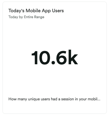
Chart 1: Today’s Mobile App Users
What does it tell you?
This chart shows you how many unique users had a session in your mobile app today.
How to interpet?
When you first create this chart, it’s really about getting a baseline, though we recommend you monitor this over time to ensure that your traffic is growing.
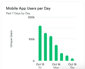
Chart 2: Mobile App Users per Day
What does it tell you?
This chart shows you many users accessed your mobile app each day over the past 7 days.
How to interpet?
You may notice a typical pattern each week, such as a difference in activities on weekdays vs. weekends, or that your traffic peaks on one specific day. Keep an eye on this metric over time to watch for unusual spikes that don’t have an obvious cause (such as a holiday).
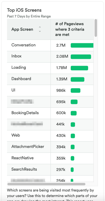
Chart 3: Top iOS Screens
What does it tell you?
This shows you which specific screens are being visited the most frequently in your iOS app.
How to interpet?
Understanding which pages are being viewed the most is key to understanding what your visitors find interesting or helpful. Compare this with your Android app data to see if there are notable differences between the two platforms.
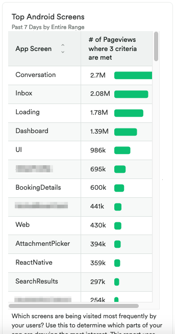
Chart 4: Top Android Screens
What does it tell you?
This shows you which specific screens are being visited the most frequently in your Android app.
How to interpet?
Understanding which pages are being viewed the most is key to understanding what your visitors find interesting or helpful. Compare this with your iOS app data to see if there are notable differences between the two platforms.
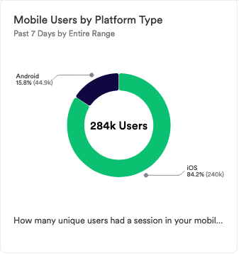
Chart 5: Mobile Users by Platform Type
What does it tell you?
This chart shows how many unique users had a session in your mobile app, segmented by platform.
How to interpet?
Which platform is driving the most traffic? Why might one platform be outperforming another? Depending on how the data aligns with your business goals, you may want to shift resources to investigate app performance further to see if improvements can be made.
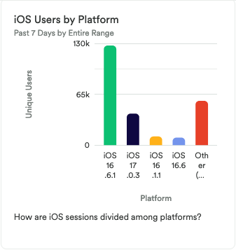
Chart 6: iOS Users by Platform
What does it tell you?
This chart shows how iOS sessions are divided up among iOS platform versions.
How to interpet?
Are you seeing sessions across all platforms that your app is set up to support? Are there any anomalies, such as a dip in sessions for the latest platform? Compare this data to other sources and investigate any unusual differences.
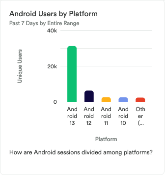
Chart 7: Android Users by Platform
What does it tell you?
This chart shows how Android sessions are divided up among Android platform versions.
How to interpet?
Are you seeing sessions across all platforms that your app is set up to support? Are there any anomalies, such as a dip in sessions for the latest platform? Compare this data to other sources and investigate any unusual differences.
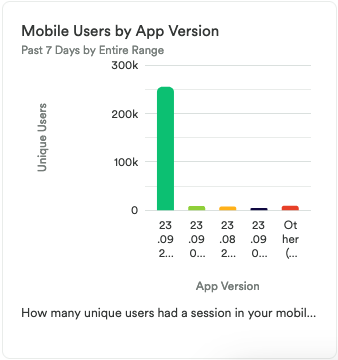
Chart 8: Mobile Users by App Version
What does it tell you?
This chart shows how many unique users had a session in your mobile app, segmented by app verison.
How to interpet?
Are you seeing sessions across all versions that your app is set up to support? Are there any anomalies, such as a dip in sessions for the latest version? Compare this data to other sources and investigate any unusual differences.
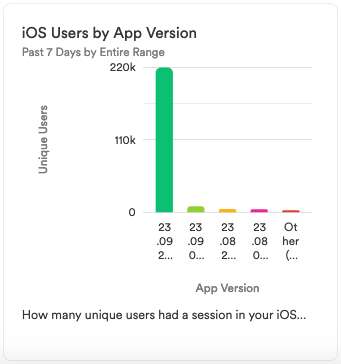
Chart 9: iOS Users by App Version
What does it tell you?
This chart shows how many unique users had a session in your iOS app, segmented by app verison.
How to interpet?
Are you seeing sessions across all versions that your app is set up to support? Are there any anomalies, such as a dip in sessions for the latest version? Compare this data to other sources and investigate any unusual differences.
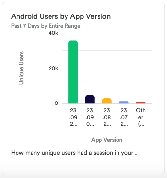
Chart 10: Android Users by App Version
What does it tell you?
This chart shows how many unique users had a session in your Android app, segmented by app verison.
How to interpet?
Are you seeing sessions across all versions that your app is set up to support? Are there any anomalies, such as a dip in sessions for the latest version? Compare this data to other sources and investigate any unusual differences.
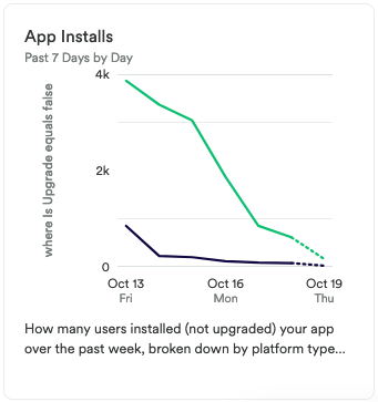
Chart 11: App Installs
What does it tell you?
This chart shows how many users installed (not upgraded) your app over the past 6 days, segmented by platform and day.
How to interpet?
If this number is going up, then great, it means you are getting more traffic. If you see a spike, try to figure out what caused it. Being able to replicate this success in the future can have a meaningful impact on your business.
If you do notice a downward trend, try to dig deeper into that platform, version, or user type to see if there’s a correlation to the drop in installations.
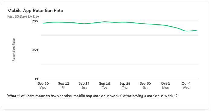
Chart 12: Mobile App Retention Rate
What does it tell you?
This chart shows what percent of users returned to have another mobile app session within a week of having a different session, over the past 30 days.
How to interpet?
This chart provides insight into whether your mobile users are coming back over time. Depending on the nature of your app, you may have more monthly users than daily users, or more daily users than weekly users, or some other variation of this. Compare this data to your expectations for user activity over time based on your business goals.
This chart can be an indicator of how much value your users are getting from your tool. Having a low ratio of weekly active users compared to monthly active users may be standard or expected for you, and therefore normal, but for others, it could mean that your product is not resonating with your audience.
Step 3: Take action
This dashboard contains metrics you’ll want to look at to decide where you want to focus in your mobile engagement efforts. While most of this data is high-level, it can give you a good overview of your traffic and how users are interacting with your app across different platforms and versions.
Where do you think you can find the most leverage with acquiring new users? Experiment with changing your UX, augmenting your content strategy, and learning from the insights here. Try to uncover what caused the change as replicating that could be key to your success.
Then, keep measuring! This is an iterative process. Get the data, look for insights, take action, then go back to the data to measure the results of your work!