To make the most of this guide, you’ll need a baseline understanding of key concepts like events, charts, and properties. If you are still learning about Heap (meaning those terms don’t mean anything to you), we recommend taking our Hello Heap course or reviewing our Setting Up Heap guide prior to jumping into this guide.
Introduction
Heap can help you definitively understand what customers are searching for. This can give you a full picture of what your customers are interested in and can even highlight potential areas for expansion.
If you’re new to analysis in Heap, we recommend reviewing Create Your First Chart, which covers helpful charts 101 info.
Step 1: Add purchase data and appropriate snapshots to Heap
Make sure your purchase data is being sent to Heap. Along with your purchase event, any information that is being captured about products/categories should be sent into Heap as well, like “product name”. In the screenshots below, you’ll notice we used the Shopify integration.
Be sure to prioritize setting up any Snapshots that you may want to have to capture product/category details, as Snapshots are not retroactive and will only collect data upon creation.
Step 2: Analyze your features!
Chart 1: Product demand over time
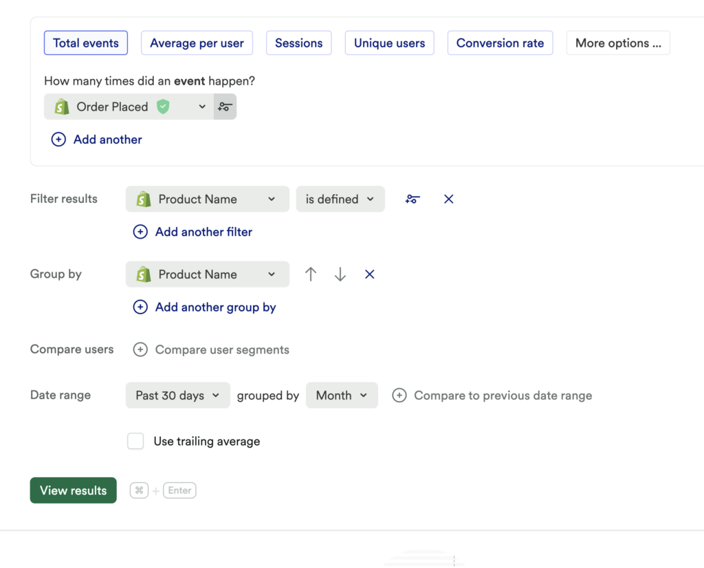
To start, set up a usage over time chart to measure a count of Order Placed. Add the following conditions to the chart:
- Add a filter for Product Name is Defined
- Add a group by Product Name
- Add a comparison to see previous periods

What does this tell you?
Which products are purchased most frequently, compared by week, month, and year?
Order Placed Event
If you have a custom purchase event you’re sending into Heap, that would be an ideal thing to use here, as opposed to an autocaptured ‘place order’ button.
Chart 2: Product interest over time
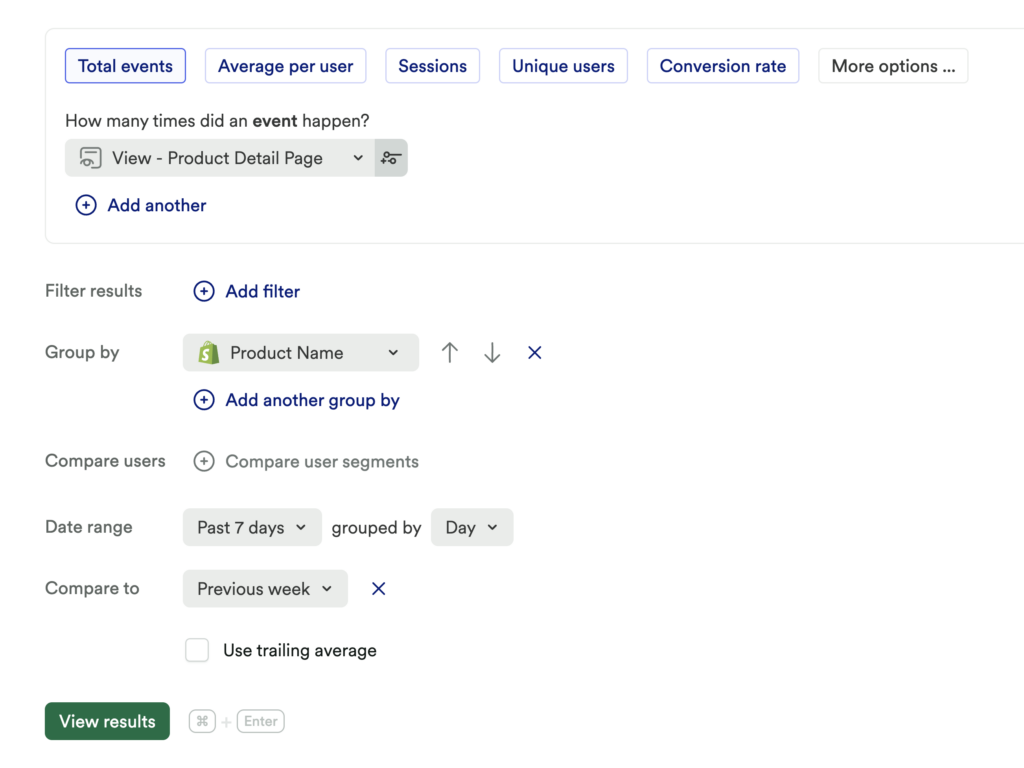
Set up another usage over time chart for a count of View Product Detail Page. Add the following conditions:
- Group By Product Name or Title
- Comparison to see previous periods

What does this tell you?
Which products are viewed most frequently, compared by week, month, and year?
Chart 3: Product searches over time
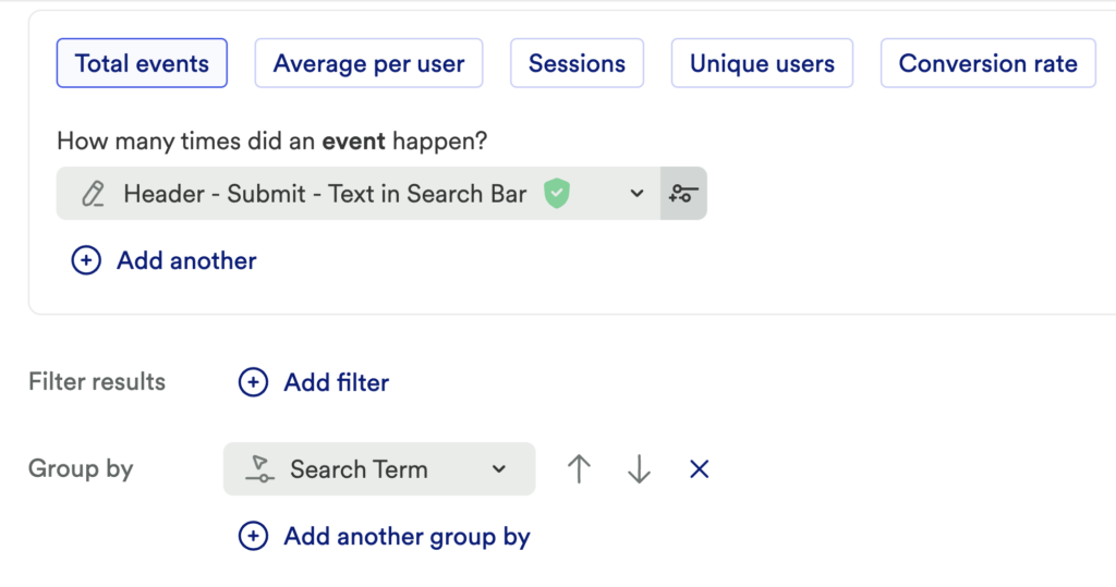
If you have a snapshot that captures search terms, you can set up a usage over time chart to measure the count of Use Search Bar. Then, add a group by for the Search Term snapshot.

What does this tell you?
Examine baselines and draw a hypothesis. For example, is there a significant drop-off? Which products are searched most frequently, compared by week, month, and year?
To specifically see what are the most common search terms with no results, check out our note below. This chart provides insights into customers’ needs/wants that may not be currently available. Is there a particular product that has received a large number of unique searches?
Have a “Search Results” Page?
Depending on how your site is configured, if you have a dedicated “Search Result” page, we recommend looking at a count of your “search results” page instead of “Use Search Bar” as stated above. This would provide more clarity on search terms with no results.
Step 3: Interpret your results and take action
Knowing what your most searched-for items are can help you optimize marketing spend by focusing on your most in-demand products, which can help the product team prioritize more prominent placement of certain items on your site. You could even encourage customers to purchase the most searched-for items by including them as an “add-on” in checkout. Have you uncovered a common search term that does not have a result? This can inform product expansion decisions.
Conclusion
Understanding patterns in search terms can have a domino effect on the success of your business. Know which products are searched the most so they can be more prominently placed on your site, or even discover common search terms that produce no results…and expand your business!