To make the most of this guide, you’ll need a baseline understanding of key concepts like events, charts, and properties. If you are still learning about Heap (meaning those terms don’t mean anything to you), we recommend taking our Hello Heap course or reviewing our Setting Up Heap guide prior to jumping into this guide.
This guide is meant to be used in tandem with one of Heap’s in-app Dashboard templates (linked in step 0). We recommend having the template and this guide open and working through them side-by-side.
If you’re new to analysis in Heap, we recommend reviewing Create Your First Chart, which covers helpful charts 101 info.
Introduction
Use this guide to gain a better understanding of how your blog is performing, including conversion, search engagement, shares on other platforms, and more.
Step 0: Open the in-app dashboard template
First things first: Open up the in-app dashboard template (linked directly below this line) so that you can complete these steps side-by-side.
In-app dashboard template: Blog performance
Step 1: Define the inputs needed for this dashboard template
To use this dashboard template, you’ll need to select some baseline inputs. In some cases, you’ll have the option to use a default Heap event or property.
If you need to create a new event or property as part of this process, see our guides on creating new events and properties.
Not sure what to put here? See a list of useful events for eCommerce, SaaS, and Financial Services businesses in the Industry Recommendations section of our Getting Started guide.
| Name | Description |
| Share blog | An event that captures when a user organically shares a blog post (e.g. by clicking a share button) |
| Subscribe to blog | An event that captures when a user successfully subscribes to a blog (e.g. to receive e-mail updates) |
| View any blog post | An event that captures all page views on blog content aimed at generating organic site traffic and/or sign-ups. |
| Conversion | An event that tracks completion of a goal event (purchase, sign up, etc.) |
| Execute blog search | An event that captures when a user searches for content within your blog |
| Blog search term | A property on the Execute Blog Search event that captures the text entered when searching on your blog |
| Click blog search result | An event that captures when a user clicks on a result from a blog search |
Step 2: Save your new dashboard
This dashboard will be automatically generated as you select your inputs. To save it for future reference, click the Save dashboard button at the top.
Chart Breakdown
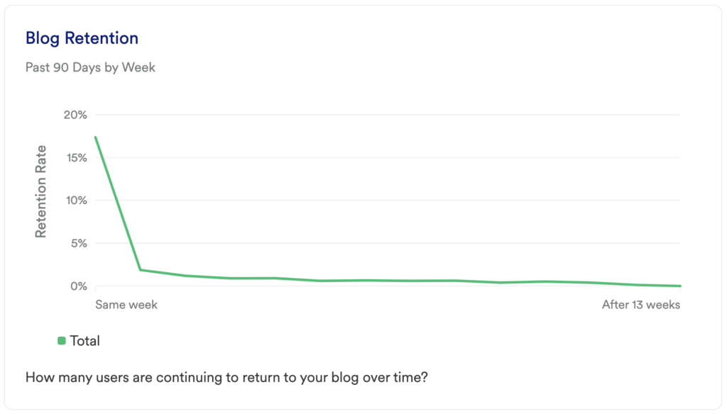
Chart 1: Blog Retention
What does it tell you?
How many users are continuing to return to your blog over time?
How to interpret?
If you see a large dip at the start of your chart, don’t panic! This is normal, especially as users are becoming acquainted with your blog. The key here is seeing improvement over time and to have an upwards trend after any initial fall off.
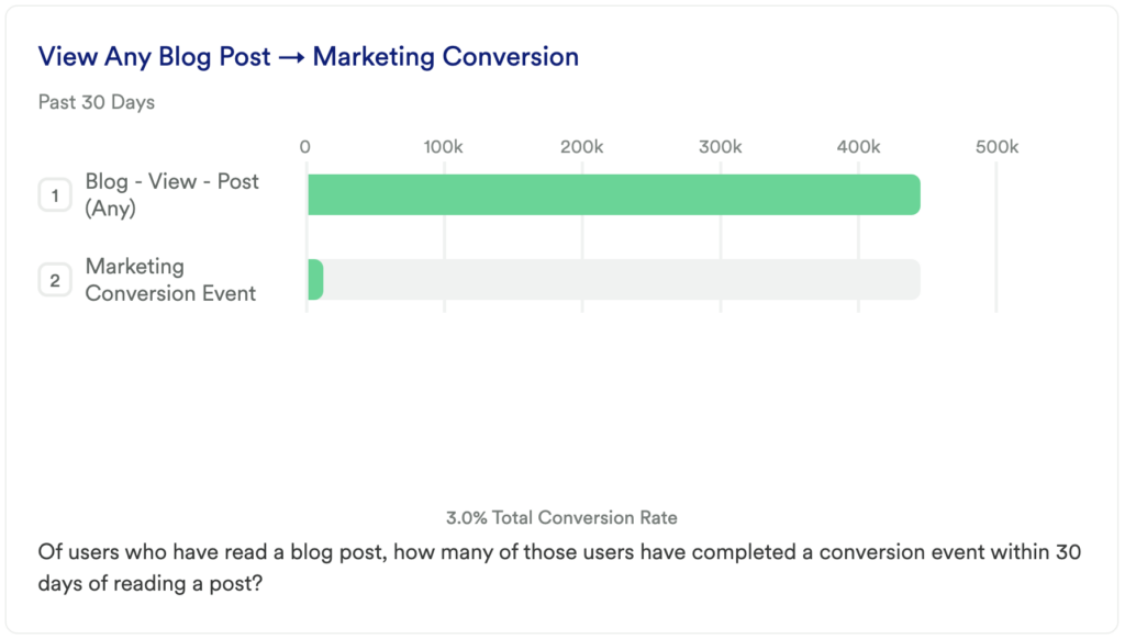
Chart 2: View Any Blog Post -> Marketing Conversion
What does it tell you?
Of users who have read a blog post, how many of those users have completed a conversion event within 30 days of reading a post?
How to interpret?
This will help you identify the impact your blog has on your desired conversion event. If there is a high drop-off, it might be time to revisit the CTA on your blog posts. If the drop-off rate is low, then great! Try running some additional A/B tests to continue optimizing this funnel.
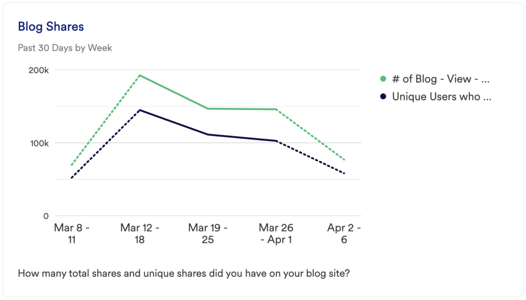
Chart 3: Blog Shares
What does it tell you?
How many total shares and unique shares did you have on your blog site?
How to interpret?
Unique terms may help you to add tags to existing posts or to inspire new content ideas.
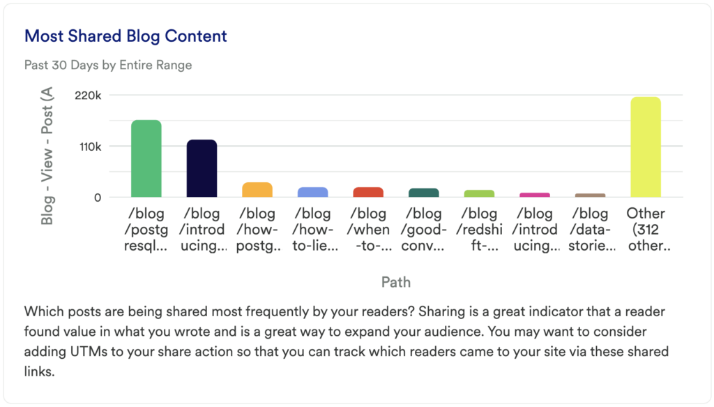
Chart 4: Most Shared Blog Content
What does it tell you?
Which posts are being shared most frequently by your readers?
How to interpret?
Sharing is a great indicator that a reader found value in what you wrote and is a great way to expand your audience. You may want to consider adding UTMs to your share action so that you can track which readers came to your site via these shared links.
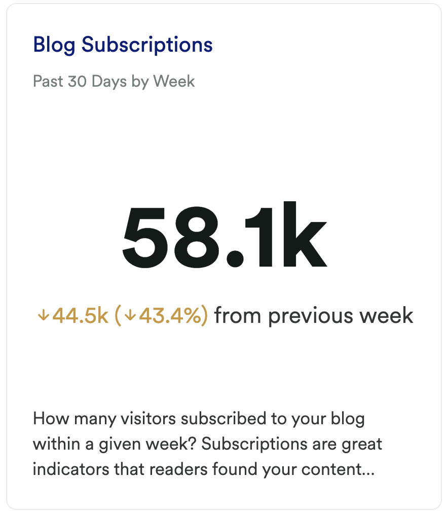
Chart 5: Blog Subscriptions
What does it tell you?
How many visitors subscribed to your blog within a given week?
How to interpret?
Subscriptions are great indicators that readers found your content valuable.
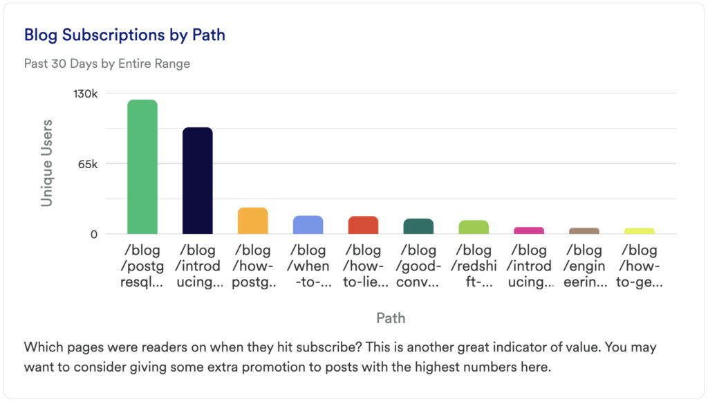
Chart 6: Blog Subscriptions by Path
What does it tell you?
Which pages were readers on when they hit subscribe?
How to interpret?
This is another great indicator of value. You may want to consider giving some extra promotion to posts with the highest numbers here.
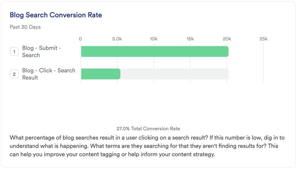
Chart 7: Blog Search Conversion Rate
What does it tell you?
What percentage of blog searches result in a user clicking on a search result?
How to interpret?
If this number is low, dig in to understand what is happening. What terms are they searching for that they aren’t finding results for? This can help you improve your content tagging or help inform your content strategy.
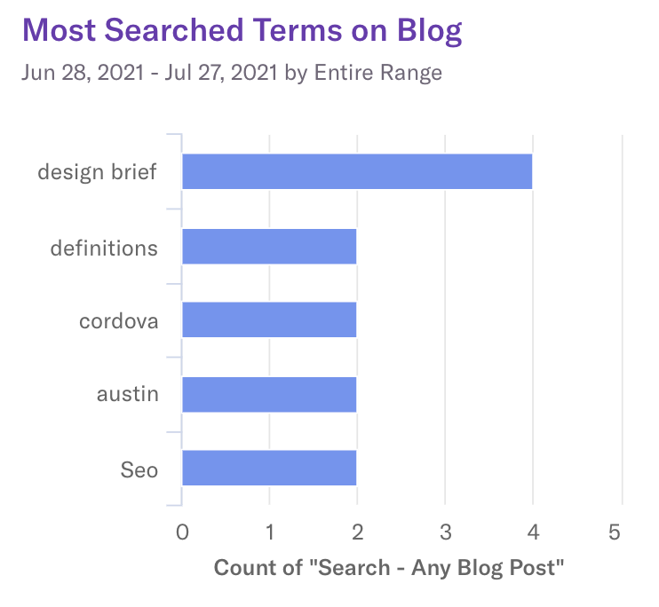
Chart 8: Most Searched Terms on Blog
What does it tell you?
Shows you the top terms being searched for in the blog.
How to interpret?
Unique terms may help you to add tags to existing posts or to inspire new content ideas.
Step 3: Take action
This series of reports can help you determine which parts of your blog are performing the best. Knowing what content is being shared and what content is leading to your key conversion event gives you an opportunity to double down on the most impactful content.
In conclusion
This simple series of queries in Heap can quickly give you the insights you need to allocate efforts to the content that actually leads to customer acquisition.