To make the most of this guide, you’ll need a baseline understanding of key concepts like events, charts, and properties. If you are still learning about Heap (meaning those terms don’t mean anything to you), we recommend taking our Hello Heap course or reviewing our Setting Up Heap guide prior to jumping into this guide.
This guide is meant to be used in tandem with one of Heap’s in-app Dashboard templates (linked in step 0). We recommend having the template and this guide open and working through them side-by-side.
If you’re new to analysis in Heap, we recommend reviewing Create Your First Chart, which covers helpful charts 101 info.
Introduction
User happiness is a critical component in the success of any business. In order to see long-term success, you need to understand promoters, passives, and detractors of your product and see their comments at a glance.
Step 0: Open the in-app dashboard template
First things first: Open up the in-app dashboard template (linked directly below this line) so that you can complete these steps side-by-side.
In-app dashboard template: NPS overview
Step 1: Define the inputs needed for this dashboard template
To use this dashboard template, you’ll need to select some baseline inputs. In some cases, you’ll have the option to use a default Heap event or property.
If you need to create a new event or property as part of this process, see our guides on creating new events and properties.
Not sure what to put here? See a list of useful events for eCommerce, SaaS, and Financial Services businesses in the Industry Recommendations section of our Getting Started guide.
| Name | Description |
| Active usage | An event that you use to define an active user when counting daily/weekly/monthly active users (choose “Session” if you define an active user as any visitor) |
| NPS response | An event that captures a submission of a single NPS survey response, including a score (between 1-10) and any comments |
| Promoter score | A property that captures the answer to “how likely are you to recommend this product?” on a scale from 1 to 10. This is usually a property of an NPS Response |
| NPS comments | A property that captures any open feedback provided in an NPS survey |
Step 2: Save your new dashboard
This dashboard will be automatically generated as you select your inputs. To save it for future reference, click the Save dashboard button at the top.
Chart Breakdown
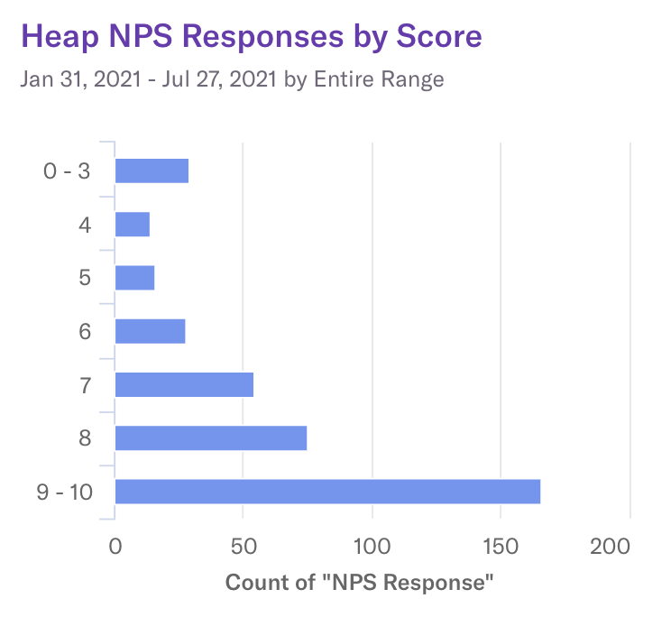
Chart 1: Heap NPS Responses by Score
What does it tell you?
What NPS scores are users submitting via surveys?
How to interpret?
This chart will provide you with a baseline understanding of how happy your existing customers are. This chart, in conjunction with the following charts in this guide, will give you an understanding of how your users are feeling overall.
Chart 2: Detractor -> Promoter

What does it tell you?
How many users are going from ‘detractor’ to ‘promoter’?
How to interpret?
We never like to see a detractor, so this chart allows you to see if your efforts to improve user experience, whatever those efforts may be, are having an impact on those users who once submitted a detractor NPS score.
In this funnel, you will want to see a low drop-off rate. Low drop-off indicates users who were detractors are no longer detractors; meaning your efforts are working!
Chart 3: Promoter -> Detractor
What does it tell you?

How many users are going from ‘promoter’ to ‘detractor’?
How to interpret?
This chart allows you to see if users are finding continued value and happiness with your product. In this funnel, you will want to see a high drop-off rate. A high drop-off indicates users are not going from a Promoter score to a Detractor score.
Chart 4: # Users Surveyed

What does it tell you?
How many users were surveyed?
How to interpret?
This provides you with a baseline of how engaged users are by letting you know how many of them have provided you with an NPS response. Understanding this in relation to the scores you receive can be helpful; you need a reasonable sample size to interpret data!
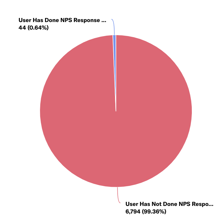
Chart 5: % Users Surveyed
What does it tell you?
What % of active users were surveyed?
How to interpret?
Like the previous chart, this helps you understand your NPS score at a baseline level. What percentage of users have responded? Again, sample size is important, especially when it comes to making major changes to your app or processes.
Chart 6: Promoters

What does it tell you?
How many promoters are submitting an NPS survey?
How to interpret?
Once you know how many users completed an NPS survey, and what percentage of active users submitted a survey you will want to dig into the breakdown of promoter scores.
We recommend grouping by account or user information, any relevant segments, and more to fully understand who these ‘happy’ users are, and determine what can be repeatable for others.
Chart 7: Passive

What does it tell you?
How many passives are submitting an NPS survey?
How to interpret?
Again, dig into who these users are. Are there any commonalities in behavior and usage? Is there anything these users are not doing that the Promoters are? This chart provides you with a great starting point to do deeper investigating.
Chart 8: Detractors

What does it tell you?
How many detractors are submitting an NPS survey?
How to interpret?
Like the two previous charts, dig into who these users are. Are there any commonalities in behavior and usage? Is there anything these users are not doing that the Promoters are? This chart provides you with a great starting point to do deeper investigating.
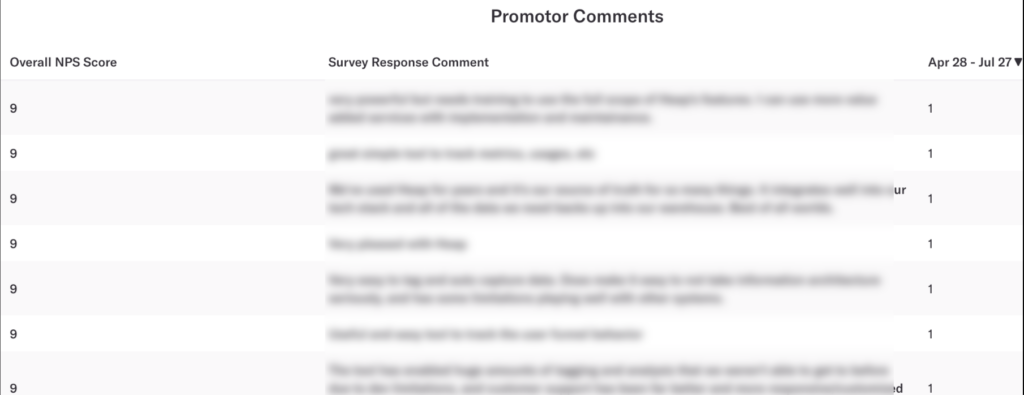
Chart 9: Promotor Comments
What does it tell you?
What comments are promotors leaving?
How to interpret?
This provides you with a quick and condensed view of Promotor responses.
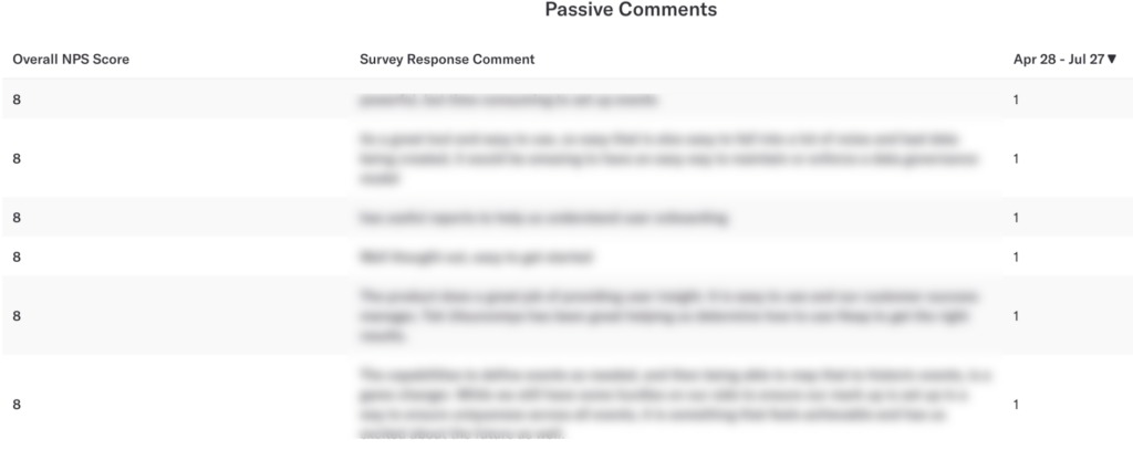
Chart 10: Passive Comments
What does it tell you?
What comments are passives leaving?
How to interpret?
This provides you with a quick and condensed view of Passive responses.
Chart 11: Detractor Comments
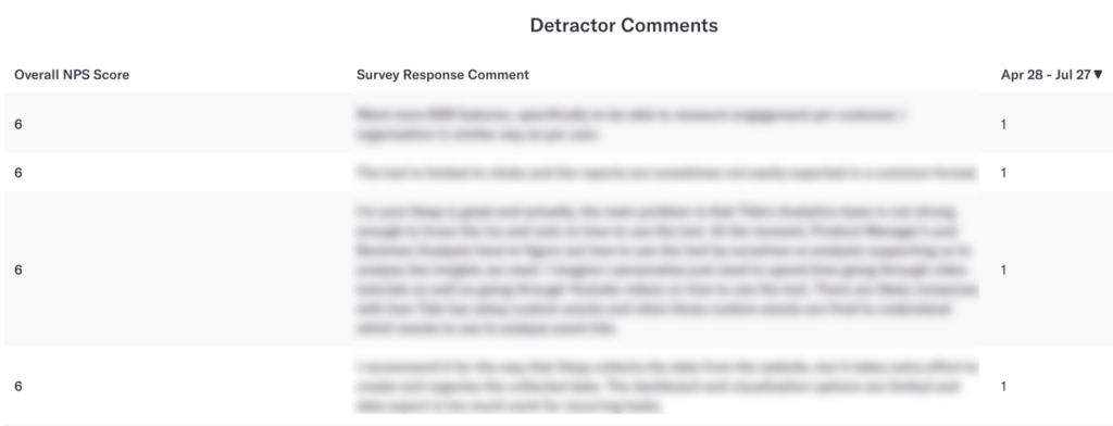
What does it tell you?
What comments are detractors leaving?
How to interpret?
This provides you with a quick and condensed view of Detractor responses.
Step 3: Take action
Understanding if you are retaining users, and what delights users, are difficult tasks to take on, but are essential for any team. This dashboard gets you started and can help you identify how happy your users are.
Take the findings from here and do additional research on each of these segments of users. Who are the Promotors; are they performing actions Detractors aren’t performing; are there any user segments that are more or less successful? Understanding who these high NPS score users are will allow you to surface repeatable behaviors that can be encouraged among low NPS score users.
Then, keep measuring! This is an iterative process. Get the data, look for insights, take action, then go back to the data to measure the results of your work!
In conclusion
It’s common to spend a majority of resources acquiring new customers, but what about retaining the customers you already have? It’s important to find out what makes your most successful users keep coming back. Using data to inform your strategy is another important step to ensuring that you grow your business.