To make the most of this guide, you’ll need a baseline understanding of key concepts like events, charts, and properties. If you are still learning about Heap (meaning those terms don’t mean anything to you), we recommend taking our Hello Heap course or reviewing our Setting Up Heap guide prior to jumping into this guide.
This guide is meant to be used in tandem with one of Heap’s in-app Dashboard templates (linked in step 0). We recommend having the template and this guide open and working through them side-by-side.
If you’re new to analysis in Heap, we recommend reviewing Create Your First Chart, which covers helpful charts 101 info.
Introduction
Using promotional codes to improve conversion? Use this dashboard to understand the impact of your promotions, which promotions are top performers, and more.
Step 0: Open the in-app dashboard template
First things first: Open up the in-app dashboard template (linked directly below this line) so that you can complete these steps side-by-side.
In-app dashboard template: Promotion engagement & impact
Step 1: Define the inputs needed for this dashboard template
To use this dashboard template, you’ll need to select some baseline inputs. In some cases, you’ll have the option to use a default Heap event or property.
If you need to create a new event or property as part of this process, see our guides on creating new events and properties.
Not sure what to put here? See a list of useful events for eCommerce, SaaS, and Financial Services businesses in the Industry Recommendations section of our Getting Started guide.
| Name | Description |
| Apply promotion | An event that captures when a user applies a promotion before purchasing, with an included property identifying which promotion was applied |
| Order | An event that captures confirmation of a completed order, with an included property for the total price of the order. |
| Total discounts | A property on the “Order” event that captures the total discounts applied to the order |
| Total price | A property on the “Order” event that captures the total price of the order |
| Discount codes | A property on the “Order” event that captures the discount codes applied to the order |
Step 2: Save your new dashboard
This dashboard will be automatically generated as you select your inputs. To save it for future reference, click the Save dashboard button at the top.
Chart Breakdown
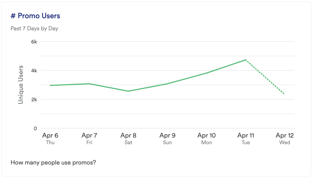
Chart 1: # Promo Users
What does it tell you?
How many people use promos?
How to interpret?
This chart gives you a baseline understanding of how many individual visitors use a promo code over a week. Compare this to previous weeks to see if there is any fluctuation in usage, and determine if you need to make your promo codes more discoverable.
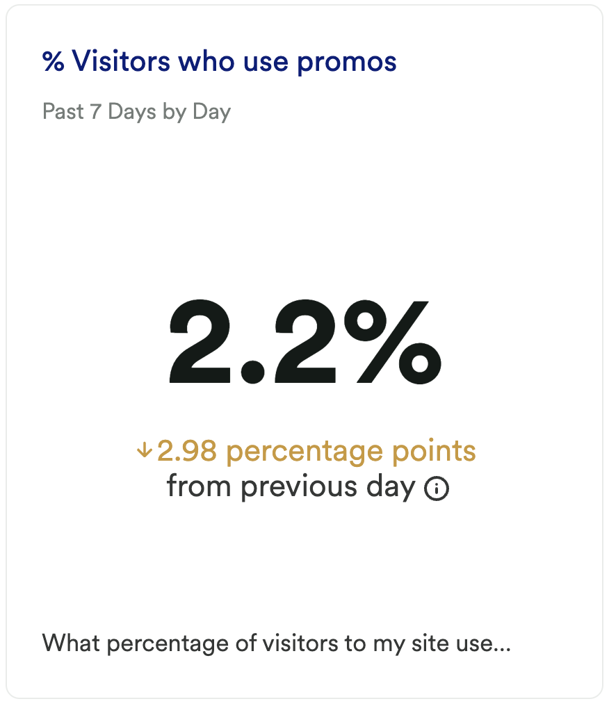
Chart 2: % Visitors who Use Promos
What does it tell you?
What % of visitors to my site use promos?
How to interpret?
Of the individual visitors, what percentage of them use promo codes? If this number is going up, then great, it means you are getting more purchases from promo users. If you see a spike try to figure out what caused it.
Tip: Try grouping by Marketing Channel or Landing Page to see if you can uncover the cause of the change.
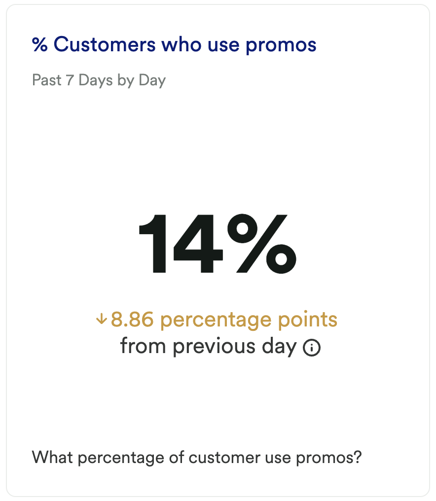
Chart 3: % Customers who Use Promos
What does it tell you?
What % of customers use promos?
How to interpret?
As opposed to the previous chart where you looked at how many visitors used a code, this chart will tell you how many customers, or buyers, used a promo code. Again, try to see what causes any spikes or dips in this; being able to replicate this success in the future can have a meaningful impact on your business.
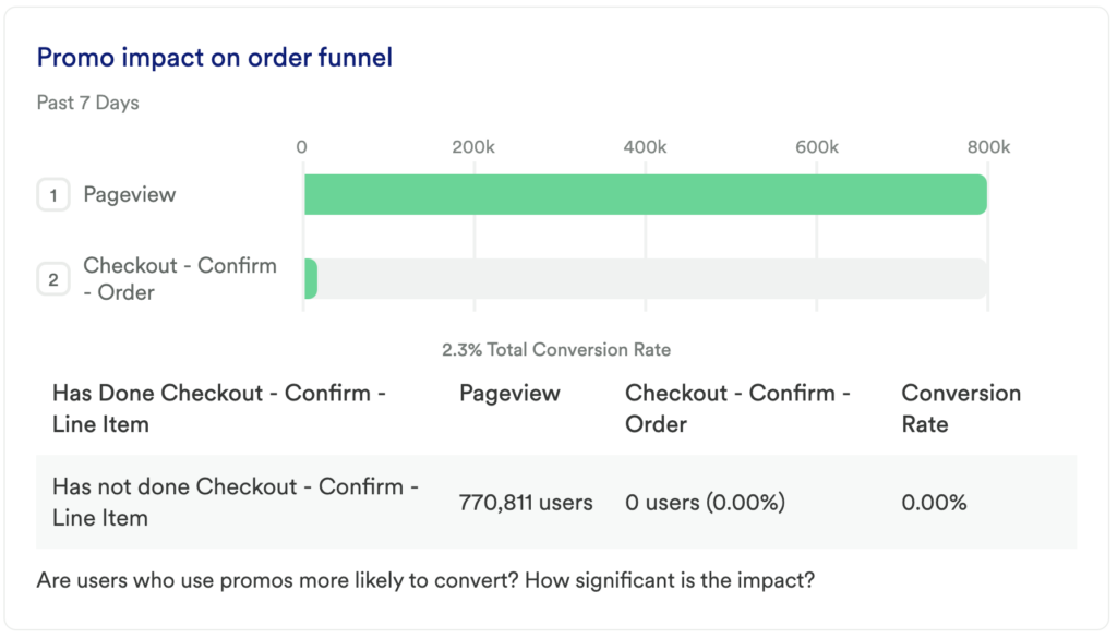
Chart 4: Promo Impact on Order Funnel
What does it tell you?
Are users who use promos more likely to convert? How significant is the impact?
How to interpret?
Take a look at the “group analysis” on this chart. If you are seeing a noticeable difference in conversion, this is worth investigating. If those who have used a promo have a higher conversion rate, it is worth making your promo codes more prominent.
Feel free to experiment here! Try encouraging promo code usage on the homepage, add it to marketing campaigns, include promo options in the checkout process, and more.
Chart 5: Total Discounts
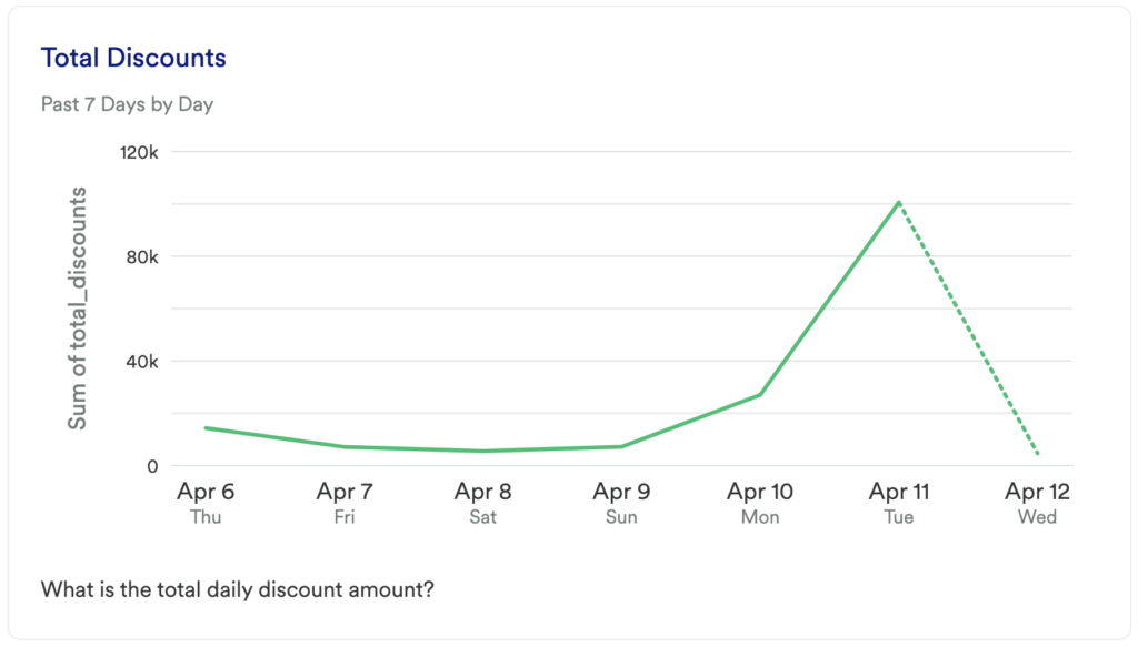
What does it tell you?
What is the total daily discount amount?
How to interpret?
How much are your users saving each day? This can be a great way to see if users are spending more because they have a promo code.
Chart 6: % Discounts / Revenue
What does it tell you?
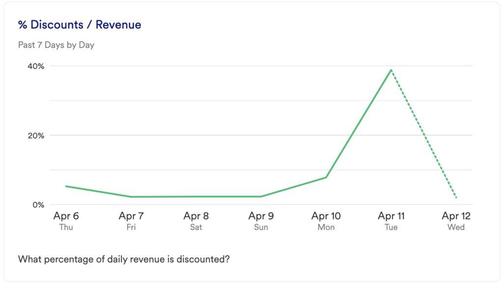
What is the % of daily revenue that is discounted?
How to interpret?
This is something to monitor especially during sale events – are your sales encouraging users to spend more? Understanding if users are consistently spending more during sales can even be a way to determine if pricing should be adjusted for your products.
Additionally, this is a great way to gauge how frequently your company can afford to offer promo codes, and how large the discounts can be.
Chart 7: Top Promotions
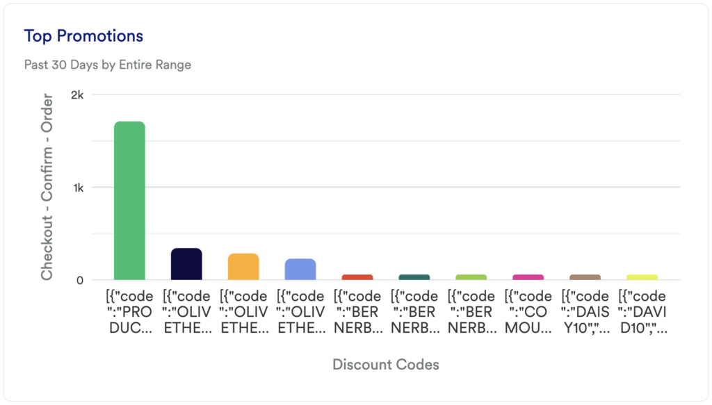
What does it tell you?
Which promo codes are being used the most?
How to interpret?
This chart will help you understand which promo codes are being used most frequently; providing you with the insight you need to double down on some codes, and sunset others.
Step 3: Take action
This dashboard contains the metrics you’ll want to look at to decide how you want to focus your promo efforts. While most of this data is high-level it can give you a good overview of the overall impact. Are some promos being used more than others? Are discounts tied more to sales events rather than promo codes?
Try to uncover what is encouraging users to ultimately convert, as replicating that will be key to your success.
In conclusion
If you’re just starting out with analytics, you’ll want to understand your promo code performance and impact, and this template will help you to do just that.