To make the most of this guide, you’ll need a baseline understanding of key concepts like events, charts, and properties. If you are still learning about Heap (meaning those terms don’t mean anything to you), we recommend taking our Hello Heap course or reviewing our Setting Up Heap guide prior to jumping into this guide.
Introduction
This guide covers how to define what “activation” means for you and analyze it, allowing you to optimize your activation funnel and reduce friction.
Reducing friction in an onboarding or activation funnel can have a lasting impact on retention. If there is a minimal, or even nonexistent barrier to entry, the likelihood of someone continuing to use your tool or product increases exponentially.
If you’re new to analysis in Heap, we recommend reviewing Create Your First Chart, which covers helpful charts 101 info.
Step 1: Determine what “Activation” means for you
The word “activation” can mean a lot of different things to different people – even in the same company! Simply put, activation is when users find that ‘ah-ha’ moment.
Your aha moment is a metric that happens early on, is done quickly, and which shows that users are starting to get value out of your tool.
A few examples to help guide you:
- Adding 7 friends in 10 days on Facebook
- Following 30 users in 7 days on Twitter
- Getting your question answered in Quora
This will be different in every product, so it’s important to figure out what yours is so you can monitor it in Heap.
Step 2: Analyze your feature!
Now it’s time to analyze your activation feature. We will cover how to understand general usage AND identify where drop-off is occurring in your activation flow.
Chart 1: Activation Funnel
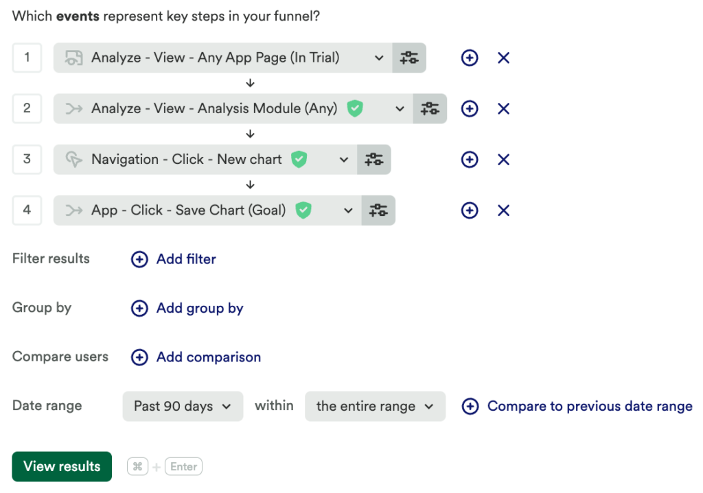
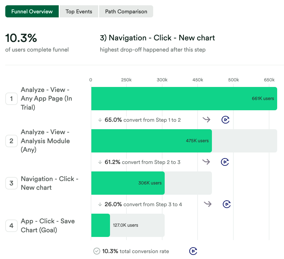
To identify the conversion rate of your Activation event, Create a funnel chart that includes each high-level step in your desired flow leading to your Activation Event.
We recommend starting with high-level milestone events, like Pageviews. Chart #3 in this guide will show off how to analyze a more detailed funnel.

What does this tell you?
From this funnel, you can identify major drop-off points. If there are multiple major drop-off points, narrow your focus by analyzing the largest drop first.

Chart 2: Activation Funnel with Journeys from this step
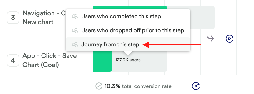
To discover what users are doing instead of your desired funnel, in this funnel, click on the step that has the largest drop and click Journey from this Step. Be sure to click into a step that has a drop-off after.

Chart 3: Journeys chart with journeys from this step
To see pageviews from this step, add steps to the journeys chart linked in the last step.
What does this tell you?
Journeys allows you to see what users are doing from your desired step; are your users bouncing from your site, or going somewhere that was not expected? This chart can also help you understand if you need to define more events.
Chart 4: Analyze a more detailed funnel
Once you have used the journey chart to discover what users are doing instead of your desired steps, and you have defined more granular events based on that journey chart, you’ll want to analyze your funnel again.
This time we recommend adding more steps to your funnel, including anything you may have identified as common steps from your Journey analysis.
What does this tell you?
This chart can give you a more precise understanding of how users are making it through your desired activation steps, where there might be confusion, or any other indicators of lack of interest – ultimately impacting adoption and long-term retention.
Step 3: Interpret your results and take action
The data uncovered through this series of steps can help identify your user’s specific pain point in the activation funnel. If you are still seeing a large drop-off in the final funnel, it is important to determine a new solution to mitigate drop-off and implement it. Use this same series of steps to test your new solution!
Conclusion
Retain and delight customers by making the activation experience simple and seamless. We never forget a first impression!