To make the most of this guide, you’ll need a baseline understanding of key concepts like events, charts, and properties. If you are still learning about Heap (meaning those terms don’t mean anything to you), we recommend taking our Hello Heap course or reviewing our Setting Up Heap guide prior to jumping into this guide.
This guide is meant to be used in tandem with one of Heap’s in-app Dashboard templates (linked in step 0). We recommend having the template and this guide open and working through them side-by-side.
In-app dashboard template: Retention overview
Use this guide to understand where you should be investing to bring in new users who end up becoming long-term repeat users.
If you’re new to analysis in Heap, we recommend reviewing Create Your First Chart, which covers helpful charts 101 info.
Step 1: Define the inputs needed for this dashboard template
To use this dashboard template, you’ll need to select some baseline inputs. In some cases, you’ll have the option to use a default Heap event or property.
If you need to create a new event or property as part of this process, see our guides on creating new events and properties.
Not sure what to put here? See a list of useful events for eCommerce, SaaS, and Financial Services businesses in the Industry Recommendations section of our Getting Started guide.
| Name | Description |
| Active usage | A user action that you use to define an active user when counting daily/weekly/monthly active users (choose “Session” if you define an active user as any visitor) |
| Marketing channel | A defined property that groups together similar marketing channels (e.g. Email, Display Ads) for a session |
Step 2: Save your new dashboard
This dashboard will be automatically generated as you select your inputs. To save it for future reference, click the Save dashboard button at the top.
Chart Breakdown
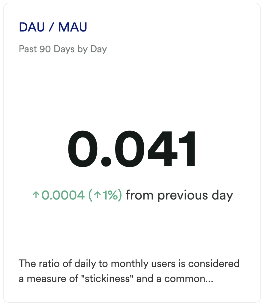
Chart 1: DAU / MAU
What does it tell you?
This chart gives you the ratio of daily to monthly active users. This common KPI indicator can assist in measuring stickiness of your app or site.
How to interpret?
This chart will provide insight into how your users are performing over time, while comparing usage and retention indicators. If you are like most sites, you are going to have way more monthly users than daily users.
However, this can be an indicator of how much value your users are getting from your tool. Are you expecting most users to be active on a daily basis? Having a low ratio of daily active users compared to monthly active users may be standard or expected for you, and therefore normal, but for others, it could mean that your product is not resonating with your audience.
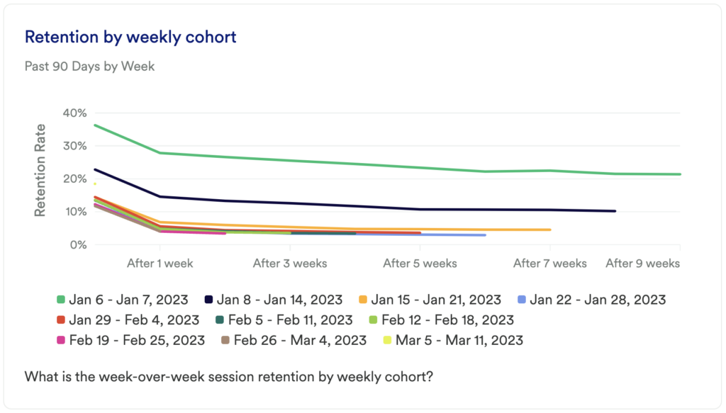
Chart 2: Retention by Weekly Cohort
What does it tell you?
This chart will show you how many of your users continue to return and complete your primary active usage event, broken out by weekly cohorts. It will tell you the frequency with which your users return to complete your desired return event.
How to interpret?
If you see a large dip at the start of your chart, don’t panic! This is normal, especially as users are becoming acquainted with your tool or site. The key here is seeing improvement over time and to have an upwards trend after any initial fall-off.
Add a filter to see if any particular user types or segments are more or less likely to be retained.
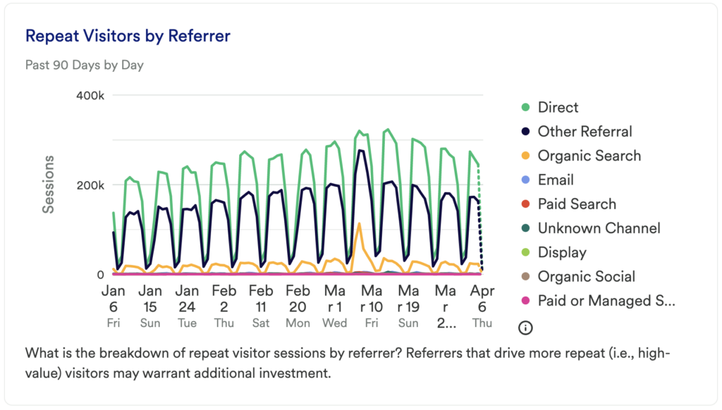
Chart 3: Repeat Visitors by Referrer
What does it tell you?
This chart will tell you where your repeat users are starting their sessions from. Understanding where repeat users are coming from can help provide direction when determining where to invest resources.
How to interpret?
Are there certain referrers that are performing above the rest? Do you notice more users coming in Direct versus a search engine, or even another company domain? Has there been a spike in any of these? Since this chart is looking specifically at high-value visitors, it is worth investigating any spikes, or dips, to leverage that referrer to the fullest extent.
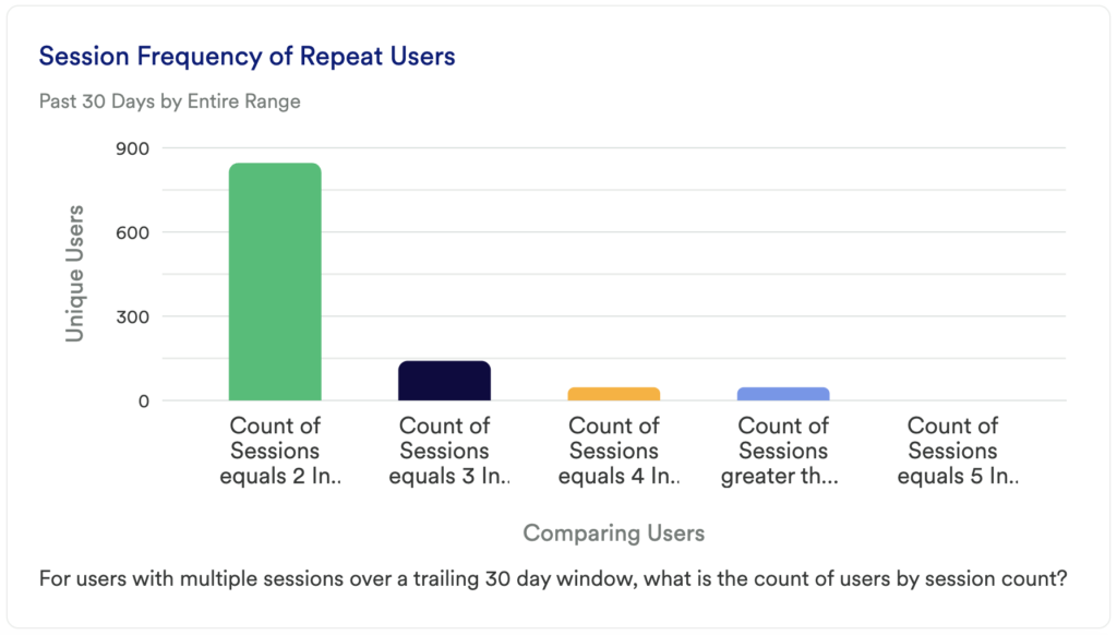
Chart 4: Session Frequency of Repeat Users
What does it tell you?
This chart looks at the number of unique sessions among users who have had multiple sessions per day in a 30-day period. It directly compares user groups based on the number of sessions in a day.
How to interpret?
This chart is intended to show you exactly how active your users are by uncovering how frequently they are visiting in a trailing 30-day period. How many sessions occurred by users who visited 2 times in a day versus how many sessions occurred by users who visited 5 times in a day?
Chart 5: Session Frequency of Repeat Users by Day
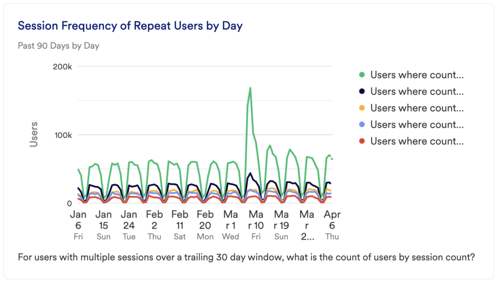
What does it tell you?
Where the previous chart identified the number of sessions repeat users had in a 30-day period, this chart looks at the number of unique users who have had multiple sessions per day in a 30-day period. It directly compares user counts based on the number of sessions they had in a day.
How to interpret?
Use the table chart to identify the number of users who had 2 sessions in a day, and compare that to the number of users who had 5 sessions in a day; all broken out by day. Do you notice any surprising dips or spikes? Do these numbers align with any product changes or marketing efforts?
Chart 6: Repeat Users by Marketing Channel
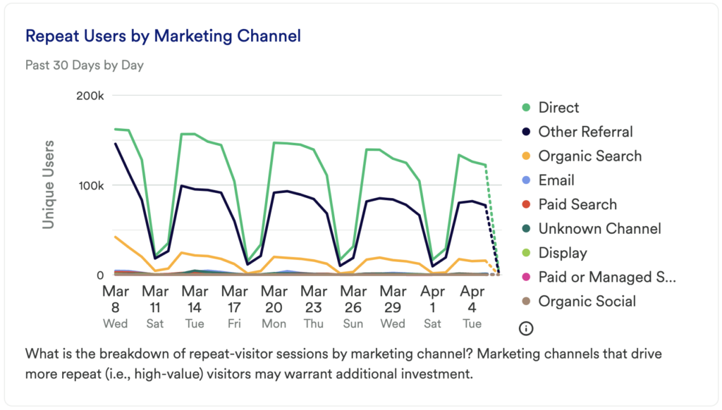
What does it tell you?
This chart will start to tell you which of your marketing channels is driving the majority of your traffic among repeat users.
How to interpret?
Are there certain channels that are performing above the rest? Do you notice a difference between paid channels and organic channels? Is there any clear winner between email, search, or social channels? Was there a spike in any of these?
Before you jump to investing in the channels that are driving the most traffic among your high value users, you’ll also want to look at the impact of your Initial Marketing Channels on conversion rates. Identify any overlap to ensure efforts are focused on channels that drive both high retention and higher conversions.
Step 3: Take action
Understanding if you are retaining users and what drives user retention are big tasks to take on, though they are essential for any product team. This dashboard gets you started and can help you identify, first and foremost, if users are finding value in your product or service by measuring session repeat details.
Take the findings from here and do additional research on these high-value users. Who are they, are they performing actions nonfrequent users aren’t performing, are there any user segments that are more or less successful? Understanding who these high-value users are will allow you to surface repeatable behaviors that can be encouraged among nonfrequent visitors.
Then, keep measuring! This is an iterative process. Get the data, look for insights, take action, then go back to the data to measure the results of your work!
In conclusion
It’s common to spend a majority of resources acquiring new customers, but what about retaining the customers you already have? It’s important to find out what makes your high-value customers keep coming back, and the first step in doing so is identifying the frequency with which your tool or service is being used. Using data to inform your retention strategy is another important step to ensuring that you grow your business.