To make the most of this guide, you’ll need a baseline understanding of key concepts like events, charts, and properties. If you are still learning about Heap (meaning those terms don’t mean anything to you), we recommend taking our Hello Heap course or reviewing our Setting Up Heap guide prior to jumping into this guide.
This guide is meant to be used in tandem with one of Heap’s in-app Dashboard templates (linked in step 0). We recommend having the template and this guide open and working through them side-by-side.
If you’re new to analysis in Heap, we recommend reviewing Create Your First Chart, which covers helpful charts 101 info.
Introduction
Heap can help you definitively understand which of your campaign efforts are having the greatest impact on user retention… and which aren’t, allowing you to be decisive and strategic as you direct your efforts.
Step 0: Open the in-app dashboard template
First things first: Open up the in-app dashboard template (linked directly below this line) so that you can complete these steps side-by-side.
In-app dashboard template: Email performance overview
Step 1: Define the inputs needed for this dashboard template
To use this dashboard template, you’ll need to select some baseline inputs. In some cases, you’ll have the option to use a default Heap event or property.
If you need to create a new event or property as part of this process, see our guides on creating new events and properties.
Not sure what to put here? See a list of useful events for eCommerce, SaaS, and Financial Services businesses in the Industry Recommendations section of our Getting Started guide.
| Name | Description |
| Email opened | An event that captures opening an email from your marketing automation tool |
| Active usage | A user action that you use to define an active user when counting daily/weekly/monthly active users (choose “Session” if you define an active user as any visitor) |
| Conversion | An event that tracks completion of a goal event (purchase, sign up, etc.) |
| Campaign title | A property that captures the name of your email campaigns |
| Email clicked | An event that captures when an email link is clicked |
Step 2: Save your new dashboard
This dashboard will be automatically generated as you select your inputs. To save it for future reference, click the Save dashboard button at the top.
Chart Breakdown
Chart 1: Conversion Rate by Email Campaign
What does it tell you?
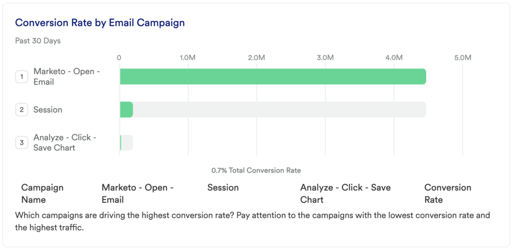
This chart looks at your overall campaign conversion rate. Specifically, this is telling you if the CTAs in your email campaigns are resulting in your desired conversion and active usage events.
How to interpret?
Ideally, you will see a high overall conversion rate. If not, you might consider doing additional digging into your campaigns by leveraging the charts in this dashboard.
Alternatively, you might consider changing the language or CTA in your campaign in order to grab more users. The group by allows you to really see which campaigns are leading to the greatest (or lowest) conversions. Be mindful of the traffic-to-conversion ratio!
Chart 2: Top Opened Emails
What does it tell you?
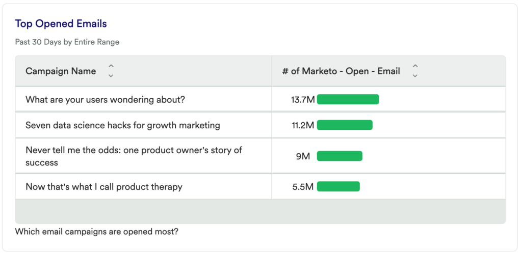
This chart will show you which of your campaigns are interacted with the most, based on opens.
How to interpret?
Specifically, of any campaign that has had an email opened, which campaign is interacted with the most; or least. Of the campaigns you expect to have the most engagement, is the data confirming that hypothesis? Are you surprised by high or low engagement on certain campaigns? Are you noticing and interesting dips or spikes? This chart can help you determine which email campaigns require additional digging and refining!
For long standing campaigns, add a Date Range Comparison to see how this chart changes compared to a previous period.
Chart 3: Impact on Retention (Opens)
What does it tell you?
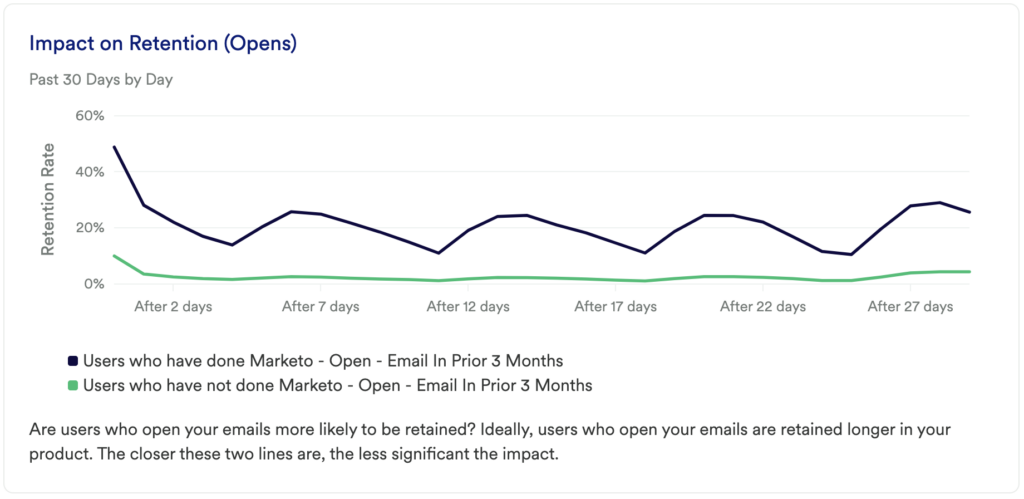
This chart will tell you if the users who open your emails are more likely to complete your desired active usage event and be retained over time.
How to interpret?
This chart shows if users continue returning to complete your active usage event after initial use, and is broken out by whether or not they’ve opened any email. This chart highlights how frequently they return to complete your usage event.
It is common to see a drop-off at the beginning of the line chart as users are getting acquainted with your tool or experimenting. Retention of users is indicated by an upwards tick at the end of the line chart.
If the line continues to go down, that lets us know that users are not finding value and are not returning to complete the desired event, and ultimately are not being retained.
Chart 4: Impact on Retention (Clicks)
What does it tell you?
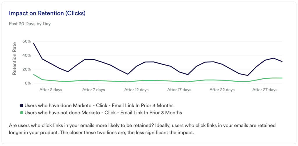
The previous chart showed you if email opens were driving retention, though it’s equally important to understand if any clicks are driving user retention.
How to interpret?
This chart shows if users continue returning to complete your active usage event after initial use, and is broken out by whether or not they’ve interacted with any email via clicks.
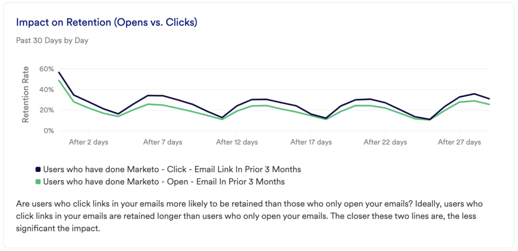
Chart 5: Impact on Retention (Opens vs Clicks)
What does it tell you?
We’ve taken a look at the impact of both opens and clicks on retention, though this is a chance to go deeper into that analysis. Directly compare the impact of opens versus clicks on retention.
How to interpret?
Just like before, you want to understand which is having an impact on retention in order to dig in more. Are those who click the links in your emails more likely to be retained than those who only open the emails?
Step 3: Take action
Surfacing the most relevant and impactful campaigns can be really powerful for a business. Customer communication is a major part of the customer journey – whether the journey is just starting or they have been on it for years!
Dig deeper into the most successful campaigns to see what users are opening and clicking on the most. Is there language that is grabbing your audience? Are there certain segments of users who are more likely to open your emails and ultimately be retained? Try to recreate what is working, and work on or depreciate the content that isn’t working. You might be surprised at what your audience is finding valuable.
Then, keep measuring! This is an iterative process. Get the data, look for insights, take action, then go back to the data to measure the results of your work!
In conclusion
Knowing where to invest time and effort in campaign content can often feel like a guessing game, but Heap allows you to make data-driven decisions. This series of charts allow you to determine which content has the greatest impact on retention, and which campaigns you might even be able to depreciate.