To make the most of this guide, you’ll need a baseline understanding of key concepts like events, charts, and properties. If you are still learning about Heap (meaning those terms don’t mean anything to you), we recommend taking our Hello Heap course or reviewing our Setting Up Heap guide prior to jumping into this guide.
Introduction
Understanding pain points in a customer’s journey is just one aspect of improving usability and adoption. Identifying which features are seldom used, and segmenting users who should be using those features to later target with guides is a powerful way to strategically increase engagement.
If you’re new to analysis in Heap, we recommend reviewing Create Your First Chart, which covers helpful charts 101 info.
Download our guide and worksheet on Measuring Feature Success to give your team an easy-to-use framework to make data-driven product decisions.
Step 1: Identify your Key Features
The word “feature” can mean a lot of different things to different people. Start by identifying the list of features that you actually want to analyze in this exercise. This will help you narrow your focus and give you a list of items to compare.
Additionally, you’ll want to identify the specific events that indicate usage of the feature(s). This will be your Usage Event.
Step 2: Create appropriate Segments
If applicable, create segments of users who you expect to interact with your feature(s) at a higher volume. Learn how to do this via Segments overview.
For example, Admin users may interact more with the setup components of your product, whereas other team members may not interact with setup components at all. Alternatively, users who have not added an item to their cart will likely not click to view their cart.
Step 3: Analyze your features!
Now it’s time to analyze our features. We’ll cover how to understand general usage, AND how to engage with users who have not used your key feature(s).
Chart 1: Total usage of features
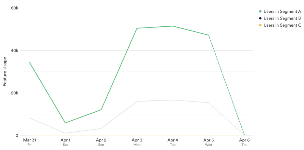
Set up a usage over time chart with a count of your feature usage event, and use Compare Users to compare any segments that are of interest. If you are analyzing multiple usage events, we recommend creating a dashboard.

What does this tell you?
Analyzing overall feature usage allows you to zero in on your unengaged customers. To do this, you will want to analyze the number of times each of your features have been used. We recommend creating a unique chart for each of your features.
This chart, or series of charts will show you overall usage of your key feature(s). Comparing users allows you to understand usage among relevant segments. From here, you can determine which features need the most attention.
Chart 2: Funnel of steps to final Usage Event
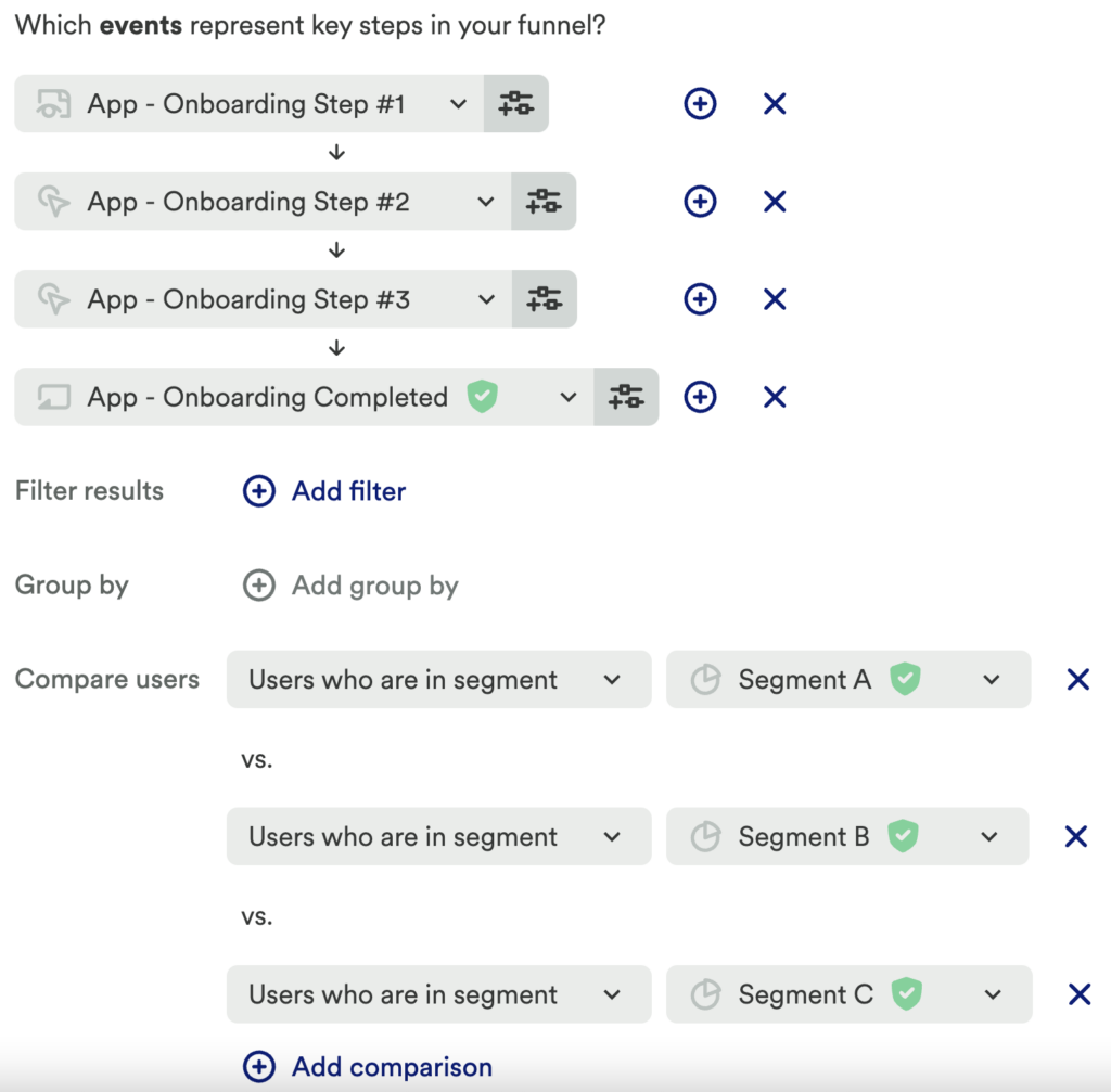
Next, set up a funnel chart where each step represents the steps that users take leading up to the final Usage Event. Add a Compare Users to compare the segments you set up in step 2. We recommend creating a unique funnel for each of your features and collecting them in one dashboard.

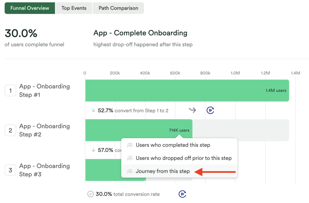
Note any large drop-offs between steps in this funnel.
Chart 3: Analyze journeys from this step
For the steps in your funnel(s) with a large drop-off after, click on that step and select Journey from this step.

What do these tell you?
To fully understand why users may not make it to your determined Usage Event, we recommend this 2-step plan. The funnel chart will allow you to see where there may be drop-off and identify a point of friction. Looking at journeys from this step will help you identify if the point of friction is because of confusion, or if users are exploring your tool (and not making it to the final step in your desired flow).
Step 4: For each underused Key Feature, create segments of unengaged users
To increase usage among those who have not interacted with your key feature(s), you will want to understand who those individuals are. For any feature you would like to improve engagement of, you will need to create a segment of unengaged users for each feature. Use the following structure to create your segments:
Filter: Users who have not done Usage Event in past 30 days
Heap segments can be exported, which makes it easy for you to take action with your unengaged users in another tool. This way, you can create an email cadence aimed at sharing targeted content with these users, or even create an in-app guide. We recommend in-app guides as a great, engaging way to help walk users through a flow! Let’s explore that together below.

Step 5: Import your segment(s) into an in-app guide tool, like Appcues
Targeting just the users in your new segment with an in-app guide allows you to make meaningful suggestions to your users. Heap has direct integrations with Appcues, Chameleon, and Delighted.
To export your segment:
- From your segment(s), click More Analysis on the top right and select Users. From here, you can export this list by using the
icon on the top right.
- Appcues users can go to the Integrations option to send your segment(s) directly into Appcues.
Other In-App Guide Integrations
Appcues is one of Heap’s several native integrations. Check out this integrations guide, or head directly to our Chameleon or Delighted integration guides if you do not have these tools connected to Heap!
Step 6: Outside of Heap: Build your in-app guide
In your User Guide tool, create your in-app guide according to the features and users you have identified.
Step 7: Set your guide live!
Once built and totally customized to your Key Feature(s) and segment(s), set your guide to live! To analyze the impact of your guides, check out our guide Measure In-App Guides.
Take your analysis further and find out who the users are who are doing your usage events. Create a segment of these users to unpack in analysis. Explore and see if you can uncover commonalities – are they all the same type of user or account tier, did they come from the same marketing or referral channels, or maybe they were all exposed to specific parts of your site that your unsuccessful users were not exposed to?
Conclusion
Determining which of your Key Events have low engagement is an important insight. Heap allows you to take it a step further and understand who the unengaged users are. Having this information lets you create hyper-personalized guides to increase adoption and ultimately retention.