To make the most of this guide, you’ll need a baseline understanding of key concepts like events, charts, and properties. If you are still learning about Heap (meaning those terms don’t mean anything to you), we recommend taking our Hello Heap course or reviewing our Setting Up Heap guide prior to jumping into this guide.
Introduction
Understanding what users are doing (or not doing) just before your conversion event provides you with a unique opportunity to optimize your sign-up flow with data backing your every move.
If you’re new to analysis in Heap, we recommend reviewing Create Your First Chart, which covers helpful charts 101 info.
Step 1: Determine what “Conversion” event you wish to monitor
Which conversion event are you hoping to monitor? Oftentimes this is a one-time event, such as “sign up,” “submit order,” “request a demo,” or “learn more.” Identifying this conversion moment in your tool or on your site will help you narrow your focus and give you direction as you begin building your queries.
Step 2: Analyze your features!
Chart 1: Count of conversion event
To start off, for a baseline understanding, set up a usage over time chart of a count of your conversion event. Use the + Add another button to add a count unique of this same conversion event.
What does this tell you?
This chart allows you to see the number of times your conversion event has been interacted with compared to the number of people who have interacted with the event.
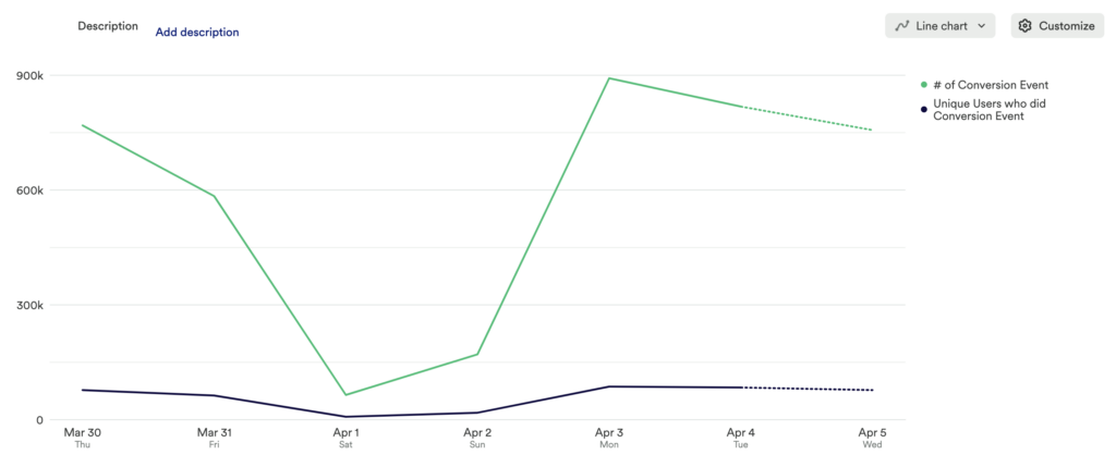
Chart 2: Identify the conversion rate of your Conversion funnel
For this step, set up a funnel chart with each step in your desired flow leading to your conversion event. We recommend starting with high-level milestone events, like Pageviews. Chart 4 in this guide will show off how to analyze a more detailed funnel.
What does this tell you?
From this funnel, you can identify major drop-off points. If there are multiple major drop-off points, first focus on the largest drop – this can help narrow your focus.
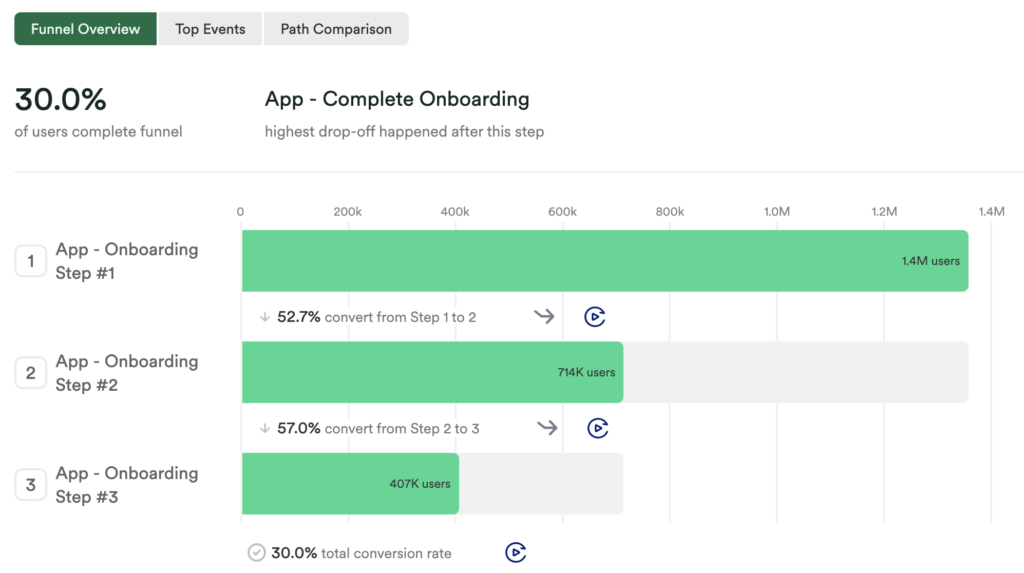
Chart 3: Discover what journeys your customers are taking instead of your desired funnel
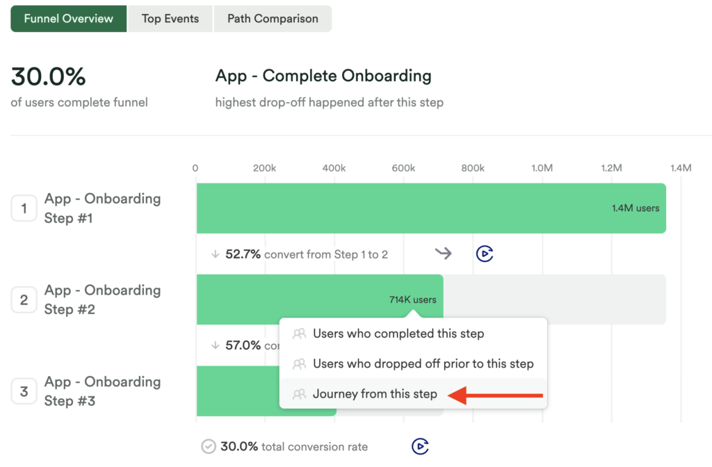
Within your chart 2 funnel, click on the step that has the largest drop-off after to bring up the option Journey from this step.
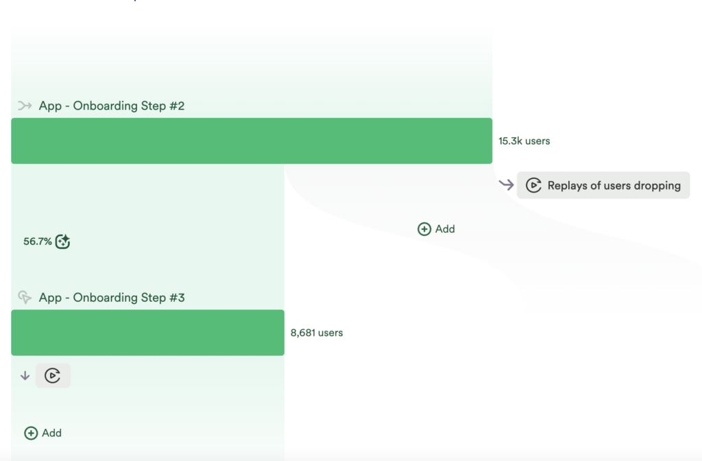
Click on this to open up a journeys chart with the two steps that result in this drop-off.
What does this tell you?
Once you have set up a basic journey chart to discover what users are doing instead of your desired steps, and you have defined more granular events based on that journey, you’ll want to go back and analyze your funnel from chart 2. This time, we recommend adding more steps to your funnel, including anything you may have identified as common steps from your journey analysis.
Chart 4: Analyze a more detailed funnel
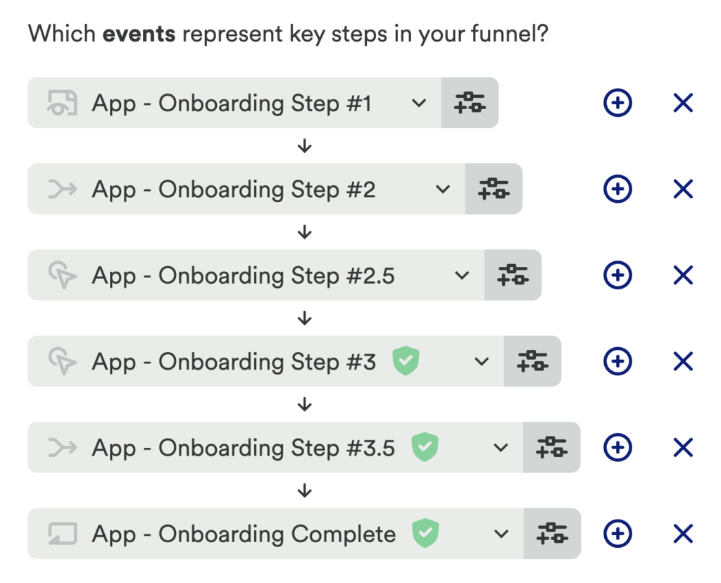
Bringing it all together, use the information from your analysis of your journey chart to set up a more detailed funnel chart.
What does this tell you?
This chart can give you a more precise understanding of how users are making it through your desired activation steps, where there might be confusion, or any other indicators of lack of interest – ultimately impacting adoption.
Chart 5: Which content has the highest impact on my conversion event
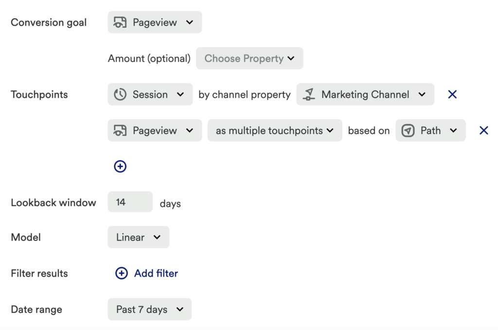
Last but not least, set up an influence chart to see which content impacts your conversion the most. Some guidance for setting up this chart:
- Conversion Goal: Conversion Event
- Touchpoints: Any marketing or educational efforts you wish to understand!
- – Lookback window: 14 – 30 days (The lookback window directly relates to exposure to your touchpoint)
- – Model: Linear
What does this tell you?
This allows you to see what percentage of your conversions were influenced by your touchpoint(s).
Step 3: Interpret your results and take action
The data uncovered through this series of steps can help identify your user’s specific pain point in the conversion funnel.
How often is your conversion event occurring, and what is the ratio between your conversion event occurring and the number of unique users completing the event? If you’ve just as many users completing the event as it is occurring, that indicates there is a wide range of acquisition, and you can continue digging into how users are finding success in your flow via the funnel and journey charts. If you find that the same users are repeating the desired conversion event, then it is worth digging into who are those users, what are their behaviors and demographics, and setting up an action plan for your team to drive those same behaviors on your site or in your tool.
The series of charts in this guide allow you to dig deep into the stickiness of your funnel. Zero in on what specifically is working, and what isn’t. Use segments to see how they perform among each other. Are users who are working directly with a sales representative, spending more money, or logging into your tool the most often more successful than other users? Segmenting your users will allow you to fully understand why your funnel is successful. Have fun and get creative here! You can create as many segments as you desire.
If you are still seeing a large drop-off in the final funnel, it is important to determine a new solution to mitigate drop-off and implement it. Use this same series of steps to test your new solution!
Conclusion
Ensure customers are successful in your conversion funnel by making your conversion experience simple and seamless. We never forget a first impression!