To make the most of this guide, you’ll need a baseline understanding of key concepts like events, charts, and properties. If you are still learning about Heap (meaning those terms don’t mean anything to you), we recommend taking our Hello Heap course or reviewing our Setting Up Heap guide prior to jumping into this guide.
Introduction
Understanding which of your marketing efforts have had the greatest impact on conversion can be a game-changer – but also a challenge. Let Heap help you determine which of your efforts you should double down on, and which you can leave in the dust.
If you’re new to analysis in Heap, we recommend reviewing Create Your First Chart, which covers helpful charts 101 info.
Step 1: Determine which conversion event you would like to analyze
First things first: To measure conversion, you need to identify what your conversion event is. Oftentimes a conversion event is a one-time event, such as “sign up,” “submit order,” “request a demo,” or “learn more.”
Step 2: Customize your Marketing Channel information
Be sure to customize your Marketing Channel information if you have not done so already! Out-of-the-box, Heap offers UTM parameter properties that can get you off to a great start. However, for your data to be the most robust, it’s best to create your own customized Marketing Channel-defined property. This will allow you to see ALL of your marketing efforts rolled up into one, and can be broken out in analysis.
Not sure where to start? Use a chart template!
Creating a defined property requires some time and can be nuanced – making it feel a bit overwhelming. Let our chart template Which marketing channels are driving my conversions help you define your Marketing Channel (last touch) defined property, and use the chart template Which marketing channels drive the most traffic for an Initial Marketing Channel (first touch) property!
Step 3: Analyze your features!
Now it’s time to analyze your marketing content’s impact on your conversion goal. The below charts will cover how to understand general usage AND impact of content.
Chart 1: Get a baseline understanding of your Conversion event
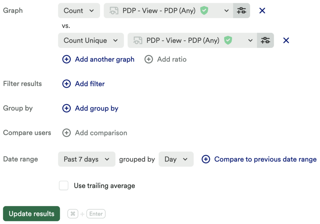
Set up a usage over time chart for a count of your conversion event, then use the + Add another button to add a count unique of this same event in the same chart.
What does this tell you?
This chart allows you to see the number of times your conversion event has been interacted with compared to the number of people who have interacted with the event.
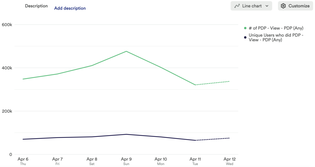
Chart 2: Understand which marketing channel leads to your conversion event
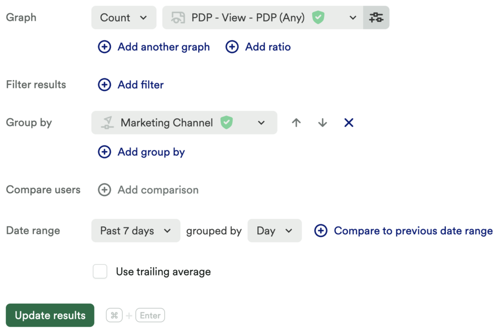
Next, set up another usage over time chart measuring a count of your conversion event grouped by marketing channel.
What does this tell you?
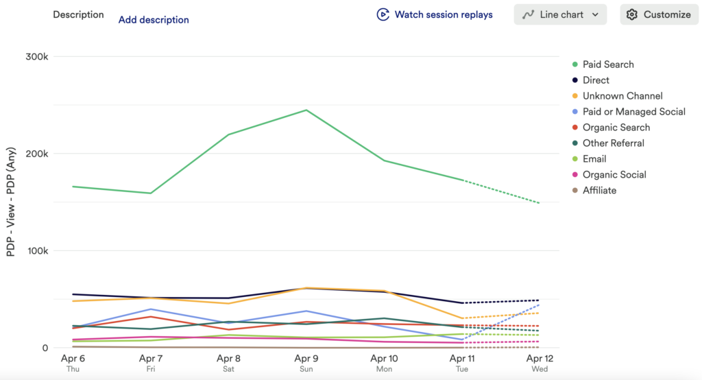
This chart allows you to clearly see the top and bottom performers for the last touch impact on your desired conversion event. Take it to the next level and add time comparisons!
Note: Timing is Everything
Sometimes, conversions can be attributed to a multitude of different marketing materials. It’s important to understand when these materials are viewed in the customer journey, and appropriately weigh their influence to find the high value pieces of content! We recommend looking at shorter date ranges and comparing time frames.
Chart 3: Which marketing content has the highest conversion rate
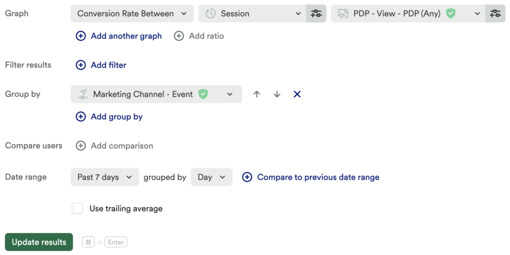
Set up another usage over time chart to measure a conversion rate between a generic action, like Session or viewing a page, and your conversion event. Be sure to group by marketing channel.
What does this tell you?
This chart will show you the number of unique users who have successfully completed your conversion goal, broken out by marketing channel, so you can get a clear idea of where your users are coming from, and which channel leads to the most successful conversion.
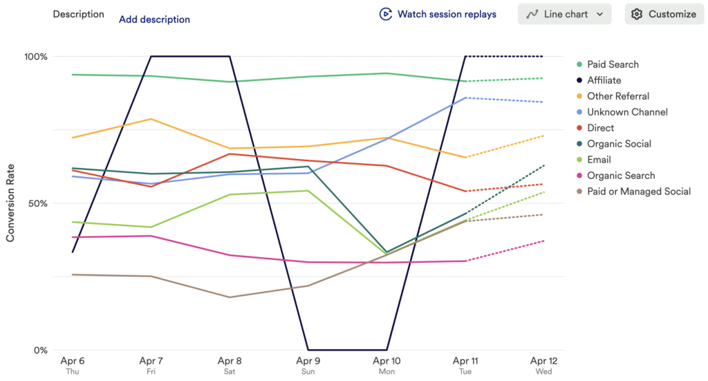
Chart 4: Which content is driving most conversion in the conversion funnel
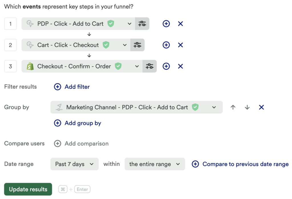
Now, set up a funnel chart, and add steps for each action leading up to your conversion event. Be sure to group by marketing channel.
What does this tell you?
Here, you are able to uncover the success rate of the various marketing efforts, as users who come from each channel make their way through your entire conversion funnel. Which marketing channels have the highest abandon rate? Which have the lowest?
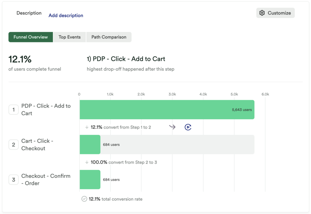
Chart 5: Which content has the highest impact on your conversion event?
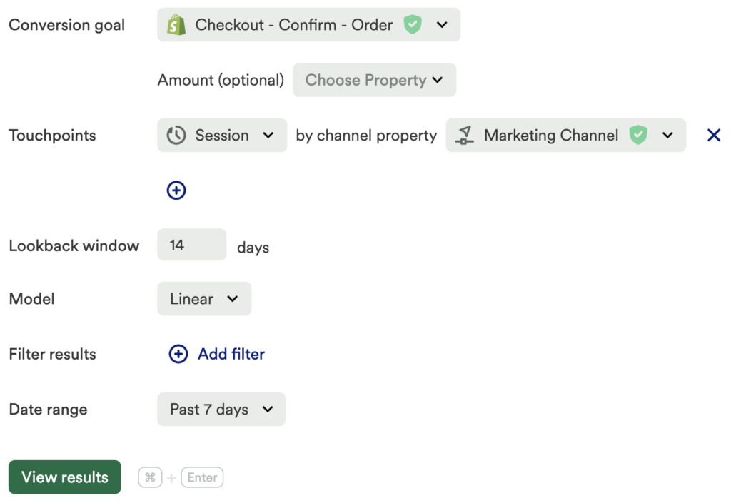
Last but not least, set up an influence chart with the following criteria:
- Conversion Goal: Conversion Event
- Touchpoints: Marketing Channel
- Lookback window: 14 – 30 days
*The lookback window directly relates to exposure to your touchpoint - Model: Linear
Note: If you are not using ‘marketing channel’, but instead marketing material such as Blogs or Guides, your touchpoint will be “Viewed Blog” “as multiple touchpoints” based on “title” or “path.” This way you can see which blog post or guide has had the most impact!
What does this tell you?
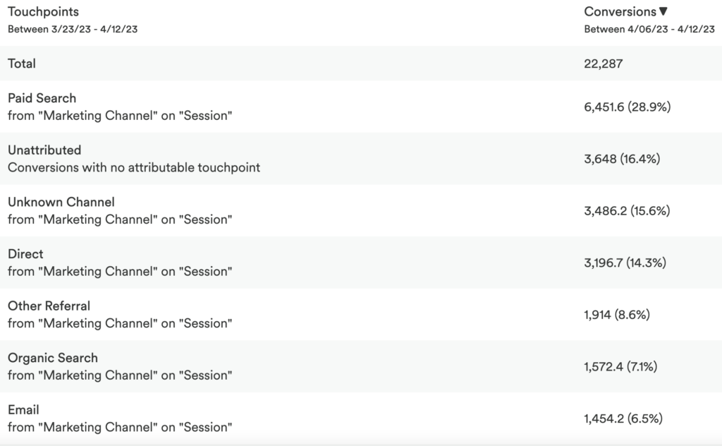
This allows you to see what percentage of your conversions were influenced by your touchpoint(s).
Step 4: Interpret your results and take action
Through these charts, you can figure out what content to optimize and where to direct your marketing efforts. Gain insight into what content successful users gravitate towards and focus your marketing efforts on delivering similar content. You can even encourage prospects to convert by gatekeeping high-volume resource materials, like blog posts or guides.
Conclusion
Knowing where to invest time and effort in marketing content can often feel like a guessing game. This series of charts allow you to determine where traffic is coming from, which content has the greatest impact on conversion, and which content you can depreciate, so you can make data-driven decisions.